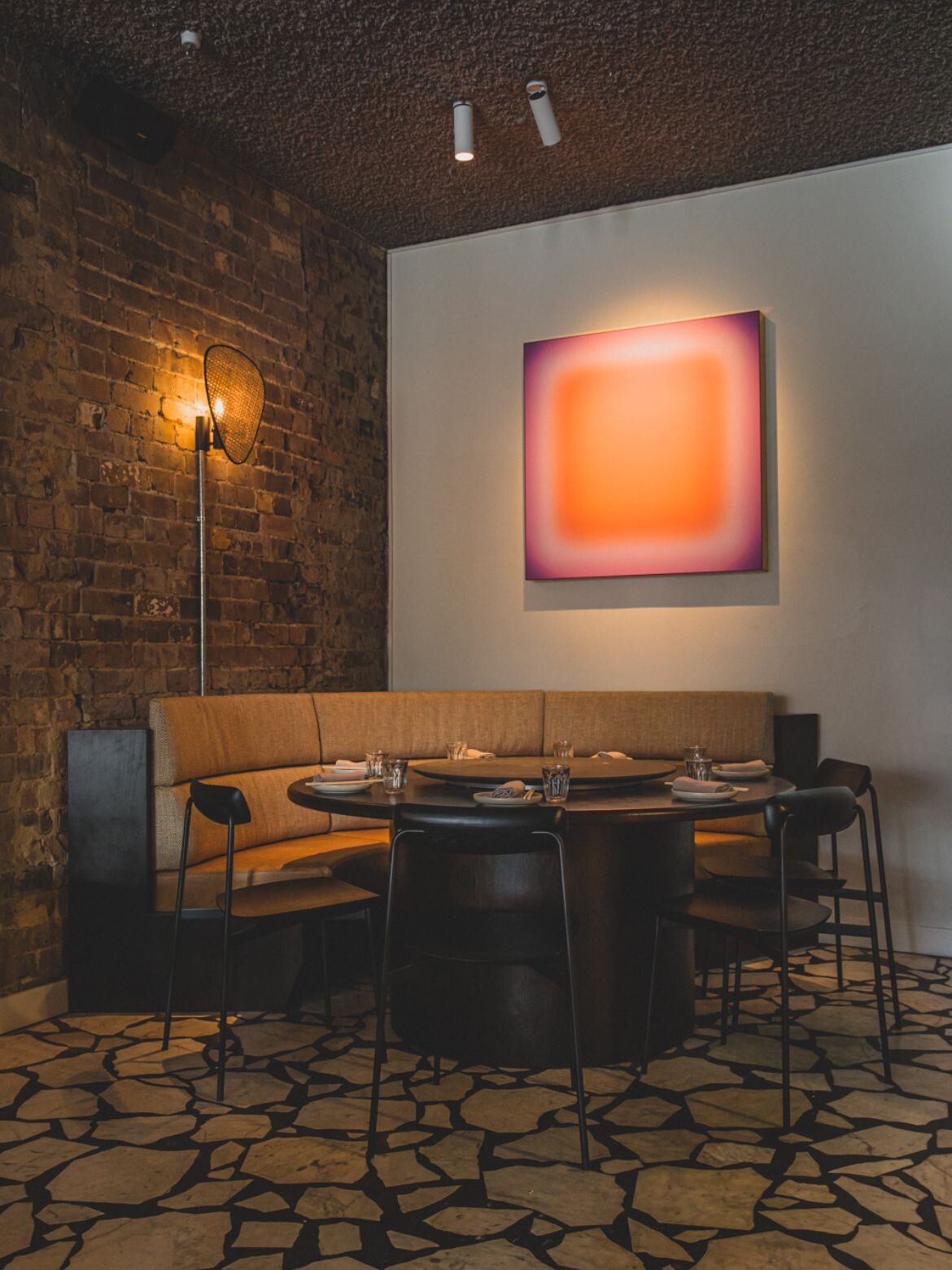
Ostensibly Redfern’s local Chinese restaurant, Redbird is the new offering in this trendy and food-filled corner of Sydney. It’s a sumptuous interior design job that makes this hospitality venue all the more tempting.

June 21st, 2023
There is one consistent element in Luchetti Krelle’s portfolio — an ability to suggest a culinary tone without wallowing in formulaic touchpoints. Rather, the design house looks at a project’s potential, layers in nuanced references and ultimately creates a new design take on whatever culinary delight they are embracing. That said, when they do introduce a cliché, it is apparent that tongue is firmly in cheek.
If you haven’t been to Redfern in a while, the whole mood has changed with a thriving restaurant hub right on Redfern Street. For Redbird, the designers took on a legacy of elements that didn’t quite work. These included a crazy paved floor with contrasting grout, a semi-open kitchen and a black tiled exterior.

True to form Luchetti Krelle embraced these ugly ducklings and transformed them swan-like into integrated and astonishing design elements — and all on a tight budget. The pavers, for example, are now a primary feature that runs below fine legged SIA and Bentwood chairs, and crisp edged detailing. “Balancing the dominating floor, we stripped the white walls to reveal raw brickwork, adding a textural layer of speckled five spice tones,” says Stuart Krelle. “Vintage carpets unstitch the severity of the internal paving.”
Extrapolating this further a fine grey pebble Fibonacci terrazzo (with aged steel trim) has been used for some table tops, while expanses of brown marble have been introduced to the bar. With the wall stripped of cladding, unruly electricals were visible and simplified: “We embraced an industrial approach, utilising vertical steel electrical casings, in turn adding a sculptural touch,” says Krelle.
The exterior tiles have similarly been embraced with signage on the black facade elegantly proclaiming ‘REDBIRD’ in brass lettering, while a glowing orange Jonny Niesche painting placed on the far interior wall acts as a glowing beacon when viewed from the street.
Related: Jane by Luchetti Krelle

With chef, Hamish Ingham, and partner, Rebecca Lines, taking a contemporary slant at traditional Chinese fare, the menu ranges from tapas-style bar servings to feast-like arrays. As such, the space has been arranged for small and large groups as well as bar dining.
While reusing as much as possible, including the upscaling of existing built in banquettes, a combination of fine and robust furniture has been placed to demark space and direct flow: “Twin solid custom circular American oak tables add a weighty permanence at opposing ends of the room, with Lazy Susans crafted from lava-like stone adding an elevated spin,” says Krelle. It brings us to the fun inclusion of Lazy Susans not seen in contemporary Chinese restaurants since the eighties, but now making a comeback as a nod to era specific design.

The restaurant is a simple delight of considered detailing, such as sustainable cork joinery lining the bar stained a darker tone to compliment the timber, but far more sound absorbing. The ceiling too has acoustic properties thanks to a coat of nubbly natural fibre spray. It is, however, the fat oak tables and fine orange detailing that rocket this little slice of Redfern into the stratosphere! Oh, and the food is absolutely to die for, which is perhaps why the Lazy Susans, last seen when visiting the local Chinese in pyjamas was the norm, are such a hit.
Luchetti Krelle
luchettikrelle.com
Styling
Buffet Digital
Photography
Nikki To


We think you might also like this story on Beverly by Mitchell & Eades.
A searchable and comprehensive guide for specifying leading products and their suppliers
Keep up to date with the latest and greatest from our industry BFF's!

The Man x Machine x Material collaboration by Jarrod Lim and The American Hardwood Export Council explores how generative AI can enhance design processes while also revealing the areas where human intuition remains irreplaceable.

XTRA celebrates the distinctive and unexpected work of Magis in their Singapore showroom.

Designing people-first buildings with flooring that contributes to achieving WELL features in the WELL Building Standard. Works with WELL is a new trademark created by the International WELL Building Institute for use by manufacturers to show when their products align with features in the WELL Building Standard.

It’s been an extraordinary ten years of exemplary projects from Studio Tate, and accolades go to Alex Hopkins and the team for an exemplar decade.
The internet never sleeps! Here's the stuff you might have missed

Modular and prefabricated buildings are gaining attention as innovative solutions to the challenges faced in the construction industry.

Removing the need for a conventional water stop at the shower entry, the Stormtech 120SCS shower screen support drain is ideal for installation in these increasingly popular residential spaces.