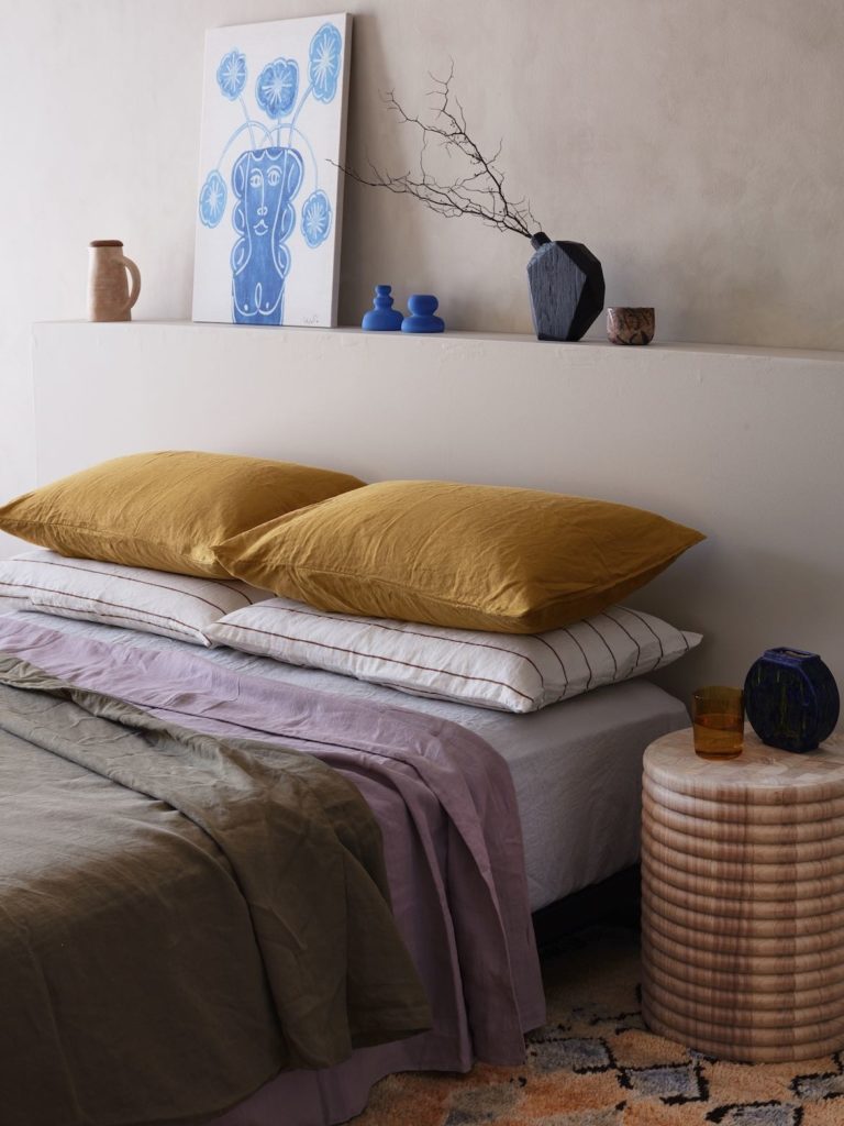
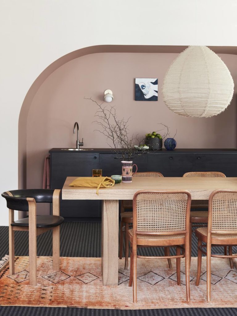
Hotel and retail environments lean hard on their surface selections in particular to bring design vision to life.

February 2nd, 2022
One need only have a cursory look through recent awards shortlists to see the exceptional quality of hotel and retail design currently being produced in Australia.
We’ve been seemingly reinvigorated by the pandemic, re-evaluating how to do things better and more effectively – and it’s given rise to some of our best work yet. But while good design is at the basis of all successful outcomes, essential to that are the tools and trades that make it happen.
Hotel and retail environments lean hard on their surface selections in particular to bring design vision to life. The intersection between product and spatial innovations is palpable and how the two come together to create interiors that offer a sense of deep immersion, activation and authenticity is essential to the end user’s experience.

A balance between aesthetics and function has to exist, especially in spaces that are expected to be hard-working. And there’s perhaps no better case study to highlight this than Adelaide’s newly opened Hotel Indigo, designed by studio-gram (along with base building architect Lucas Zahos Architects).
Located in the Adelaide Central Market precinct in the heart of the CBD, the 145-room hotel’s design is driven by the fun, craft and eclecticism of its surrounds.
As studio-gram co-director Graham Charbonneau explains, “All of our design decisions were based on telling the neighbourhood’s story so every aspect of the guest experience is rooted in the neighbourhood itself, which constitutes the DNA of the Hotel Indigo brand.”

Craft is at the core of Adelaide’s cultural identity and Charbonneau and the team, including studio-gram interior designer Tess Sporn, ensured the hotel’s scheme is richly conceptualised and finely detailed.
There’s an overwhelming plushness to the interior, with a bright colour palette and textural materiality that serves to create an inviting sense of excitement. It also reveals the importance of supporting rigorous design thinking with the best quality products.
“Ultimately, we developed a different strategy for each space when it came to surface finishes,” says Sporn. “Bricks add a weighty element in the ground floor lobby, sensual soft furnishings delineate the mezzanine level, and tiles and concrete link the Merry Maker Rooftop bar to the urban environment.”

Craftsmanship is expressed through exquisite detailing, such as the use of CDK Stone’s Super White Dolomite as an inlay in the concrete bar tops; Calacutta Viola (also by CDK Stone) on the central stairs; and Abet Laminate in Cobalt Blue as the mezzanine’s joinery finish, and paired with solid brass pulls.
These surface finishes are certainly good looking, but they’re also robust, which designers, manufacturers and suppliers all agree is necessary for applications in high traffic areas.
For Laura Di Bartolo, Alternative Surfaces’ national manager, the emphasis is on resilience, ease of maintenance, durability and seamlessness.

She also highlights the significance of product development in keeping up with the performance needs of both designers and their clients.
“When we first launched our X-Bond overlay system in Australia over 20 years ago, we had one finish and only applied it to floors,” Di Bartolo explains. “Now, we have the ability to create custom colours and can apply it to walls, ceilings, wet areas and custom furniture too.”
Interestingly, Alternative Surfaces has recently introduced a product called Liquid Membrane, which is an anti-fracture and waterproof membrane. It’s changing the resurfacing game for the supplier and the wider industry, as it allows X-Bond to be installed seamlessly over sheeting and surfaces that have a lot of movement.
If there’s one Australian design practice recognised for its adherence to lush surface finishes and material palettes that are seductively immersive, it’s YSG Studio.

The Sydney-based practice has completed the fit-out for textiles brand Cultiver’s headquarters in Sydney’s Crows Nest and it’s characteristic of director Yasmine Saleh Ghoniem’s expressive style.
“It’s a retail space for designers to select their products and so the brief was to make everyone, including staff, feel at home. The idea was to make it very experiential, with more of a European sensibility to it,” she says.
Domestic vignettes framed via recessed arches and hand-painted chequerboard concrete flooring set a tactile tone, as do the walls’ organically coloured paint finishes.
Ghoniem’s vision could not have been achieved was it not for her surface selections, which create as much visual intrigue as they do ambience.

The downstairs kitchen, for example, stands out for its custom impasto splashback that bears a textured imprint of native leaves, coupled with the joinery’s Laminex finish in Green Slate.
According to Laminex’s general manager sales and marketing, Sacha Leagh-Murray, “It’s pertinent to select great quality, hard-working surfaces that will maintain a sleek appearance for years to come, particularly in retail environments where the interior design is used as a drawcard to attract customers.”
Variety is as important as durability, of which Laminex is well aware. Over 200 of its decors in the Laminex Colour Collection are now built with Protec+, which inhibits the growth of bacteria, fungus and mould. And an increase in the demand for feature surfaces has led to the launch of Surround by Laminex, a new brand of wall panelling solutions.
Creating a memorable hotel or retail experience very much relies on architects and designers understanding how to use surface finishes to achieve the desired effect and engagement. It also relies on those surfaces to deliver a high performance.
And the beauty of supporting good design with surface innovation lies in the end result, which will always gently entice and welcome, keeping people coming back time and again.
Alternative Surfaces
alternativesurfaces.com.au
Laminex
laminex.com.au
studio-gram
studio-gram.com.au
YSG
ysg.studio
This article originally appeared in Indesign Magazine #85. Order your copy today.
A searchable and comprehensive guide for specifying leading products and their suppliers
Keep up to date with the latest and greatest from our industry BFF's!

BLANCOCULINA-S II Sensor promotes water efficiency and reduces waste, representing a leap forward in faucet technology.

BLANCO launches their latest finish for a sleek kitchen feel.

Within the intimate confines of compact living, where space is at a premium, efficiency is critical and dining out often trumps home cooking, Gaggenau’s 400 Series Culinary Drawer proves that limited space can, in fact, unlock unlimited culinary possibilities.

Laminex debuts a new epoch of surface design that preserves the essence of the Australian landscape through proprietary technology.

Walls, ceilings and joinery work in seamless harmony thanks to this elevated alternative to traditional timber battens

August has been a dynamic month for the creative industries, with architects and designers expanding their firms through promotions and several others embracing change through rebranding. Overall, this month has been marked by significant expansion and evolution.
The internet never sleeps! Here's the stuff you might have missed

With its fusion of architectural sensibility and impeccable sustainability credentials, the furniture of Actiu provides exceptional options for comfortable, collaborative, productive and calm indoor environments.

A bistro that pays homage to the existing mid-century and Japanese-inspired architecture of its context.

The story of how Gray Puksand’s design team crafted their very own office in Melbourne.

In the latest installment of SpeakingOut!, Jan Henderson, Program Director of the INDE.Awards, sits down with Elizabeth Carpenter, Managing Principal of fjcstudio. Representing the “Best of the Best” category, proudly supported by Zenith Interiors, this episode dives into the creative journey behind the award-winning Darlington Public School project. A Passion for Architecture Jan Henderson: Elizabeth, […]