The home of architecture and design in the Asia-Pacific
Get the latest design news direct to your inbox!
Get the latest design news direct to your inbox!
From colour and materiality to textures and even the odd column, here are some offbeat, oblique observations from the great Italian festival of design.

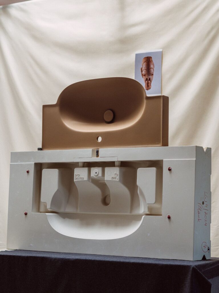
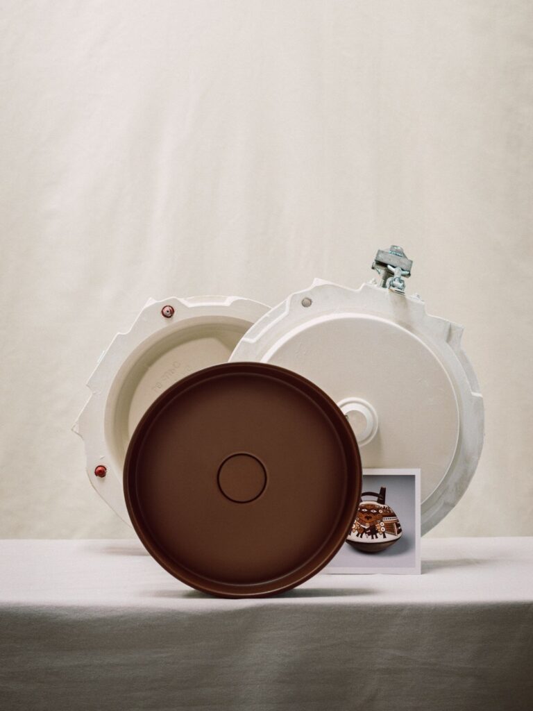
Arper, Dominio Bagnoli.

June 26th, 2024
Dive into our full Milan 2024 Edit here!
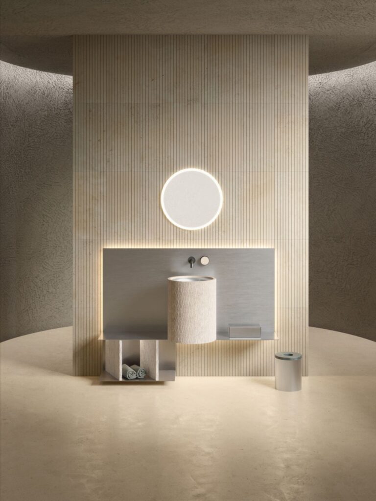
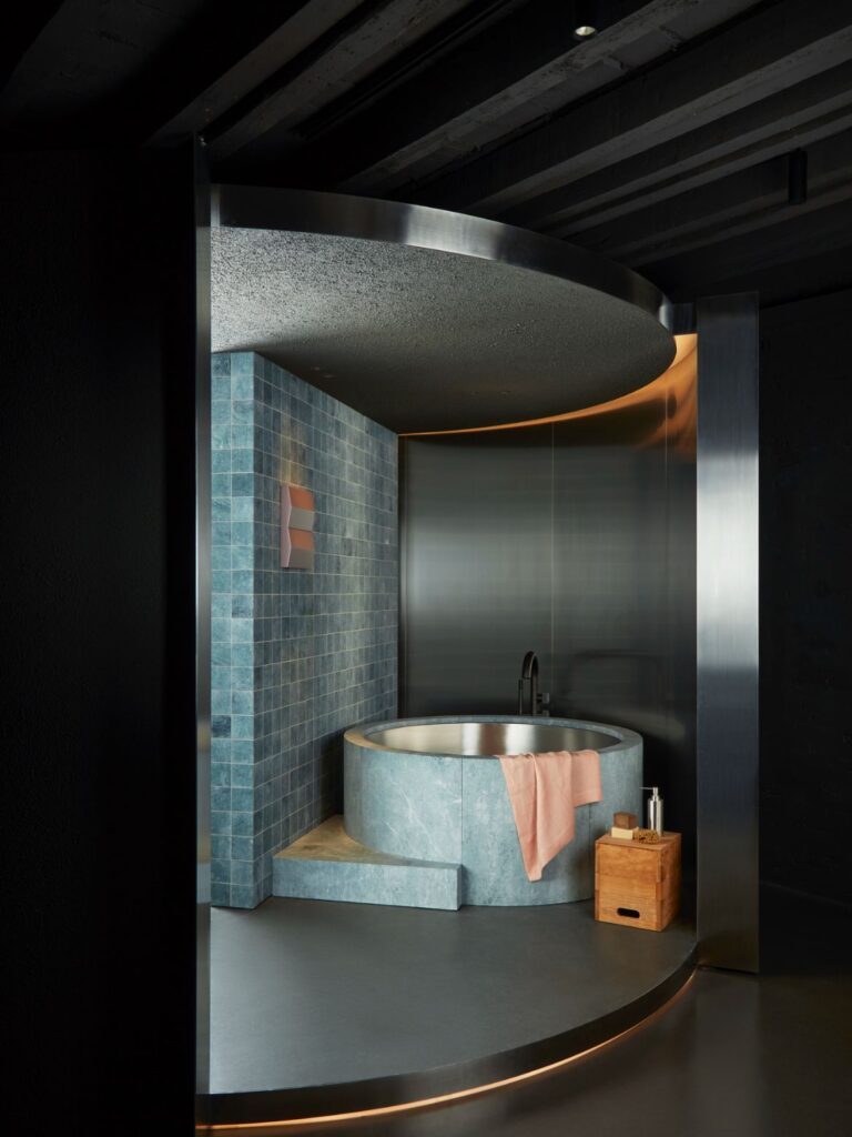
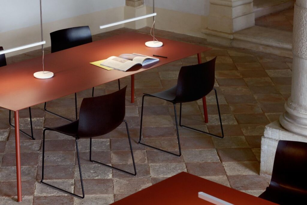
1. Mixed materials – steel, anyone?
Ok, let’s start simple. Mixing one material with another – hardly sounds like a galactic breakthrough, but it seemed a touch more audacious this year. Stainless steel, for example, popped up a few times amidst softer furnishings or even bathroom stone, as was the case with The Small Hours by Patricia Urquiola at Salvatori. Talenti Outdoor Living presented Nalu (for which we interviewed designer, Roberto Palomba – more on that soon). These outdoor furniture pieces, with their bold reds, also showcased beautiful metallic finishes of lacquered aluminium alongside the surf-inspired formal aesthetic. At Gessi, meanwhile, the juxtapositions even included Pelle, tapware that “experiments with three-dimensionality and tactility in a game of aesthetic references inspired by the world of high-end leather goods.”

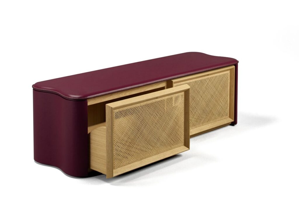
2. Burgundy and variations thereof
We couldn’t list trends without at least one colour observation. This time, it was all about those luscious burgundies – stretching in and around deep or clay reds, all the way to softer pinks. Notable sightings came with some serious design heft. First, there was Álvaro Siza’s and other pieces for Bottega Ghianda and Promemoria: simple, essential and yet with a strangely weighty presence, just like most of the Portuguese master’s architectural works.
Meanwhile, at Laufen, Roberto Sironi staged one of the more intellectual highlights of Milan 2024 with his exhibition, Colour Archaeology. This work traced the evolution of colour in ceramics over a long, global history stretching back to Ancient Egypt and elsewhere. Finally, Baxter’s display at The Clay House typified the placement of burgundy, maroon and pink tones withing a terracotta setting.

3. Same piece, different finishes
Similar to the first point above, we also noticed that variety in terms of texture and finish was taking place not only in the juxtaposition of materials but also within the same objects. To put it simply, rough and smooth parts of the same whole.
At once rugged and refined, V-ZUG’s Time and Matter display, with HENRYTIMI, made stunning use of this approach by integrating kitchen appliances into seemingly monolithic stone pieces defined by different finishes – for instance, rough sides and functionally smooth tops. The theme is also a continuation for Paola Lenti, whose strikingly colourful pieces are often no less notable for their different the ways in which lava stone achieves a quality of being both hard and soft at the same time.

4. Closing the circle
Alongside various forms of reuse, the sustainability focus was on circularity. It should, of course, be on circular economy – the latter word underlining the need for any truly sustainable industry to be a whole system, not just one brand. This remains a distant goal; all the same, let’s commend some of the work being done to create products with minimal waste on their own terms. Arper’s Catifa Carta, for example, features a re-engineered shell made of PaperShell, a revolutionary new material made of composite wood by-product. The environmental aim is to do what trees do – sequester carbon dioxide – and the material can be reduced to biochar at the end of its life-cycle.
Elsewhere, it has to be said that some of the more ostentatious presentations struck a somewhat deaf tone in the context of climate and housing crises across the world. Blatant greenwashing is probably worse than ignoring the issue altogether, but genuine attempts at introducing circularity and reuse are the way to go.

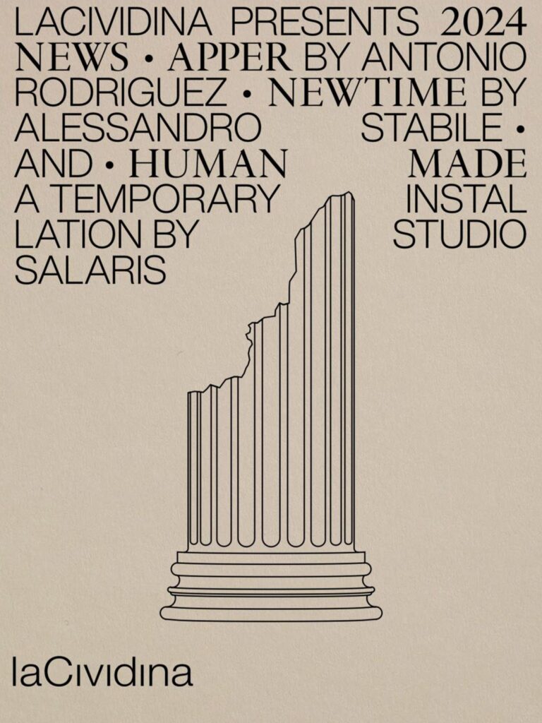
5. Long live the column
Stepping a touch into left field, we couldn’t but notice a preponderance of phallic objects – mostly decorative and in some way playing on the classical connotations. Over and above the fine architectural settings with their own columns, it seems that a number of installation designers, brands and individual practitioners went out of their way to reframe the (sometimes not so) humble old column.
COLONNE, an installation of six monolithic columns, “epitomises simplicity and substance.” These pieces are made by hand in Italy, exclusively for Galleria Rossana Orlandi by Benedetto Fasciana and Antonino Sciortino.
A searchable and comprehensive guide for specifying leading products and their suppliers
Keep up to date with the latest and greatest from our industry BFF's!
The internet never sleeps! Here's the stuff you might have missed