Afterpay by The Studio* Collaborative is modelled as a destination for a non-traditional workforce of young, engaged, tech-smart individuals.

August 29th, 2022
Occupying levels five through eight with a total of 5000 square metres, The Studio* Collaborative fit-out for Afterpay is layered as a chic and streamlined foundation with an overlay of warm and textural loose-fit components. It is also a commercial interior of surprising moments and leisurely paced experience.
Accommodating 650 people with an expectancy of a post-COVID-19 60 per cent ratio return to office, the Melbourne CBD site is significant, as is the building itself.
Previously occupying the Melbourne Stock Exchange, the GPT$272 million development has breathed new life into the heritage buildings, with the former stock exchange floor now slated for a restaurant.

“With four buildings in the mix, Gothic and heritage, the development connects the buildings through a beautiful ground-floor retail precinct with laneways through to Little Collins Street, and that was really important to Afterpay; they didn’t want to be in a corporate site,” says Melinda Huuk, The Studio* Collaborative founder and director.
The portion housing Afterpay is “gorgeous, Gothic, quite monolithic and has a real sense of community underpinning it”, says Huuk.
This article was featured in Indesign magazine, purchase your issue here.
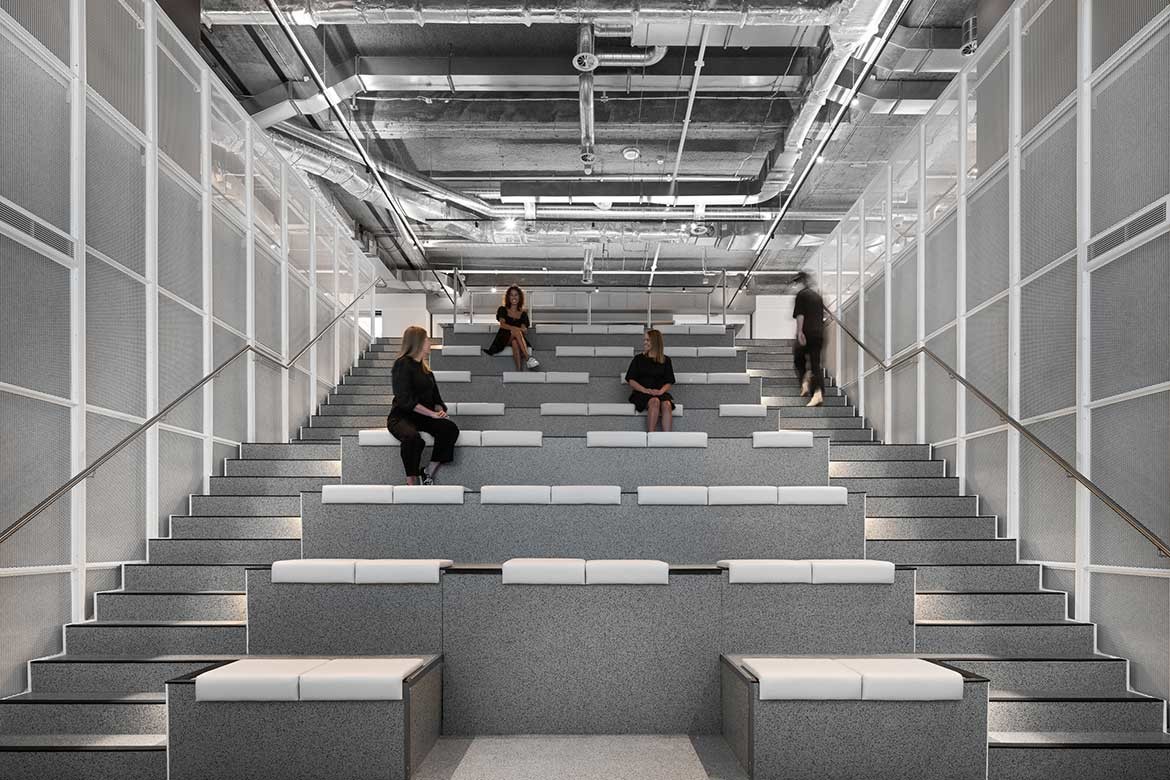
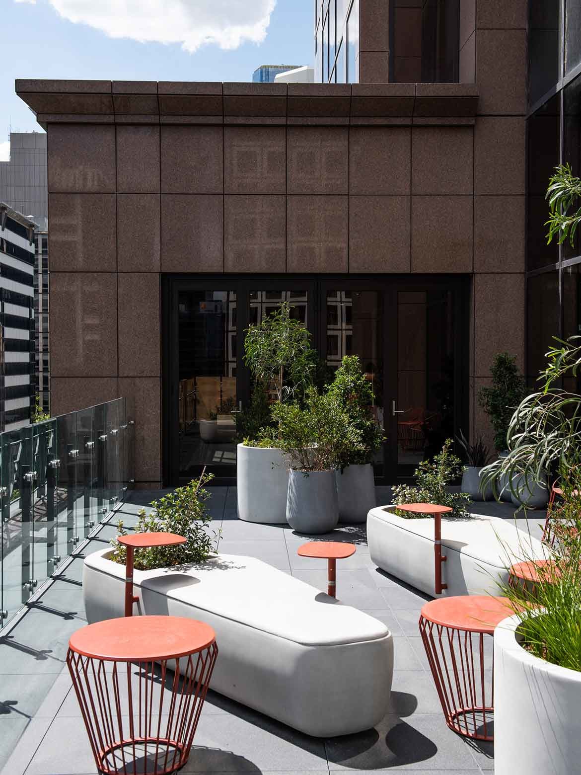
Compounding the impact of the prominent corner position internally, floors five to seven have been ‘punched through’ to create a corner atrium that infuses the whole with light. Screened with perforated white steel, the atrium presents as a sleek and highly contemporary take on an Edwardian glass house.
Here, the screening references framed glazing, while the deep green foliage and individual wintergarden gazebos are executed to perfection. Indeed, these individual pods – comprising a semicircular screen of white perforated steel, semicircular desk and simple chair over a pale blue carpet – are refined and simplified as an uncluttered haven. They are also infused with a soft dappled light and perfectly at home amongst the large and abundant potted plantings.

Overall, the profusion of white amongst the plantings is crisp, clean and restfully elegant. Moreover, in creating an additional layer between the working floors and the CBD, there is an element of containment that posits the experience of Afterpay as both standalone and connected.
The building itself has been positioned to look out over fine examples of Modernist and Gothic architecture, which in true Melbourne form, work extremely well together. This backdrop has not been lost on the designers with the more intimate nooks enjoying this view.
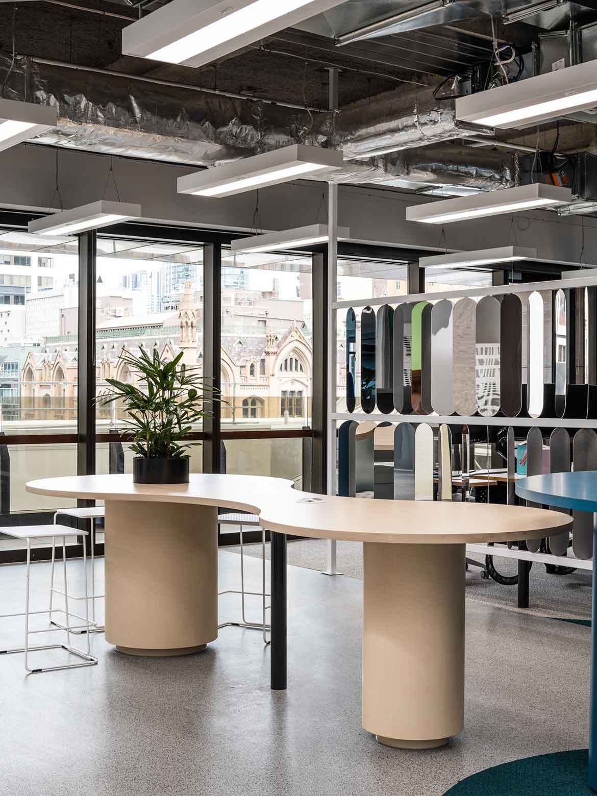
Conversely, large meeting rooms are work focused, with diaphanous curtains diffusing light but obfuscating the view. The nooks are extremely well-designed and, being mostly loose fit, provide excellent opportunity for future-proofing the design.
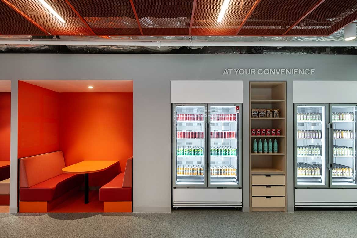
It is wrong to equate the design with fashion, and to be clear, The Studio* Collaborative has not created a fashion interior. Rather, it has created an interior that fashion mavens will be at home within. As such, pinks, reds, and oranges provide glowing booths and accents while sleek rose gold and copper tones lend speed and a sense of glamour to areas of retail presentation.
Related: Westpac’s Infrastructure Crisis Command Centre by The Studio* Collaborative
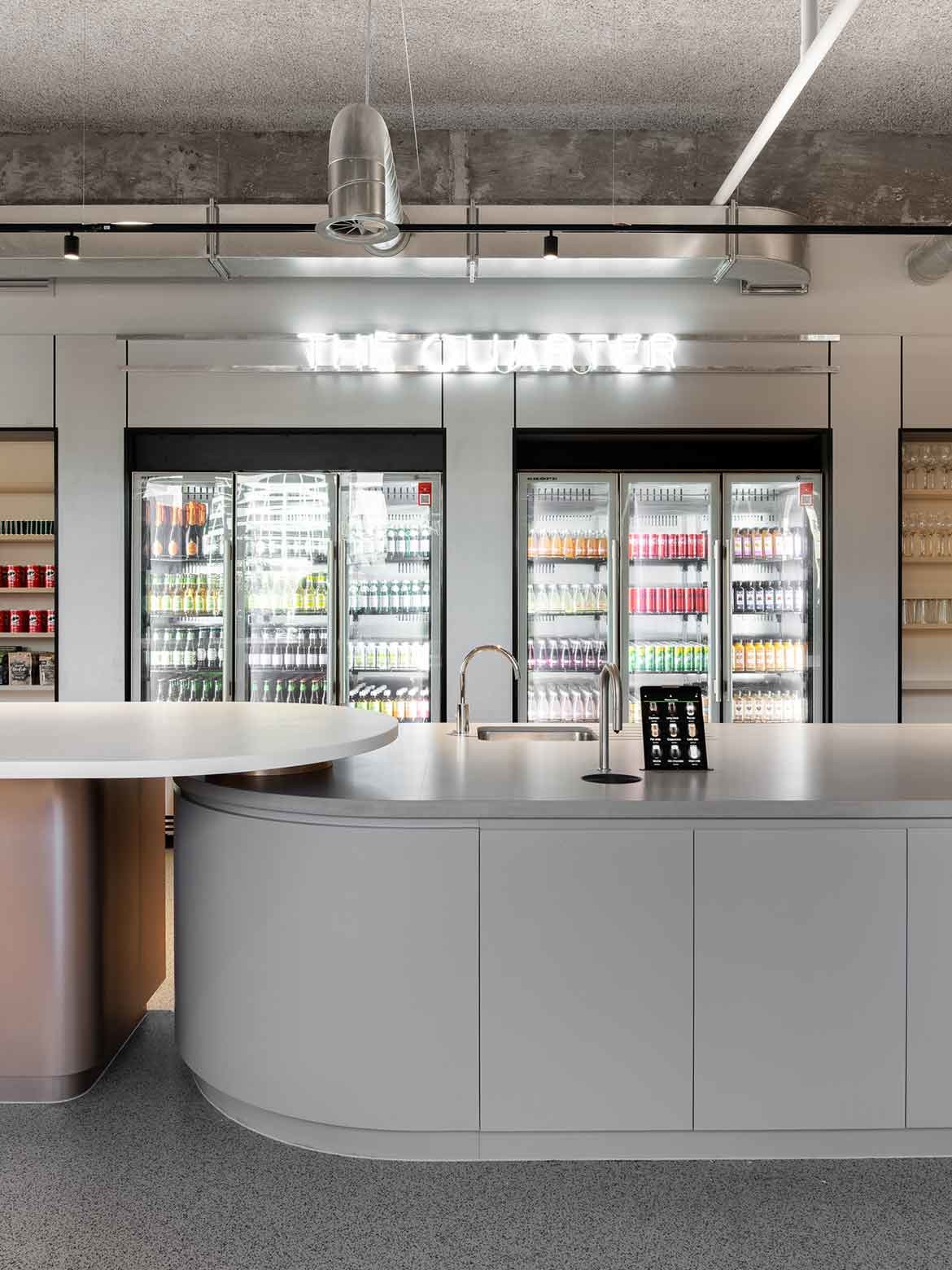
It is cleverly done with the main eighth-floor forum and marketplace providing retailers with an experiential zone where products and apps can be tested in a familiar context. “It’s a blank shell, but with lighting and AV overlays the experience can be tailored,” says Huuk of the large space at the centre of level eight.
This area is essentially a merchandising and staging area where softly curved pedestals in bronze, gold and brass (Laminex Metallic Plex Copper, Argent and Graphite) can be used by retailers for events or trials. “The softer pinks, greens are all extractions from the Afterpay palette, which we played with and added the materiality of metallic detailing,” says Huuk.

The office design answers all contemporary high-tech office needs with full connectivity through a good mix of desks, meeting rooms for two, four, six and eight, etcetera.
There are also individual video conferencing booths, creative breakout spaces (with particularly lovely Sancal Pion Stools from KE-ZU in gelato shades) and formal board rooms. All of this is executed beautifully with good furniture, lighting and flooring.

Where the design sings, however, is in the considered elements that speak to the predominantly young, engaged and tech-smart staff that Afterpay attracts and encourages. The technical support team, for example, has a different way of working to the traditional nine-to-fivers: the kitchen is larger with late-night meals expected.
There has also been a switch away from tech support being hidden in the background. Instead, the area is haloed with a fun neon light that reads ‘Insufficient Memory’ and boasts a divine blue circular foyer lounge of the grand American hotel ilk. In functional terms it makes sense to have a waiting area near tech support, but to make it fun (it has plants spouting from its centre) and glamorous elevates the whole experience. It is also on the path between two main areas, which again, brings technical support into the main game.

There are lovely soft moments of dusty pink such as the pair of chairs in a nook overlooking a Gothic building: “It’s a space to meet up and have a moment of respite; it was a natural indent in the building and made sense to create that space,” says Huuk.
To the right the indent has been used to create a slightly larger space comprising a booth with a Japanese-like ambiance of warm tones. Another gorgeous moment is the trial room, where retailers can observe a product in use from behind a mirror.

Rather than use a mock counter, The Studio* Collaborative has designed a lounge area with Colab High Quadrant Soft Sofa elements (Koskela) in muted pink and blue tones on a teal rug.
There is also a yoga room, parents’ room, lockers and first aid. Each of these is considered and warm. As such, the whole operates on two levels. Where needed, it presents as a very clever blank slate that will be infused with personality as it is populated and experienced by Afterpay’s retailer clients.
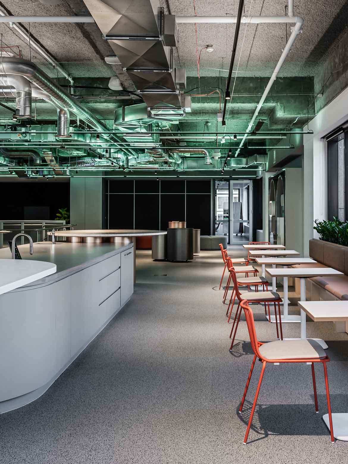
More intimately it is warm and soft, welcoming and comfortable. It also has the ability to be transformed in that the bones are clean, clear and unencumbered, while the fabrics and furnishings can change hue and finish to keep pace with the times.
This article was featured in Indesign magazine, purchase your issue here.
The Studio* Collaborative
thestudiocollaborative.com
Photography
Tom Blachford




We think you might like this story on Wyer & Co’s workplace, a project by Daniel Boddam.
A searchable and comprehensive guide for specifying leading products and their suppliers
Keep up to date with the latest and greatest from our industry BFF's!

With the exceptional 200 Series Fridge Freezer, Gaggenau once again transforms the simple, everyday act of food preservation into an extraordinary, creative and sensory experience, turning the kitchen space into an inspiring culinary atelier.

Following its successful inaugural event in early 2024, the Vietnam International Trade Fair for Apparel, Textiles, and Textile Technologies (VIATT) is gearing up for its next instalment in 2025.

Elevate your outdoor spaces with pieces that are beautiful, functional, and engineered for you.

The Man x Machine x Material collaboration by Jarrod Lim and The American Hardwood Export Council explores how generative AI can enhance design processes while also revealing the areas where human intuition remains irreplaceable.

It’s been an extraordinary ten years of exemplary projects from Studio Tate, and accolades go to Alex Hopkins and the team for an exemplar decade.

Italian furniture brand Pedrali is known for leading the way when it comes to the workplace. We speak with Busetti Garuti Redaelli design studio about the evolution of the Buddy collection – a solution for hybrid spaces that can support all sorts of working styles.
The internet never sleeps! Here's the stuff you might have missed

Italian furniture brand Pedrali is known for leading the way when it comes to the workplace. We speak with Busetti Garuti Redaelli design studio about the evolution of the Buddy collection – a solution for hybrid spaces that can support all sorts of working styles.

The next phase for Sydney Olympic Park is now on exhibition as part of the SOP Master Plan 2050.