We take you to the largest department store in South Korea, where Canadian firm Burdifilek has envisaged a boldly futuristic experience, interwoven with nature.

June 8th, 2022
With the help of Canada-based global design firm Burdifilek, Hyundai Seoul has established itself as a global retail landmark – and not simply because of its status as the largest department store in South Korea. The country is known for its appreciation of design and in Seoul, particularly, architecture and design is inherently wrapped up with fashion.
The obtruding glass of Frank Gehry’s flagship for Louis Vuitton in collaboration with Peter Marino makes a sculptural mark on the streets of Cheongdam-dong, while not far away, diffused light trickles from Acne Studios’ lightbox-like flagship by Sophie Hicks. Christian Dior’s flagship by Portzamparc rises spectacularly into the sky, crown-like, and Phillip Lim’s flagship by Leong-Leong architects is a starkly gridded white box.
It’s within this context of outwardly fashion-focused, daring design that Burdifilek has established its name in Seoul over the past nine years, and through word-of-mouth was approached by Hyundai to enter a competition for its newest department store.
“[South Korea] is an amazing canvas to play on,” says Diego Burdi, who founded the Toronto-based Burdifilek alongside Paul Filek. “They are culturally very design aware, definitely risk takers.
“And South Koreans don’t have an issue with rolling the dice at all, which really we love, as North American designers.”
It wasn’t until Burdifilek was awarded the project that the studio realised its scale. “I remember going to their construction site for the very first time. It was like several football fields. It’s just massive,” says Burdi.
Related: Joost Bakker teams up with outdoor lifestyle brand, Kathmandu
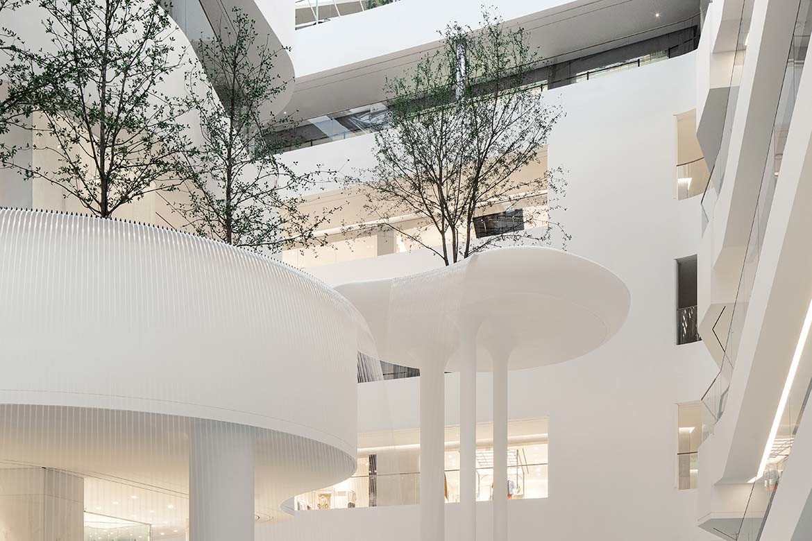
Despite being the largest project Burdifilek has ever worked on, the studio rose to the challenge, providing fully customised shopping experiences over three levels.
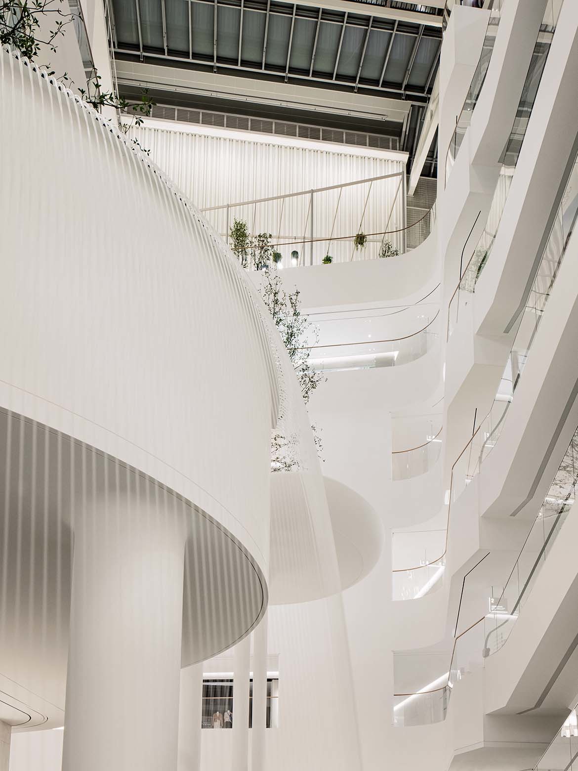
The studio also completed what it refers to as a “raceway” around the store – the common circulation that leads clients around the perimeter. In a series of atriums that pepper the perimeter, Burdifilek created a towering water feature, referencing the sky garden that was being installed on the top floor by bringing nature into the space. Nature has also been woven through the “raceway” with green belts.
The two shopping floors designed by the studio embrace completely different points of view. The second floor carries high-end womenswear and is designed to pedestal the pieces to reflect their quality.

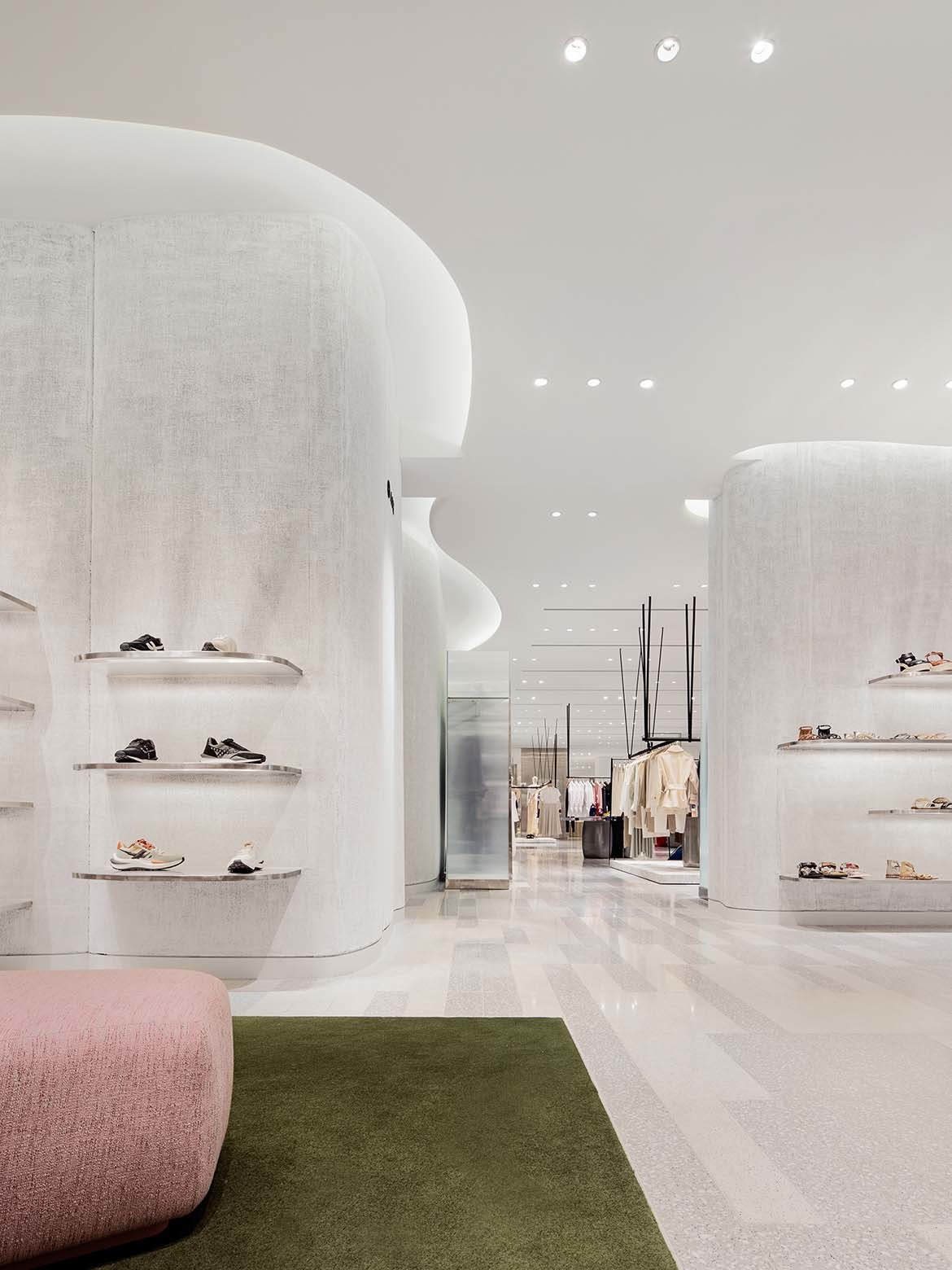
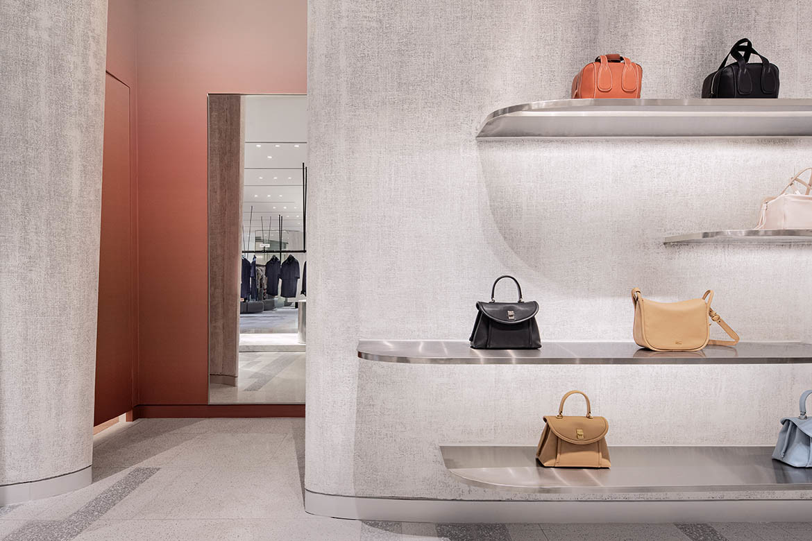
“We created more of a gallery, sculptural, very quiet space,” says Burdi about the second floor. A combination of dry, matte and textured finishes abound: the walls are plastered to create a burlap finish, and even the glass accents are matte.
Pops of colour stand out in hallways, recesses and change rooms defined by their apricot gradient, joined by pink and green soft furnishings. In certain sections, lighting emanates from curves and undulations in the ceiling to help “plate” the products flawlessly. “The whole space is very amorphic and feels really quite beautiful,” says Burdi.
The third floor is unisex, and as Burdi puts it, inclined towards a more “design-aware”, fashion-forward client. “So we had to be a lot braver there,” says Burdi.
The bravery paid off. Rather than opting for the stock-standard white or black base, the design studio conceived a boldly futuristic and lustrous space. “We wanted to have a little bit of humour with it,” says Burdi. “We’re playing with not only finishes and colour, but we’re playing with scale. You have those vacuum-formed walls that are very sculptural but as you move around they’re very kinetic. It’s almost lenticular.”
Glimpses of yourself can be caught in the rippling, metallic walls and the hard edged feel reflects the boldness of the product lines.

“We wanted that extreme juxtaposition where we have something that is kind of shiny, almost Blade Runner-like. And then the second floor is really quiet… It’s a totally different feel.”
Experiential and tantalising, Burdifilek’s design for Hyundai Seoul is a drawcard for enticing South Korean shoppers back to physical retail stores.
This article was published in Indesign #86, the ‘Hybrid At Work’ Issue. Purchase your copy here.
Burdifilek
burdifilek.com
Photography
Yongjoon Choi


We think you might like this article about 5 ground breaking poured concrete structures.
INDESIGN is on instagram
Follow @indesignlive
A searchable and comprehensive guide for specifying leading products and their suppliers
Keep up to date with the latest and greatest from our industry BFF's!
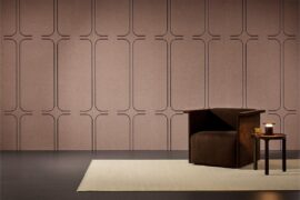
The difference between music and noise is partly how we feel when we hear it. Similarly, the way people respond to an indoor space is based on sensory qualities such as colour, texture, shapes, scents and sound.
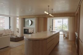
Natural stone shapes the interiors of Billyard Avenue, a luxury apartment development in Sydney’s Elizabeth Bay designed by architecture and design practice SJB. Here, a curated selection of stone from Anterior XL sets the backdrop for the project’s material language.
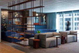
A 10,000-square-metre flagship by Hub Australia and Hassell at Brookfield Place reframes the co-working office as a hybrid of workplace, events venue and lifestyle destination.
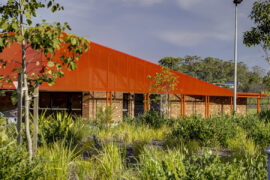
A new Sydney sports pavilion designed by Sam Crawford Architects (SCA) finds inspiration in the deep archaeological history of Indigenous sites nearby.
The internet never sleeps! Here's the stuff you might have missed

The difference between music and noise is partly how we feel when we hear it. Similarly, the way people respond to an indoor space is based on sensory qualities such as colour, texture, shapes, scents and sound.
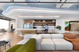
Steelcase has unveiled one of its largest Asia Pacific showrooms in Hangzhou, merging workplace, brand experience and client engagement in a single flexible environment designed by M Moser.