Studio SKLIM draws upon concepts of emptiness and negative space to optimise space in a micro café located along River Valley Road, Singapore.

December 6th, 2019
Drawn by the emptiness of cups and bowls for serving coffee and matcha – specialities found at Grace Espresso – Studio SKLIM created voids in the micro café to fulfil form and function.
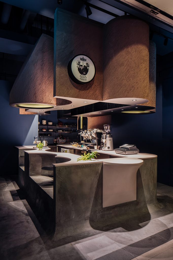
Given carte blanche for the project, the team employed a process of ‘subtraction and addition’ to optimise the modest 28-metre-square space along Singapore’s River Valley Road. “We basically took a block and carved out spaces we required,” explains Kevin Lim, founder of Studio SKLIM.

Sitting in the middle of the café, an irregularly shaped concrete block forms the focal point and intuitively guides customer circulation. Softening the mass, circular modules within the block were ‘subtracted’ to meet operational needs, such as a point-of-sale and two seating booths with fitted tables, creating cosy enclosures for singles and couples. A protruding counter was ‘added’ to showcase the day’s fresh bakes and facilitate takeaways.
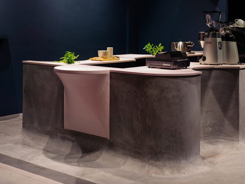
Housing the front and back of the house within the same block draws customers closer to the action, fostering intimate encounters. It is also space-saving, enabling multiple programs to occur within a small area. The team was able to allocate a small ‘Ritual Corner’ to showcase the art of brewing tea and drip coffee by hand.
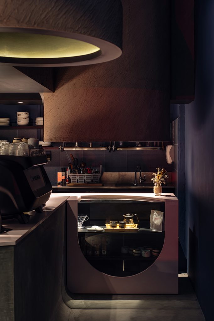
“Our work is rather methodical and stems from pragmatic means through the analysis of anthropometrics and human movements, in this case. The form or aesthetic is the result of these design processes, which perhaps makes it ‘different’ from the generic norm,” says Lim of the unconventional café.
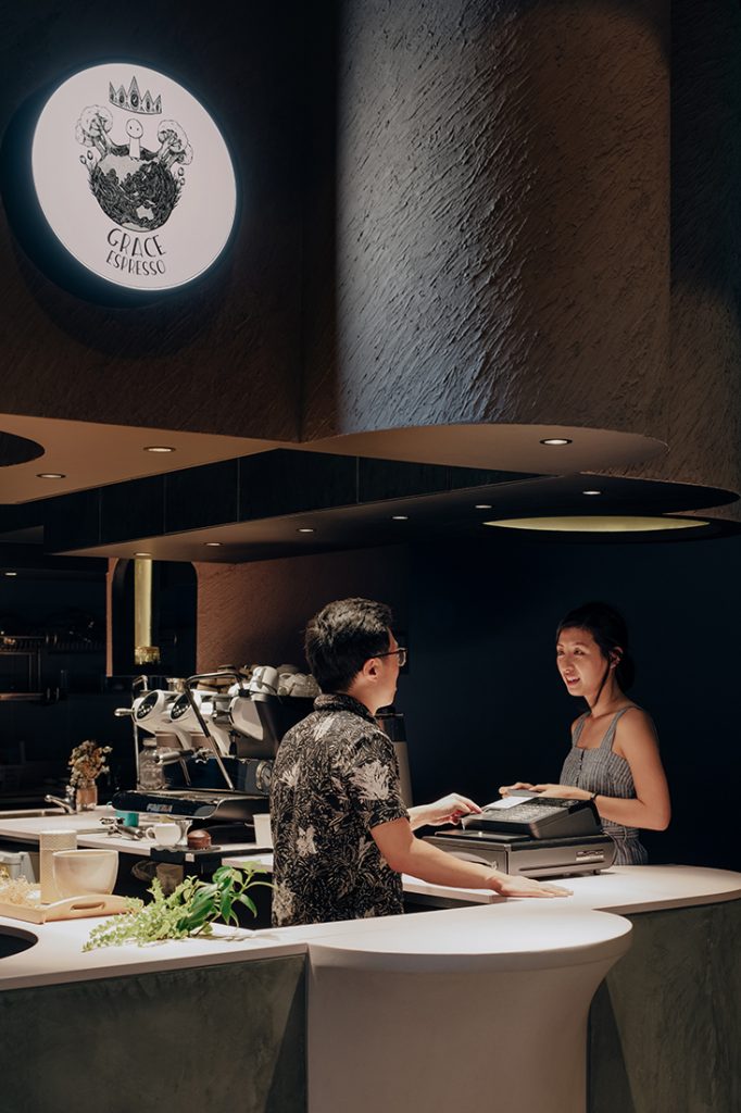
Tracing the concrete block, overhanging cylinders fashioned in dramatically textured brown stucco – inspired by coffee grounds – hang from the ceiling with no visible support, portraying a sense of lightness, or as Studio SKLIM calls it, “an anti-gravity coffee cloud”. Besides illuminating the space, it houses an ‘Experience Circle’ – an enclosure that customers can stand beneath to experience coffee and tea aromas.
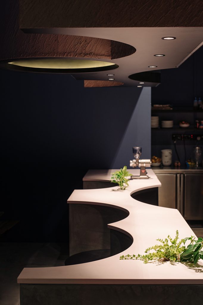
Other notable details include hand-moulded slopes at the bottom perimeters of the block to create the illusion of it being raised from the floor, as well as small cracks cast to enable plants to emerge from the surface – a playful detail inspired by weeds growing out of odd places.
According to Lim, one of the challenges was to ensure that the 11 powdered pink concrete surfaces aligned with the irregular counter and overhanging modules seamlessly within a one-month construction timeframe. “We had to CNC a common plywood template for each trade so they could work simultaneously rather than wait for each respective party to take on-site built measurements of the completed stages,” he shared.
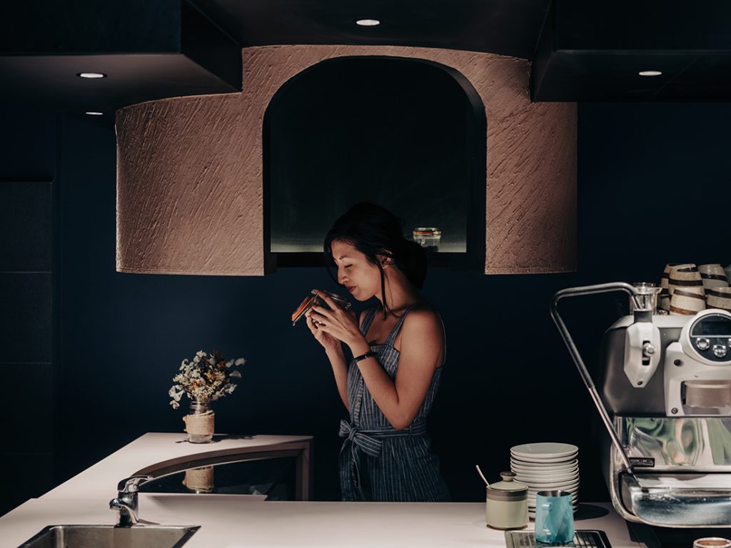
Lim attributes close collaborations with fabricators as a vital step towards the materialisation of new ideas, which he believes, must be grounded by logic. “Being ‘radically different’ is never a destination point for us but a culmination of thoughts and processes,” he adds.
This article originally appeared in IndesignLive.sg
Client: Grace Espresso
Interior Design: Studio SKLIM
Project Team: Kevin Lim, Ashwin Bafna, Svasti Agrawal
Area: 28sqm
A searchable and comprehensive guide for specifying leading products and their suppliers
Keep up to date with the latest and greatest from our industry BFF's!

Elevate any space with statement lighting to illuminate and inspire.

With the exceptional 200 Series Fridge Freezer, Gaggenau once again transforms the simple, everyday act of food preservation into an extraordinary, creative and sensory experience, turning the kitchen space into an inspiring culinary atelier.

Architectus Conrad Gargett lead the way in design for health and wellness for seniors with this latest project in Brisbane.

Designed by Flack Studio, Commons Coffee on Wellington Street is the latest addition to the portfolio of the increasingly popular co-working space.
The internet never sleeps! Here's the stuff you might have missed

Tasmania’s most popular architecture and design event, Open House Hobart, kicked of this past Sunday with fabulous crowds and some spectacular architecture.

From building selection to amenities, circulation and materiality, Carr’s fit-out for law firm Russell Kennedy is a comprehensive piece of workplace design.