Acne Studios has opened its doors with an interior renovation, showcasing Melbourne’s culture through the brand’s evocative lens.

August 22nd, 2022
Along Little Bourke Street in the heart of Melbourne, Acne Studios has reopened its doors to the world after extensive renovations. Now double the size of the original store with over 215 square metres, a feast for the eyes and soul awaits.
Understanding Acne Studios’ design comes from understanding the brand’s ethos. With a mix of the brand’s DNA and Swedish roots, its ethos comes from reflecting each of the store’s surroundings. And for Melbourne, contrast is key with Acne Studios’ new retail space.

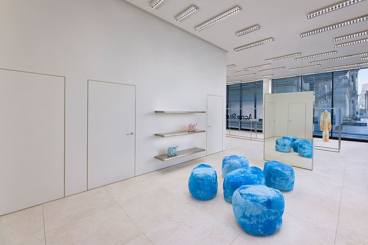
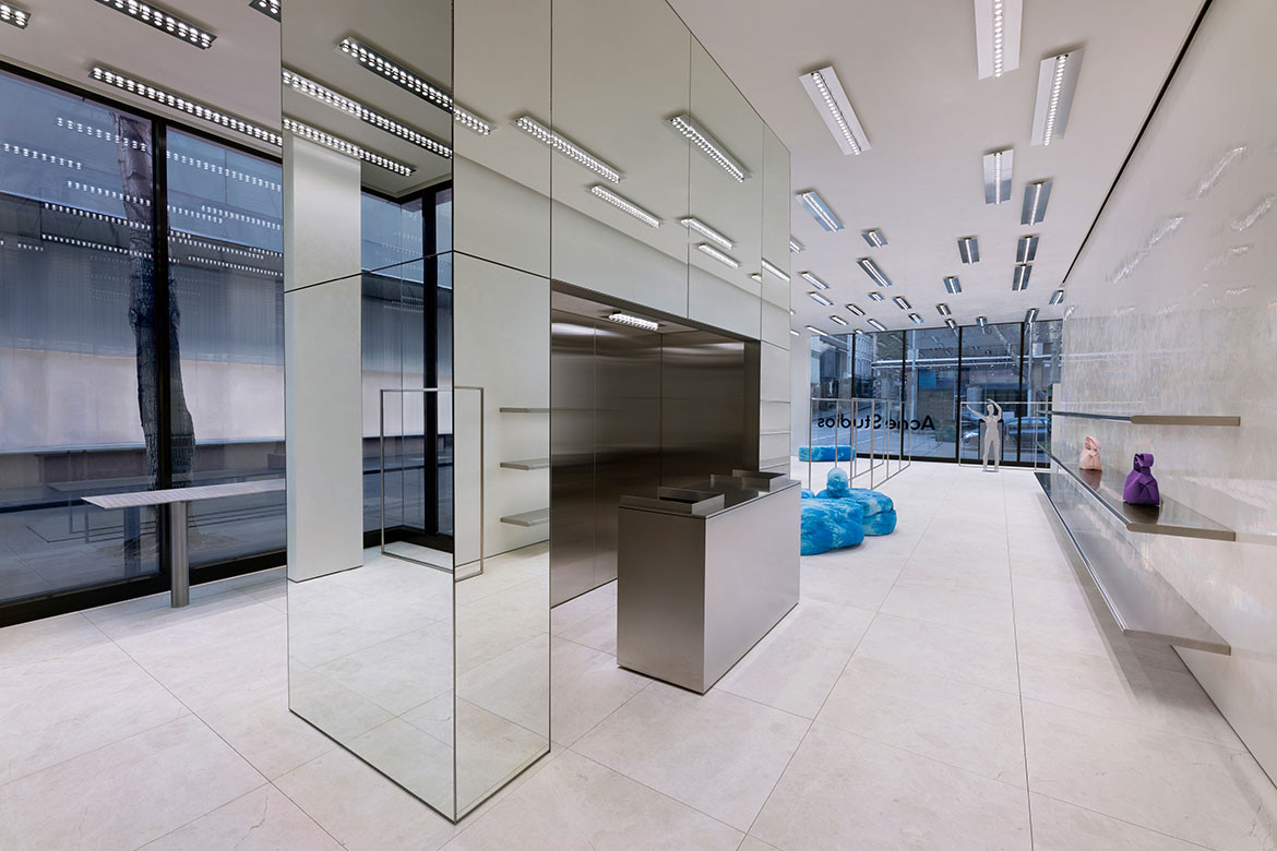
The interiors utilise minimalist design cues with a smattering of bold colour, brought to life by Max Lamb. The walls and ceiling spread across the store, made of white high-gloss stucco lustro. It crafts subtle contrasts to the ground, with light grey marble floors that have an elegant, textural sand-blasted finish.
The floor plan reaches out with open spaces, allowing oneself to be drawn to even the slightest design. And who wouldn’t? The long layout of the space encourages movement throughout, not only to explore products but to appreciate the choice of design.
Related: Small but perfectly formed: George Livissianis’ shop of the year

Max Lamb takes the design ethos of Acne Studios and makes it his own. The colour palette is muted and soft, contrasting perfectly with the furniture. Also designed by Max Lamb, the dyed blue canvas furniture with a batik pattern tells an expressive and impactful narrative against the interior’s simple palette.
The choice of palette, materiality and landscape, while individually conflicting against one another, are embraced with the lighting design by Benoit Lalloz. Illuminating the store’s landscape through the light installations is a crucial feature, as it celebrates the interior in subtle yet bold ways. “My job is to allow customers to have the best possible visual experience in order to read and discover the works,” Beniot Lalloz says.

A striking highlight of the store is a mirrored cube home to the service counter. As an embodiment of the store’s sleek design, the monolithic structure reflects and multiplies Lalloz’s light installations. It is also another juxtaposition for the store, with its sharp lines working with the organic shapes of the furniture.
Melbourne itself is a city of contrasts through architecture, design and ideas, and Acne Studios’ new renovations are an ode to that. Its ethos comes to full flight with this store’s design, making this shopping experience one of serenity.

Max Lamb
maxlamb.com
Benoit Lalloz
benoitlalloz.com
Photography
Courtesy of Acne Studios
We think you might like this article about McBride Charles Ryan, engaging students with its latest campus design.
A searchable and comprehensive guide for specifying leading products and their suppliers
Keep up to date with the latest and greatest from our industry BFF's!

Vert, an innovative demountable pergola designed for urban greening, is reshaping the way we think about sustainability in urban architecture.

XTRA celebrates the distinctive and unexpected work of Magis in their Singapore showroom.

In this candid interview, the culinary mastermind behind Singapore’s Nouri and Appetite talks about food as an act of human connection that transcends borders and accolades, the crucial role of technology in preserving its unifying power, and finding a kindred spirit in Gaggenau’s reverence for tradition and relentless pursuit of innovation.

Kokoda House in Richmond, Melbourne, puts immersive design front and centre, culminating in a seven-meter-high curved digital screen.

The delectable bakehouse franchise has expanded its oeuvre with the addition and arrival of dual Sydney locations; here, we take a look at the flagship in Rosebery.
The internet never sleeps! Here's the stuff you might have missed

Blooms the Chemist by Tom Mark Henry defies the traditional pharmacy aesthetic by stepping away from the sterile landscapes of pharmacies.

Gerald Matthews of Matthews Architects provides insight on South Australia’s 2024 Future Living code amendment, focusing on co-located living.