DesignOffice brings this 1980s Harry Seidler icon into modern working mode with ‘third spaces’ that look and feel like a top-end business lounge.

September 22nd, 2023
This article originally featured in Indesign Magazine Issue #89, The Magnetic Workplace. Buy your copy here!
DesignOffice’s creation of a new space in the Harry Seidler-designed Grosvenor Place building of 1987 in the heart of Sydney is very much about understanding the nature of an icon and the respect that surrounds that position.
Designed as a response to the shifting way we work, Grosvenor Lounge is ostensibly the third space. “It’s not your workplace, it’s not your home – it’s the other place you work,” explains Damien Mulvihill, DesignOffice joint creative director. For many, a café fulfils this need, but this option has restraints of time, crowds and privacy. The solution is a semi-private, public space with a range of amenities that Grosvenor Place tenants can book.
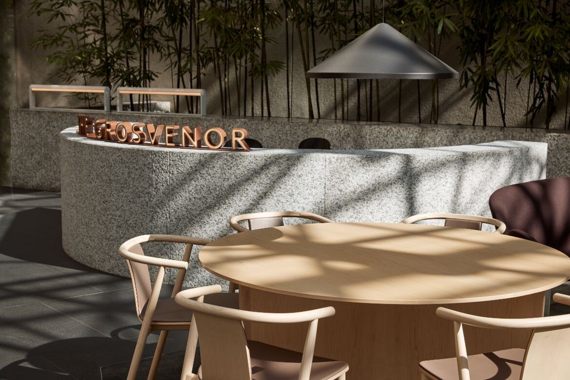
While designed for the building’s tenants, the lounge is also open to the public and makes for a very sophisticated inner-city meeting place. “It’s a slightly curious typology between corporate and civic, given it is a publicly accessible workplace that takes its cues from hotel lobbies and airline lounges,” says Mark Simpson, DesignOffice joint creative director.
Responding to an exceptional brief, developed by Right Angle Studio, that looked at improving the building as both a commercial asset and built environment, the task clearly articulated what the space should do and how it could work. “We responded to a very smart brief, which was essentially saying this building is amazing,” says Simpson. “And it’s iconic, but it’s getting on a bit – what if we actually think about it as a future legacy building? How do we add amenity to that building and give it another layer that makes it desirable, knowing that there are newer, smarter office buildings out there?”
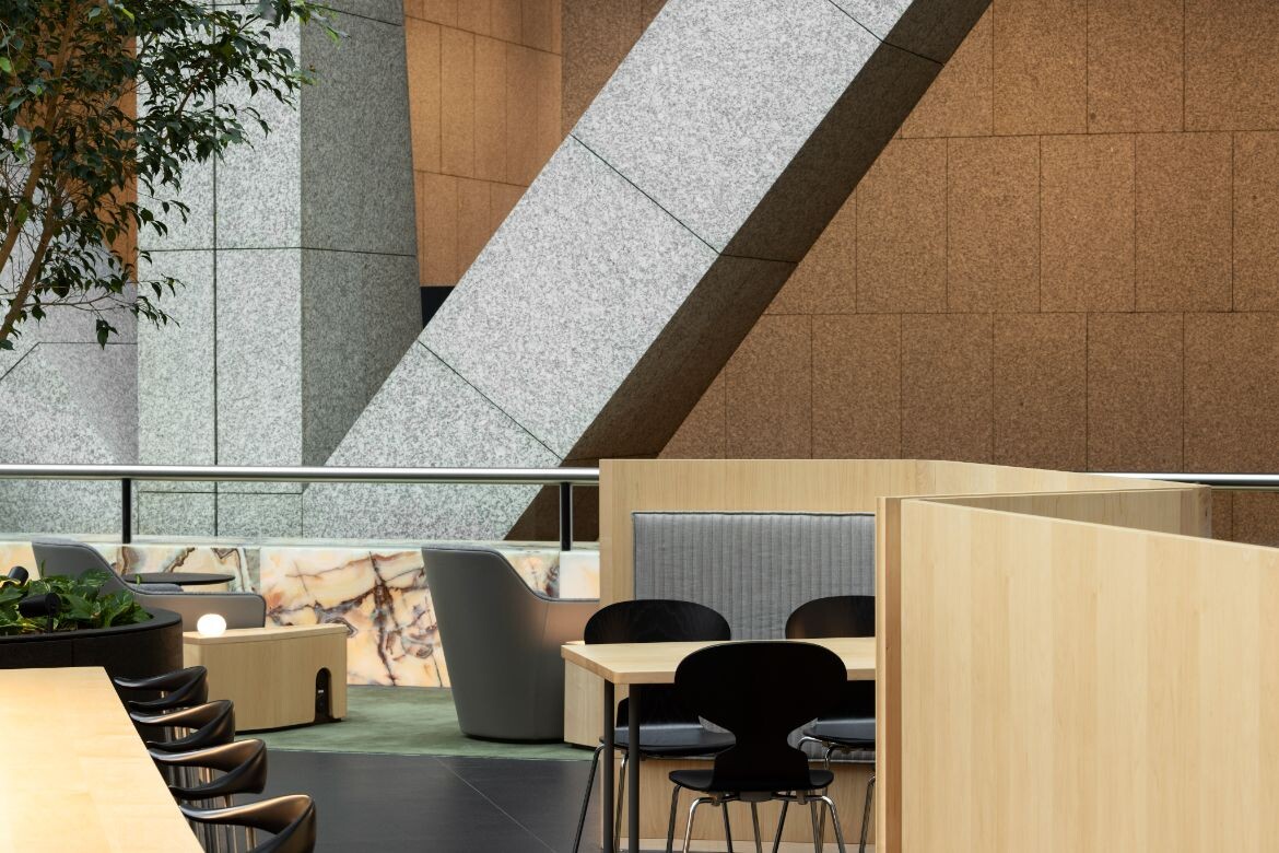
Mulvihill adds: “We love the building. We love Harry Seidler, we love his position in Australian heritage and architecture. We want to respect the existing space, the existing fabric and change as little as possible. But we needed to add a human layer and answer the ‘why’ of why people are occupying this very public space.”

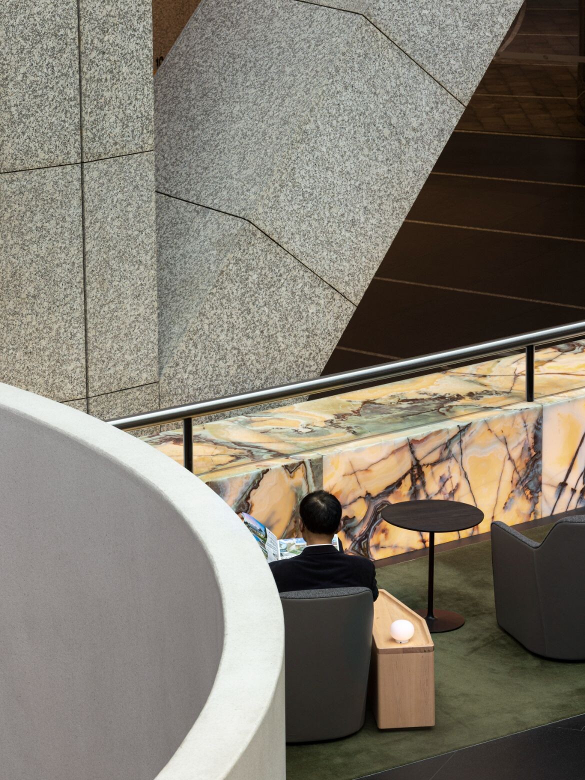
To this end the glass roof and illuminated walls of onyx that were added in 2009 by Harry Seidler & Associates have been retained as an appropriate element of the internal space. Gone, however, is any trace of the mishmash of food hall offerings that had occupied the space for the last 20 years. Instead, DesignOffice has responded to the tonal shifls of onyx and existing granite stair surrounds with a material and colour palette of subtly finessed elegance.
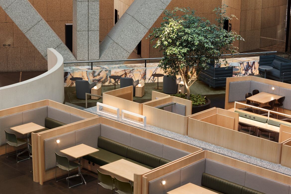
Occupying two floors, the upper level, entered from both Grosvenor and Harrington Streets, takes its cues from the very top end of business lounges, to deliver a range of working spaces including private meeting rooms and the public options. Here the designers have introduced a low curving granite wall to open the space and direct circulation. It is, however, in exactly the same granite used in the building, and it’s this exceptional level of detailed attention that typifies the meticulous nature of DesignOffice.
Related: DesignOffice x The Commons

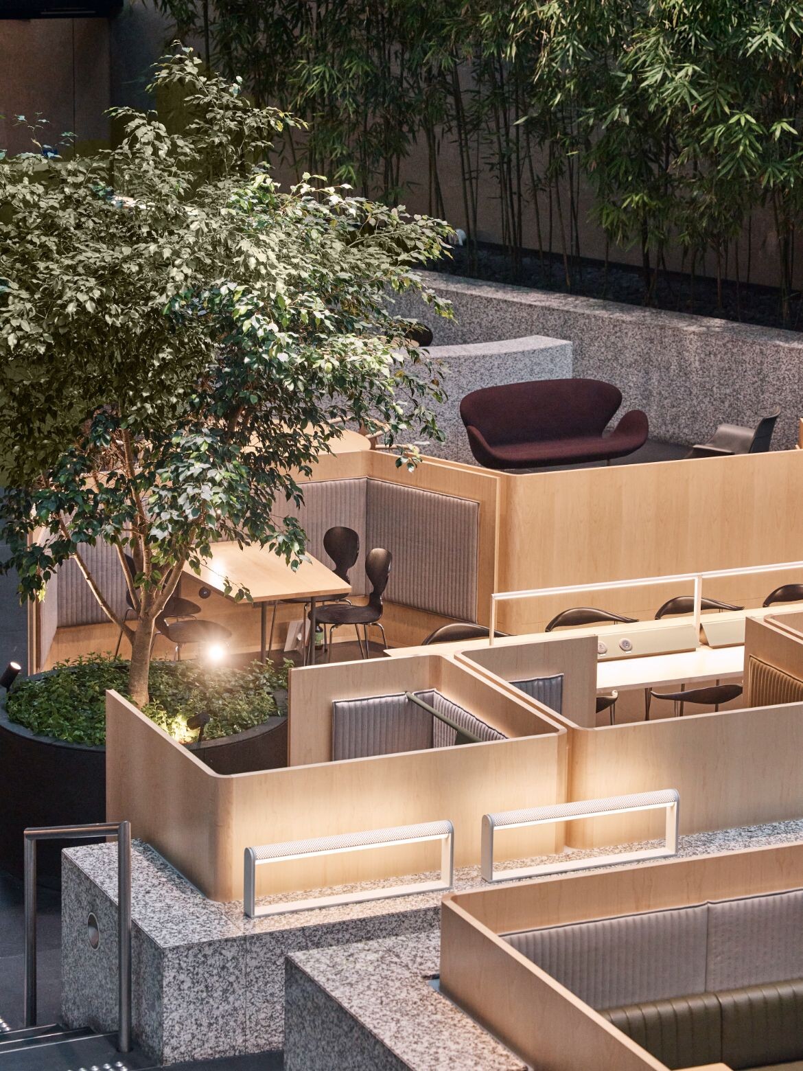
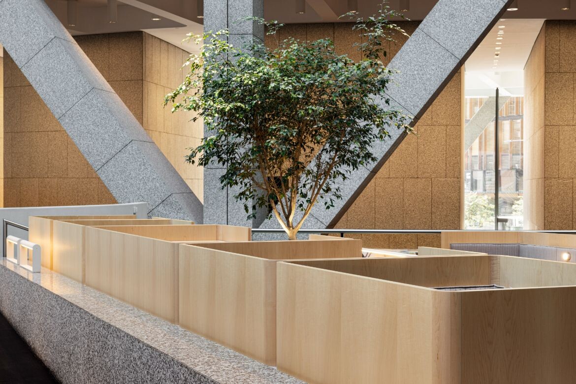
It also serves to benchmark the remainder of the fit-out, which is just as scrupulous in its delivery. The three-quarter-height walls that form a series of private booths, for example, are designed to be precisely the right height for full privacy when seated and a sense of community when standing. They are also beautiful. Each is a crafted piece of furniture where the shifts in wood grain between the elements are celebrated. Moreover, maple is introduced as a completely new material and architectural layer: “We wanted the maple to deliberately express a new lining within the respectful bounds of the existing materials, but expressed as a next chapter without trying to pretend otherwise,” says Simpson.
The butter-soft anodised leather DesignOffice favours is used for portions of the booth seating, while loose furnishings are arranged to create solo and group zones. Bespoke detailing is found everywhere from the small side tables with charging ports to the exceptional lighting. “Everything was lit with the old-school ‘90s, metal halide cans – very uniform, overblown,” says Mulvihill. “We looked at where we could change those and introduce very low-level, human-scale pinpoints of light that just fit people’s faces or lit the surfaces of tables without lighting the entire space.”


On the lower level where the illuminated wall of onyx is found, the mood is more akin to a hotel lobby with furniture that speaks to the iconic identity of the building. Large rugs define the separate spaces within the large volume. These are then defined again by the scale of furniture, which is broad and low in subtle and sumptuous tones drawn from the onyx.
In keeping the furniture low, the architecture is allowed to sing. In particular the large Y-shaped supports are permitted their full sculptural form: “The fact that we love the building is why this has been such an enjoyable project. We’re working with it, not against it,” says Mulvihill.
Indeed, every detail of these spaces is designed to be unique and beautiful, but never to overwhelm the building. The spaces are fabulous, both visually and functionally, with DesignOffice delivering on every detail as well as the big picture.
Indesign #89 ‘The Magnetic Workplace’ — find out more here.
DesignOffice
designoffice.com.au
Photography
Terence Chin

We think you might also like this story on employee ownership in architecture from Indesign #89.
A searchable and comprehensive guide for specifying leading products and their suppliers
Keep up to date with the latest and greatest from our industry BFF's!

XTRA celebrates the distinctive and unexpected work of Magis in their Singapore showroom.

BLANCO launches their latest finish for a sleek kitchen feel.

Fluid and flowing, Cocoon is a school that, through its architectural form, enhances the day-to-day rituals of learning and elevates the experience for the very young.

The British architect joined Timothy Alouani-Roby for a live recording with an audience of enthusiasts in Sydney.
The internet never sleeps! Here's the stuff you might have missed

The Standard has opened in Singapore, offering sophisticated hotel and hospitality design amidst lush greenery in a serene pocket of the city.

Aarhus, Denmark is the backdrop for a thought-provoking new book that challenges the architectural discipline to confront issues of diversity, discrimination and inclusion.