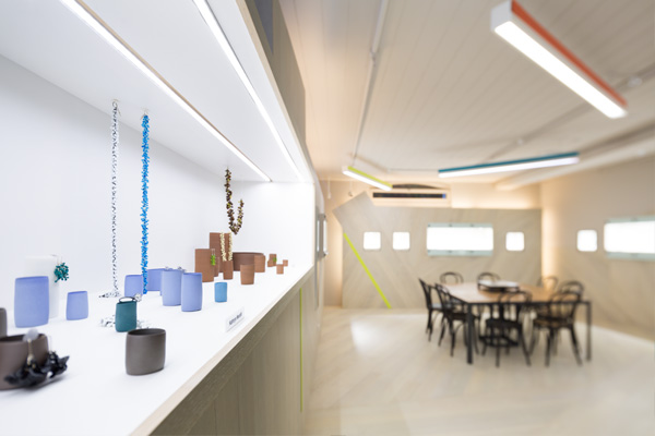
Melbourne-based interior architects Zwei impress yet again with their refurbishment of boutique gallery e.g.etal. Leanne Amodeo reports on the decidedly modern fit out

January 9th, 2014
Katherine Kemp and Hanna Richardson’s recent refurbishment of e.g.etal’s Flinders Lane gallery was not without its challenges. A modest budget and limited floor space gave the designers some headaches during the initial design stages, but they remained far from daunted.
Instead the Zwei principals relished the opportunity. “We thought it was a very significant tenancy within Melbourne; one of those lovely spaces you find that’s down in the basement,” says Kemp. “There was a sense of discovery and we felt that was really important to retain.”
Kemp and Richardson’s resulting design transforms the 96sqm gallery into a stunning backdrop for the display of Australian contemporary jewellery and objects. The trick was to also try and keep the backdrop neutral and they achieved this through the use of a single material.
The choice of a stained pale hardwood is instantly appealing and its application throughout the entire space is unexpected. To add visual interest the designers eschewed a finish flush to the ceiling in favour of a jagged edge that runs the perimeter of the space.
“We wanted a sense of enclosure, but also a sense of connection to the city,” explains Kemp. “The finish feels a bit like a skyline, so it’s almost like the jewellery and objects are being read within the context of the city.” Coloured strips are inserted randomly throughout the fit out. Reminiscent of neon signage they also reinforce the concept’s metropolitan inspiration.
To combat the lack of a clearly defined circulation path Kemp and Richardson installed a darkened steel custom-made display unit in the middle of the gallery. This feature provides a strong focal point amongst the pale timber, while enhancing customer flow around it. It’s a simple plan that works to great effect, especially when considered in relation to the individually wall-recessed display units.
Continuity is something e.g.etal’s director Emma Goodsir asked for in her brief and Kemp and Richardson have certainly delivered. Wrapping a space almost devoid of natural light in the one material was always going to be a gamble, but Richardson best sums up the outcome. “Everyone involved worked together to make it work; and it does work. We’re really happy with it.”
Zwei
zwei.com.au
A searchable and comprehensive guide for specifying leading products and their suppliers
Keep up to date with the latest and greatest from our industry BFF's!

With the exceptional 200 Series Fridge Freezer, Gaggenau once again transforms the simple, everyday act of food preservation into an extraordinary, creative and sensory experience, turning the kitchen space into an inspiring culinary atelier.

The Man x Machine x Material collaboration by Jarrod Lim and The American Hardwood Export Council explores how generative AI can enhance design processes while also revealing the areas where human intuition remains irreplaceable.
Sam Eichblatt speaks to The Visualisation Unit, a team of architects specialising in interactive architectural environments.
The internet never sleeps! Here's the stuff you might have missed

Space Copenhagen’s new outdoor furniture collection for &Tradition is inspired by a balance of opposites.

In this candid interview, the culinary mastermind behind Singapore’s Nouri and Appetite talks about food as an act of human connection that transcends borders and accolades, the crucial role of technology in preserving its unifying power, and finding a kindred spirit in Gaggenau’s reverence for tradition and relentless pursuit of innovation.