What would entice you back into the office? For the Cotton On campus in Geelong, Greg Natale solves the dilemma with a set of luxe and soulful facilities. Work never looked so good!

March 2nd, 2022
Key to Greg Natale’s design for this project is the long-term design relationship with Cotton On owner Nigel Austin.
Having designed several homes for Austin, Natale was acutely aware of what was to be achieved and the extent of Austin’s drive.
“He wanted this amazing campus that would reflect the passion he feels for Geelong and attract the best of the best. He wanted the whole place to be a great place to be, not just a great place to work,” says Natale.
Moreover, respect for the cotton was integral to the fabric of the headquarters’ design.
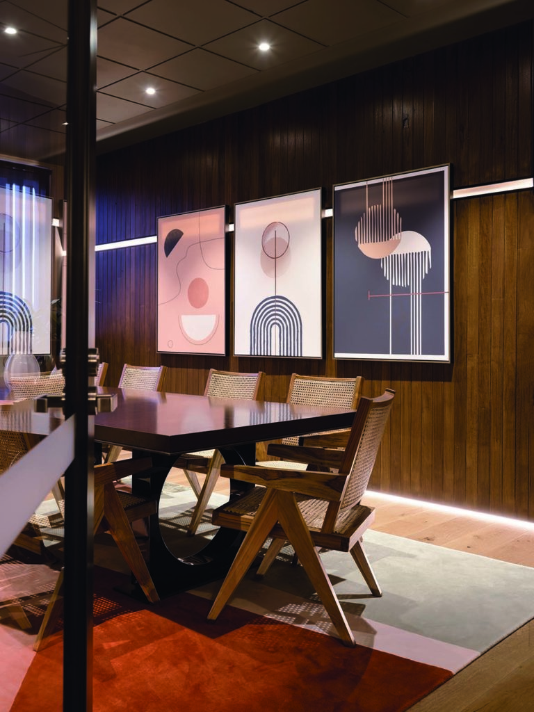
To this end, beautiful graphics created by the Cotton On design team are used throughout the project. Under Natale’s hand these graphics are contextualised and scaled to balance colour and form appropriate to each room.
That said, the designs are bold, graphic and exceedingly good. Working in collaboration with the project architects PTID, and signalling the headquarters as mercantile, the façade has a high border of brickwork with visual links to cross stitching.
Plantings of Eucalypts and grasses by Myles Baldwin similarly add rhythmic textures that will become pronounced with growth.
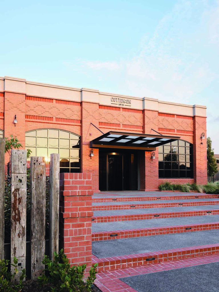
Red brick has been purposefully used to reference the heritage of Geelong and in particular the Ford factory central to Geelong’s character.
Scale is managed perfectly overall with a sense of arrival, without a sense of monumentality. The foyer and entrance are deliberately straight out of the high-end luxury hotel camp: high ceilings, bespoke lighting, dark timbers and mid-century furniture by Milo Baughman (Thayer Cogan).
The furniture is in fact exceptional with butter-soft anodised leather in tan and olive, teamed with rich burgundy and dusty pink velvets. Phoebe Stacked table lamps (Visual Comfort) on custom tables create a visual rhythm and reinforce the luxury hotel feel.
To create defined zones and humanise the scale, Natale has added two enfilades of pillars.
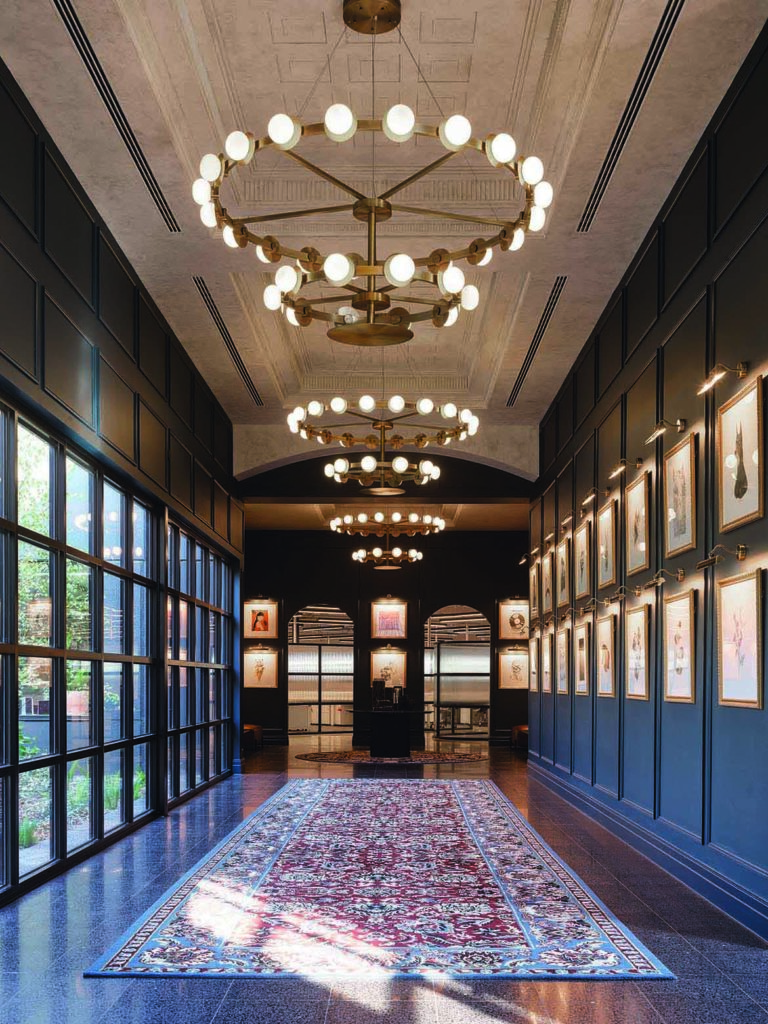
“The space was just so big, I wanted people to feel comfortable and relaxed and Nigel wanted people who work there to use the area the way you use a hotel foyer. So, yes, there is the wow factor for visitors but there is also a sense of pride and ownership,” says Natale.
Panelling and moulded detailing of the ceiling are delivered within a contemporary, slightly Ralph Lauren milieu.
Decorative rugs (Designer Rugs and Greg Natale) are used to delineate areas while adding the warmth of pattern that shifts between muted and jewel-like tones.
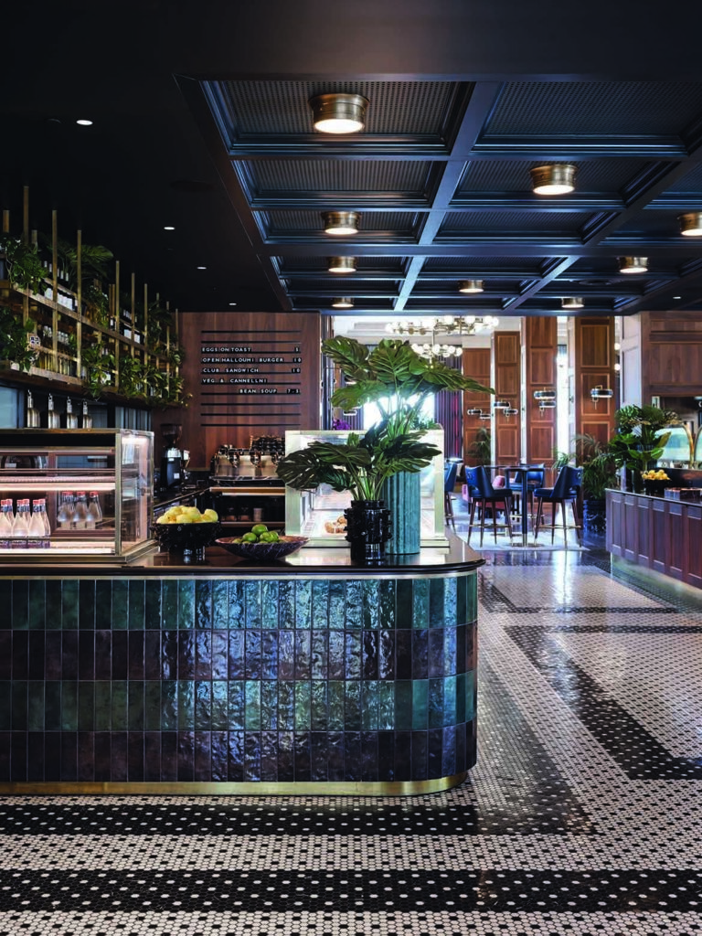
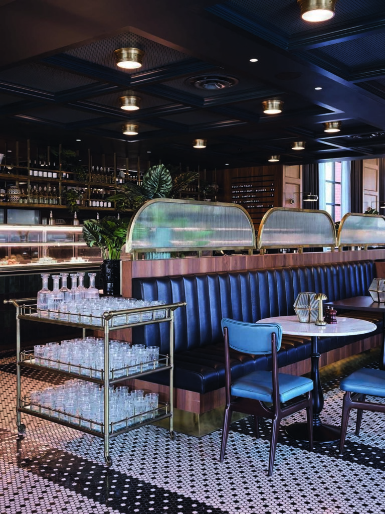
The dining room is very much a New York brasserie style. Custom Milo Baughman furniture is used extensively, as are simple marble topped tables (JRF and Thonet) with Caprera chairs (KE-ZU).
Acoustic panelling in dark olive (Dulux) is used throughout the ceiling for both practical and aesthetic considerations.
The highlight however, is the extraordinary floor of tiny black and white mosaics.
At once it is New York, Paris and Melbourne and very clever for being so very cosmopolitan and local in one hit. Brass, fluted timber and deep emerald tiles compound the effect, as does the extensive use of marble.
Paramount to the design outcomes was the client’s desire for incredible staff facilities. But, what he didn’t want was a gym that looked like a gym or a blonde Scandinavian spa.
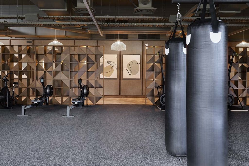
To this end, Natale has reconsidered the whole wellness mode as a resort experience of rich timber, elegant tones and very beautiful moments. Incredibly detailed cabinetry uses a simple geometric form to deliver a dimensional screen between the corridor and gym.
This detailing is then extrapolated into flat cabinetry where the pattern is emphasised through slight variations in timber hue. Paired with layers of curved malachite tiles (Bottega nove plumage, Byzantine), the overall effect is the calm only precise detailing can deliver.
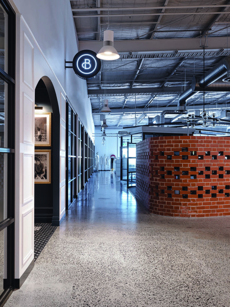
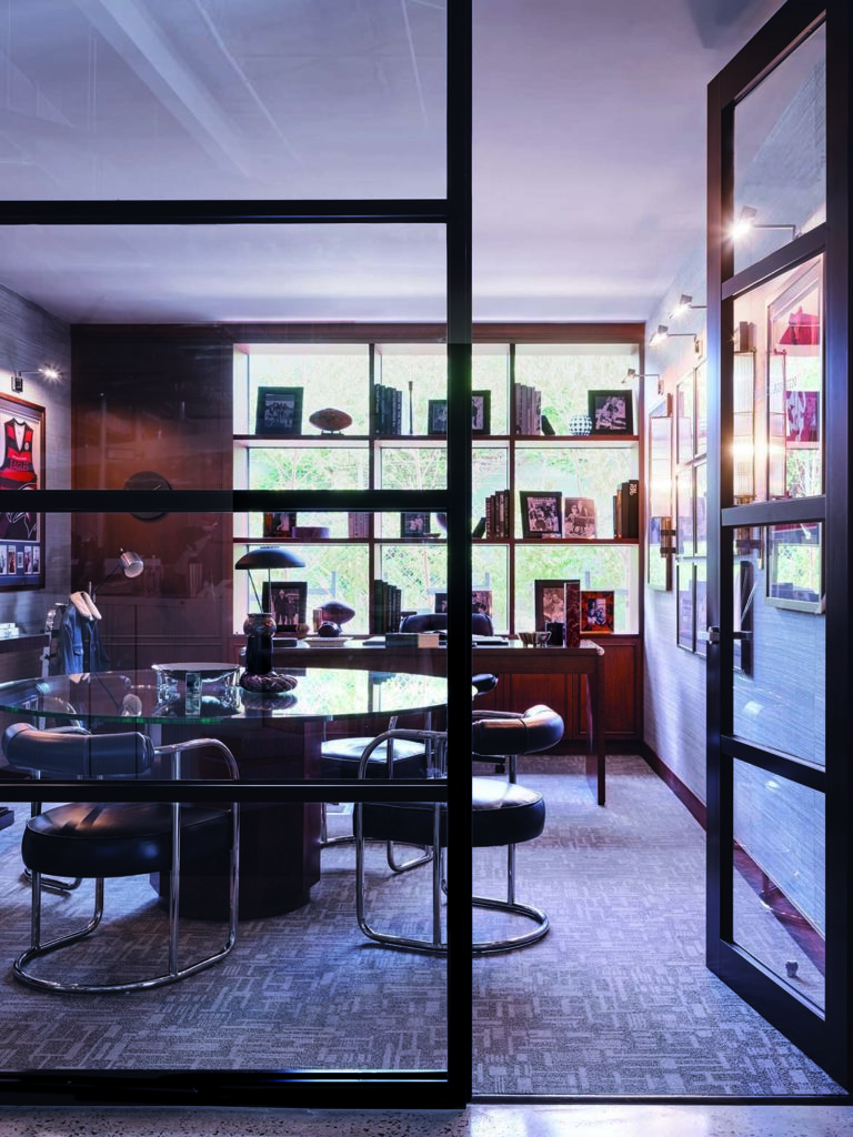
Beautifully detailed brick walls, fluted glass and glass brick are the primary materials in the studio work areas. These expansive areas have been designed for optimal light and work flow as expressed by the Cotton On designers. Here, walls are largely opaque to afford privacy and separation from the more public areas.

Dotted throughout the project are accessories from Greg Natale’s design range. Vases, bowls, objects and planters.
For most, this would not work, but herein lies the rub, Natale knows what works and when a design of his doesn’t work he will place a piece by the likes of Kelly Wearstler, Vanessa Mitranie or Georg Jensen instead.
Similarly, he places his own rugs only where appropriate to the design. The outcome is a continuous language that flows throughout while each of the areas is distinctly its own. It has also delivered an exceptional work place that will only get better with time. Bravo!
Greg Natale
gregnatale.com
PTID
ptid.com.au
Photography
Anson Smart


This article originally appeared in Indesign Magazine #85. Order your copy today.
We think you might like reading about this new workplace by Techne.
A searchable and comprehensive guide for specifying leading products and their suppliers
Keep up to date with the latest and greatest from our industry BFF's!

Elevate your outdoor spaces with pieces that are beautiful, functional, and engineered for you.

XTRA celebrates the distinctive and unexpected work of Magis in their Singapore showroom.

BLANCO launches their latest finish for a sleek kitchen feel.

With the exceptional 200 Series Fridge Freezer, Gaggenau once again transforms the simple, everyday act of food preservation into an extraordinary, creative and sensory experience, turning the kitchen space into an inspiring culinary atelier.

Designing people-first buildings with flooring that contributes to achieving WELL features in the WELL Building Standard. Works with WELL is a new trademark created by the International WELL Building Institute for use by manufacturers to show when their products align with features in the WELL Building Standard.

It’s been an extraordinary ten years of exemplary projects from Studio Tate, and accolades go to Alex Hopkins and the team for an exemplar decade.

Italian furniture brand Pedrali is known for leading the way when it comes to the workplace. We speak with Busetti Garuti Redaelli design studio about the evolution of the Buddy collection – a solution for hybrid spaces that can support all sorts of working styles.
The internet never sleeps! Here's the stuff you might have missed

Nestled within the newly launched surf park URBNSURF Sydney, RAFI URBNSURF offers a local dining experience that integrates richly with its surroundings.

This upcoming panel, Sustainability in Transport Design & Assessing Environmental Impact, will explore the sustainability initiatives at the heart of transport design.