Australian craftsmanship meets Japanese luxe in Luchetti Krelle’s exciting and luscious restaurant design for The Upper Tokyo.

June 27th, 2022
Tasked with creating a ‘metropolitan lodge’ within Tokyo’s most prestigious business district, Luchetti Krelle have brought Australian craftsmanship and Japanese luxe together with surprising and beautiful results.
Calling to mind the saturated colours of mid-century Italian Modernism, the decadence of Art Deco and a touch of Brazilian Modernism, there is nothing expected or ordinary about this project. Rather, precious metals and materials are foundational with the generosity of spatial clarity overlain as quintessential to luxury.
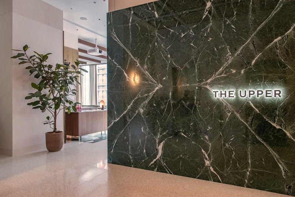
Located within the recently completed Marunouchi Terrace Tower, the Upper is the flagship property of Transit General Office’s restaurant group (responsible for the successful launches of Longrain, The Apollo, Fratelli Paradiso and Bills outposts in Tokyo).
Proximal to the Imperial Palace’s East Garden, The Upper is ultimately a place to entertain young urban professionals. As such, it was conceived as two quite separate entities: level nine comprises a formal restaurant, while upstairs is an area to relax with peers.
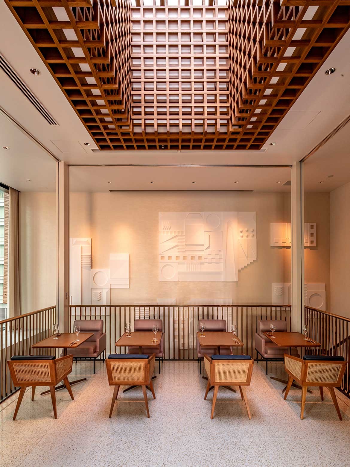
Providing a degustation experience by Yusuke Takada (one of Japan’s foremost chefs), it was imperative that the level nine space deliver a grand sense of occasion.
Magnificently opulent, Luchetti Krelle has pushed bold themes with luxe materials used en masse. And, luxe it is with gilded elevator doors parting to reveal emerald walls crowned by a shimmering latticed ceiling.
Related: 4 impressive hybrid hotels in the Indo-Pacific

Art Deco influences are also apparent, but never clichéd, rather the towering bar’s pale jade swirling granite surfaces recalls the decadence of Shanghai’s 1920s: “Whilst we didn’t set out to intimidate clientele, we certainly wanted to make them feel as though they’d arrived somewhere incredibly prestigious and special,” says Stuart Krelle, Luchetti Krelle principal and project lead.
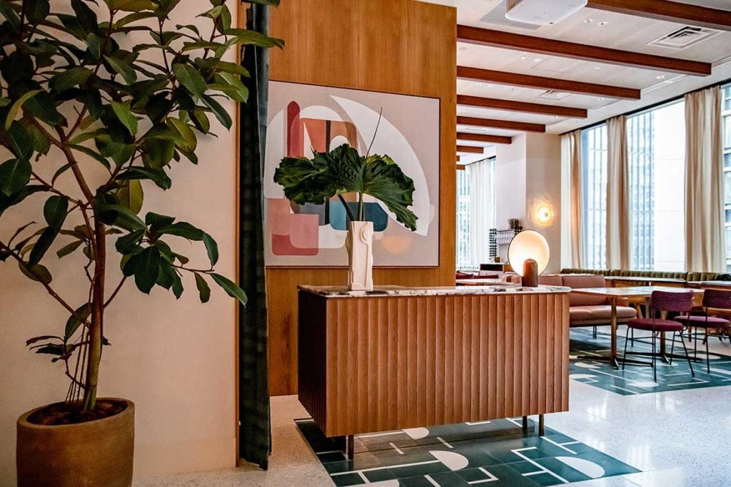
Grids, referencing the metropolis on view through full wall glazing, are prevalent but subtly integrated. Oak floors, for example, are lain in a contemporary take on checked parquetry to reference the streets, while glass bricks, tapered sconces and gridded detailing reference the surrounding high rise buildings.
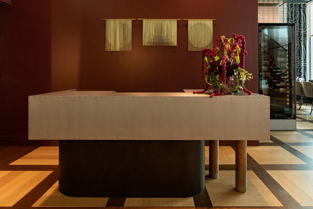
Kelly Wearstler Graffito curtains soften and add textural variance, while custom Anna Charlesworth pendants add rhythm and sculptural form. Spacious dining booths in deep blue leather enjoy the view, while a private dining table sits below a gold flecked domed ceiling.
The upper floor is far more relaxed with options for à la carte dining, afternoon tea and evening aperitivos.

“Level 10’s a breakout zone of sorts to let off some steam, where natural elements such as teak timber detailing and a planted balcony instantly introduce casual al fresco themes” says Krelle.
Blurring the line between indoor and out, the large outdoor dining terrace is plant filled, lounge strewn and intentionally touches on the Australian: “Perhaps the biggest Australian influence is the roof terrace on level 10 as you don’t encounter many in Tokyo,” says Krelle.

“It’s a verdant escape within the metropolis, so naturally, we wanted to showcase the work of incredible Australian designers.” These include pieces by Henry Wilson, ADesign Studio and Anna Charlesworth for lighting, plus customised chairs by Reddie, and Grazia & Co.
Moving to the interior, Luchetti Krelle, expert in the field of hospitality design, has introduced form and visual interest without truncation space. The plants, for example, continue to be viewed, but are more neatly realised as large potted specimens of ficus.

The unexpected shapes of the Popham Design tiles, continue the green/biophilic reference into the interior. Similarly, a gridded ceiling vault introduces dappled light while referencing the grids used on level 9 and the streets beyond.
Continuity from 9-10 is reinforced through the introduction of a geometric plaster frieze: “There are some major pieces we designed and got fabricated in Japan such as the William Mitchell [English artist 1925-2020]-inspired wall piece on Level 10 that floats south towards Level 9’s stairway,” says Krelle.
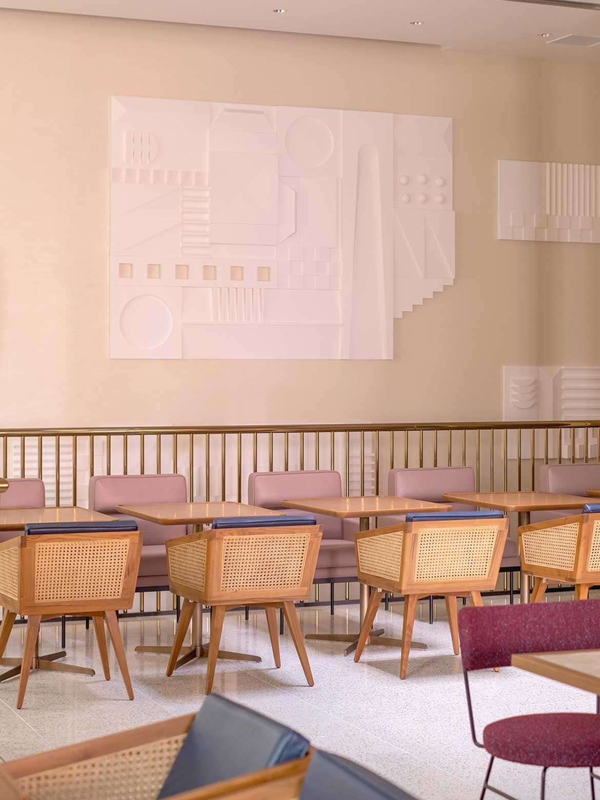
What makes the project astounding is the way Luchetti Krelle never misses a beat between opulent and casual. The two halves are clearly of the same aesthetic language despite being tailored to completely different experiences.
What it in fact feels like, is the experiential landscape of a single personality, and in being so, feels without compromise and totally brilliant.
Luchetti Krelle
luchettikrelle.com
Photography
Matsuno-san and Matsuo-san




We think you might like this article about Moonhouse restaurant by designers Ewert Leaf.
A searchable and comprehensive guide for specifying leading products and their suppliers
Keep up to date with the latest and greatest from our industry BFF's!

In this candid interview, the culinary mastermind behind Singapore’s Nouri and Appetite talks about food as an act of human connection that transcends borders and accolades, the crucial role of technology in preserving its unifying power, and finding a kindred spirit in Gaggenau’s reverence for tradition and relentless pursuit of innovation.

XTRA celebrates the distinctive and unexpected work of Magis in their Singapore showroom.

BLANCO launches their latest finish for a sleek kitchen feel.

With the exceptional 200 Series Fridge Freezer, Gaggenau once again transforms the simple, everyday act of food preservation into an extraordinary, creative and sensory experience, turning the kitchen space into an inspiring culinary atelier.

It’s been an extraordinary ten years of exemplary projects from Studio Tate, and accolades go to Alex Hopkins and the team for an exemplar decade.

Following a packed August event attended by architects, designers, overseas product suppliers and many more, the stunning new 600-square-metre showroom in Redfern is officially open to the public.
The internet never sleeps! Here's the stuff you might have missed

Creating an inspired landscape for an exemplar residence, Kiasma Studio has curated the natural world to complement the man-made with exceptional results.

Knoll’s revolutionary legacy, from its pioneering mid-century modern origins to its current place within the MillerKnoll collective, continues to shape the spaces we inhabit. Here, we explore the iconic institutions, influential collaborations, and groundbreaking ideas that have shaped Knoll’s unique understanding of the human-space connection — the bedrock of the brand’s enduring relevance.