Going against the grain of the typical minimalist, modern café atmosphere, Arnun Wattanaporn wanted to create a feeling of cosiness for Kaizen Coffee Co. in the heart of Bangkok.

October 30th, 2019
Kaizen Coffee Co. is known as one of the best speciality coffee places in Bangkok. It all began when Arnun Wattanaporn, a young barista, became inspired by the vibrant cafe culture in Australia and sought to recreate a version of it in Thailand’s bustling capital. After enjoying a widely successful reception, Kaizen set out to breach new frontiers and re-establish itself as a place to enjoy fresh, healthy meals as well as great coffee. This called for a change in design concept for Kaizen – aesthetically and functionally. To help design and bring this new iteration of Kaizen Coffee Co. to life, Arnun enlisted local design studio, space+craft.
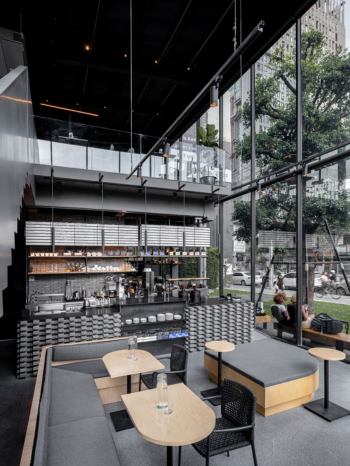
The newly built stand-alone space that Kaizen Coffee Co. now calls home sits nestled amongst the high-rises of Bangkok’s cityscape in the prime location of Ekamai. Unlike previous incarnations of Kaizen – which were characteristically minimalist in design – Arnun’s brief to space+craft was to create a cosy place for his customers to sit and enjoy delicious coffee and nutritious food. With the entire front-façade of the double-height space constructed of glass, space+craft’s first challenge was to design an interior that would interest and invite passers-by. In response to this challenge, the studio expertly harnesses the power of materiality.
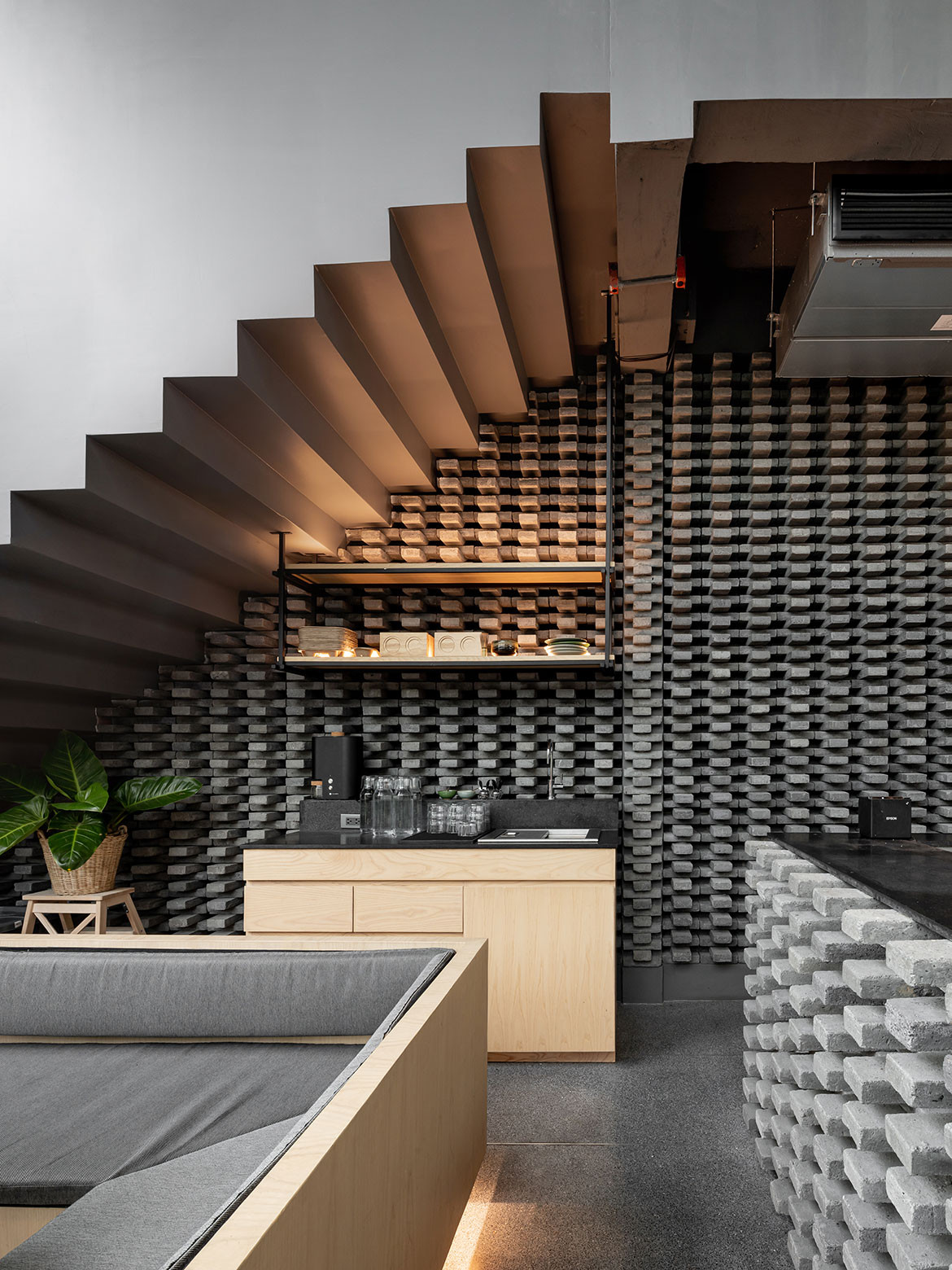
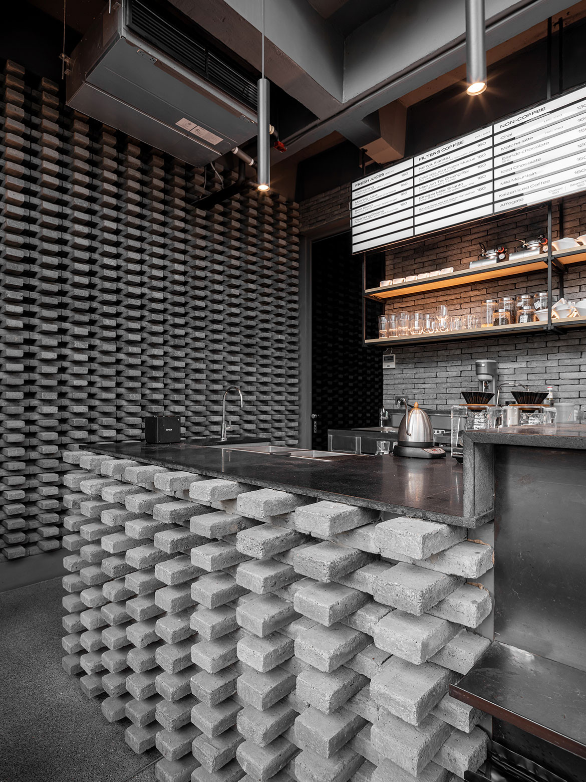
Dark grey brick and naturally finished oak were selected as the primary materials for the interior. The harmonious combination evokes a sense of cosy sophistication. Cosy thanks to the humble oak; sophisticated thanks to the tone and texture of the brick. From the street, Kaizen’s new home draws the eye with the distinctive pattern in which the bricks are laid to surround the counter and the first-floor wall. Staked in alternating directions, the brick layout adds a level of tactility, design detail and character that draws attention from the outside in.
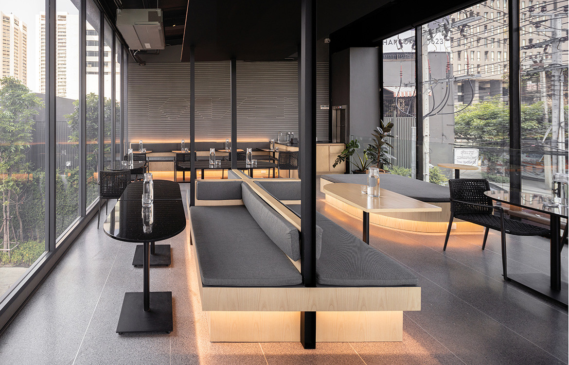
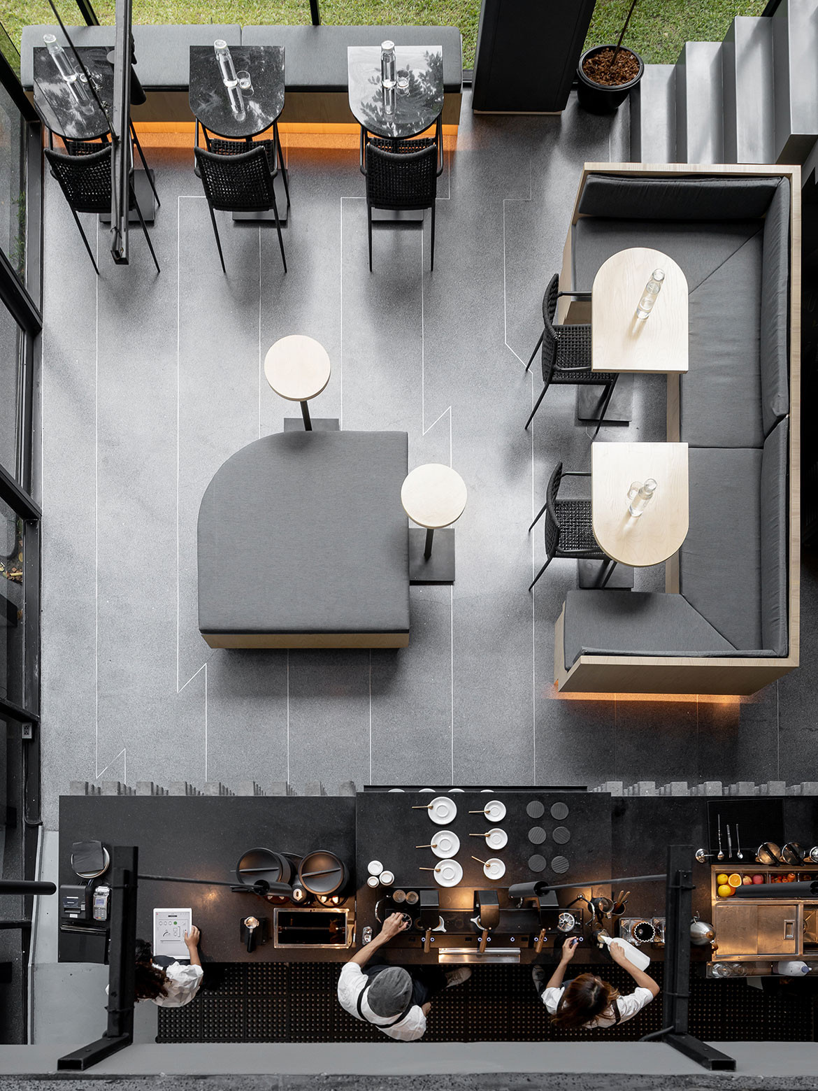
Spatially, the furniture configuration is open plan with a functional twist on both the first and second floors. The layout has been designed to make room for a variety of customer needs — whether they be in a group, or dining solo; staying for dinner or just grabbing coffee.
Kaizen Coffee Co.’s new look has become synonymous with the establishment’s high standards and great service, effectively re-establishing the look and feeling of one of Bangkok’s most popular coffee destinations.
We think you’d like this project in Sydney, High St Society by Ricci Bloch. Get regular inspiration, join our mailing list.
A searchable and comprehensive guide for specifying leading products and their suppliers
Keep up to date with the latest and greatest from our industry BFF's!

The Man x Machine x Material collaboration by Jarrod Lim and The American Hardwood Export Council explores how generative AI can enhance design processes while also revealing the areas where human intuition remains irreplaceable.

Elevate any space with statement lighting to illuminate and inspire.

Inspired by a Mediterranean ambience, Luchetti Krelle has crafted a warm and atmospheric hospitality offering in the Australian capital.

Fermob, the renowned French outdoor furniture brand, has inaugurated its first showroom in Sydney, solidifying its presence in the Australian market.
The internet never sleeps! Here's the stuff you might have missed

As the previous winner of the Gaggenau Kitchen of the Year Design Contest, Eva-Marie Prineas of Studio Prineas knows a thing or two about designing an award-winning kitchen. Here, she shares her insights into what she’s keeping an eye on when it comes to showstopping kitchen design.

Inspired by a Mediterranean ambience, Luchetti Krelle has crafted a warm and atmospheric hospitality offering in the Australian capital.