Designed by AIM Architecture, online cosmetic brand Harmay’s first brick-and-mortar store in Hong Kong is a curious, delightful counterpoint to the transactional straightforwardness of online shopping.
There was a time not so long ago when shopkeepers might give us a dirty look for taking our time browsing the wares in their stores, sometimes ending up without us buying anything. Today, in the age of online shopping, retailers are worried about getting consumers to spend time in their stores – how the dynamics have changed.
Online luxury cosmetics retailer Harmay is a digital native business with over 1 million shoppers that expanded its operation to include a brick-and-mortar store in Shanghai in 2017. The expansion was a success thanks to the unique shopping experience offered by the physical store, which was designed by AIM Architecture.
This year Harmay tasked AIM to design its second store, this time in Hong Kong – an opportunity that the designers used to delve deeper into the online-offline duality of the brand. Located in Sheung Wan, the 141-square-metre Harmay Hong Kong offers shoppers the thrill of discovery within its spaces.

The storefront is mysterious, austere even, clad in black perforated steel sheet and featuring a single-letter LED neon sign. Beyond the shutter gates and the glazed entrance is an interior that hides its ware, a magnet for Harmay’s online customer sand curious passersby alike.
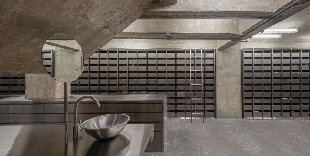
AIM took inspiration from old school Hong Kong-style apothecaries, borrowing familiar features such as walls of drawers, and articulating them to suit the taste of their digital-age consumers. The result being an artfully raw and industrial chic.

Stainless steel drawers line most of the walls on the first floor. A discreet sign on each drawer informs customers of its content. The shop unit is long and narrow. The floor and the structure are left bare. Their combined austerity is tempered by a void that connects the first and second level, and a series of mirrored surfaces.

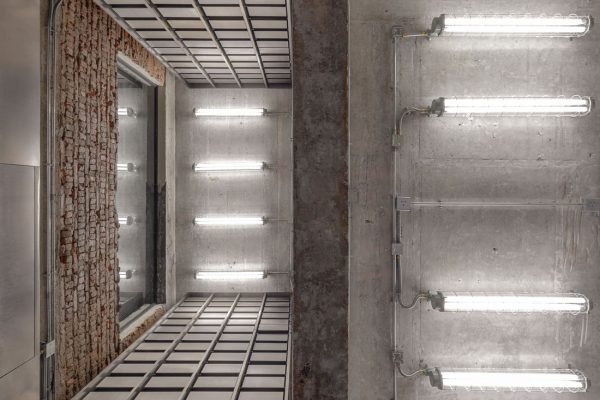
The architecture shell of the second floor has been left untouched. Walls and the staircase feature exposed bricks and cement rendered smooth by time. Stainless steel cabinets are hung from the ceiling. Their mirrored surfaces create an impression of infinite space. It takes a while for one’s eye to find them, as their reflective surfaces disguise them as part of the architecture.
The same illusion applies to the powder room. Clad in mirrored stainless steel, the room appears to float, leaving its occupants feet exposed. A curtain installed on the room creates privacy and softens the visuals.
“One of the benefits of online shopping is knowing what you want, clicking on it, and then it’s delivered,” state the designers. “Harmay’s new Hong Kong space is an elegant counterpoint – designed for the curious and engaged consumer, and the casual passerby who walks in expecting one thing and finds the unexpected.”
Explore our retail design archives here. And to always keep up to date with design, join our weekly newsletter.
A searchable and comprehensive guide for specifying leading products and their suppliers
Keep up to date with the latest and greatest from our industry BFF's!

XTRA celebrates the distinctive and unexpected work of Magis in their Singapore showroom.

Elevate any space with statement lighting to illuminate and inspire.

The Man x Machine x Material collaboration by Jarrod Lim and The American Hardwood Export Council explores how generative AI can enhance design processes while also revealing the areas where human intuition remains irreplaceable.

With the exceptional 200 Series Fridge Freezer, Gaggenau once again transforms the simple, everyday act of food preservation into an extraordinary, creative and sensory experience, turning the kitchen space into an inspiring culinary atelier.

The design at Fotografiska Shanghai honours the industrial legacy of the building, forming an authentic, multi-layered environment for photography exhibitions.

Sofia by Sans-Arc Studio, with its rich colours and material textures, is a thoughtful addition to the city’s hospitality scene.
The internet never sleeps! Here's the stuff you might have missed

Re-interpreting retail design for the future, HAS design and research is leading the way in Hefei, China with a Ligne Roset showroom that is a winter wonderland delight.

UNSW Galleries is set to host ‘barangga: First Nations Design Gathering,’ a two-day event focused on integrating Country into public art on October 25-26th.