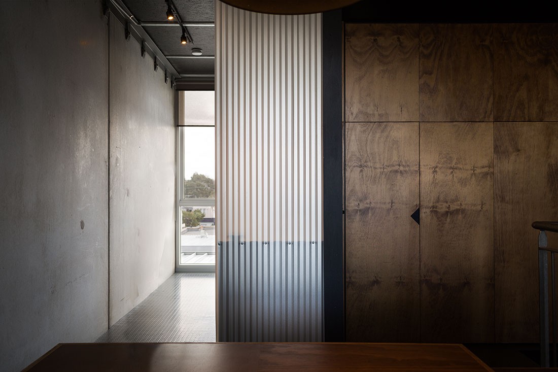
Being small in size doesn’t mean quality or sophistication needs to be sacrificed as we discover in this petite commercial project – Norton Legal by Dreamer.
Set within an existing industrial building in Melbourne’s inner west, the new fit-out for Norton Legal may clock in at just 76-square-metres but makes up for the size in its quality of finish.
As a contemporary law firm, Norton Legal was looking for a modest refit while needing to meet all its needs. Local design practice Dreamer was brought on board and delivered to the tight spatial requirements.

Stained plywood, concrete and semi-translucent materials have been used to create a refined palette.
The fit-out includes a series of work areas, a meeting room, entry and reception area, printing and archival spaces as well as a breakout area. Another thoughtful addition is a place for kids to hang out after school.
Given the tight constraints on available floor space, many of the programmatic requirements were merged to provide flexibility and multiple uses. One example of this was foregoing a traditional reception area and creating a combined meeting room/entry/waiting area, which is dividable by a curtain to offer a sense of privacy when needed. In addition, the breakout area also doubles as a place for children to watch TV after school.
A limited budget meant only selective insertions of new built structures were possible along with modest material selections that could be creatively detailed and dealt with to achieve the desired warm and sophisticated outcome. Plywood was stained and fluorescent light fittings were painted black.
With four key staff members that are often on the phone simultaneously, talking about sensitive information, sound attenuation was a key consideration. To combat this, a selection of both translucent and solid curtains were used, which add a layer of softness while serving a valuable function. They also provide flexibility in how the spaces can be split, setting up veiled views throughout the intimate space.
We think you would also enjoy this workplace fit-out for Yamaha Music.
A searchable and comprehensive guide for specifying leading products and their suppliers
Keep up to date with the latest and greatest from our industry BFF's!

Following its successful inaugural event in early 2024, the Vietnam International Trade Fair for Apparel, Textiles, and Textile Technologies (VIATT) is gearing up for its next instalment in 2025.

With the exceptional 200 Series Fridge Freezer, Gaggenau once again transforms the simple, everyday act of food preservation into an extraordinary, creative and sensory experience, turning the kitchen space into an inspiring culinary atelier.

It’s been an extraordinary ten years of exemplary projects from Studio Tate, and accolades go to Alex Hopkins and the team for an exemplar decade.

Italian furniture brand Pedrali is known for leading the way when it comes to the workplace. We speak with Busetti Garuti Redaelli design studio about the evolution of the Buddy collection – a solution for hybrid spaces that can support all sorts of working styles.
The internet never sleeps! Here's the stuff you might have missed

Michael Carr Architect is leading the way with education design that enhances teaching and supports learning for our most precious resource – our children.

Creating an inspired landscape for an exemplar residence, Kiasma Studio has curated the natural world to complement the man-made with exceptional results.