This Sydney business park by Turner Studio has its own amenity-rich mixed-use precinct – a slice of CBD life in the ‘burbs.

December 29th, 2022
Finding great amenities in the middle of town isn’t too difficult, be it a café or verdant square to have one’s lunch. But for many who live and work in a more suburban environment, such as Esplanade, at Norwest Business Park, a 45-minute drive from Sydney’s CBD, these amenities have arrived.
Esplanade, a mixed-use office and residential development by Turner, has been instrumental in changing this scene, both culturally and physically. “I still recall visiting my grandparents who lived in this area. Then it was used for cattle grazing, and later on for light industrial uses as well as logistic centres,” says architect Nick Turner, principal of Turner.
This article appeared in Indesign magazine, issue #86, purchase here or subscribe.

Located on 1.2 hectares of land, which once included an ice rink, this undulating terrain now includes a man-made lake that was originally a gully. Given the initial light industrial zoning, two years prior to laying any foundations for Esplanade were waiting for a change of zoning by the council to one that allowed for mixed use.
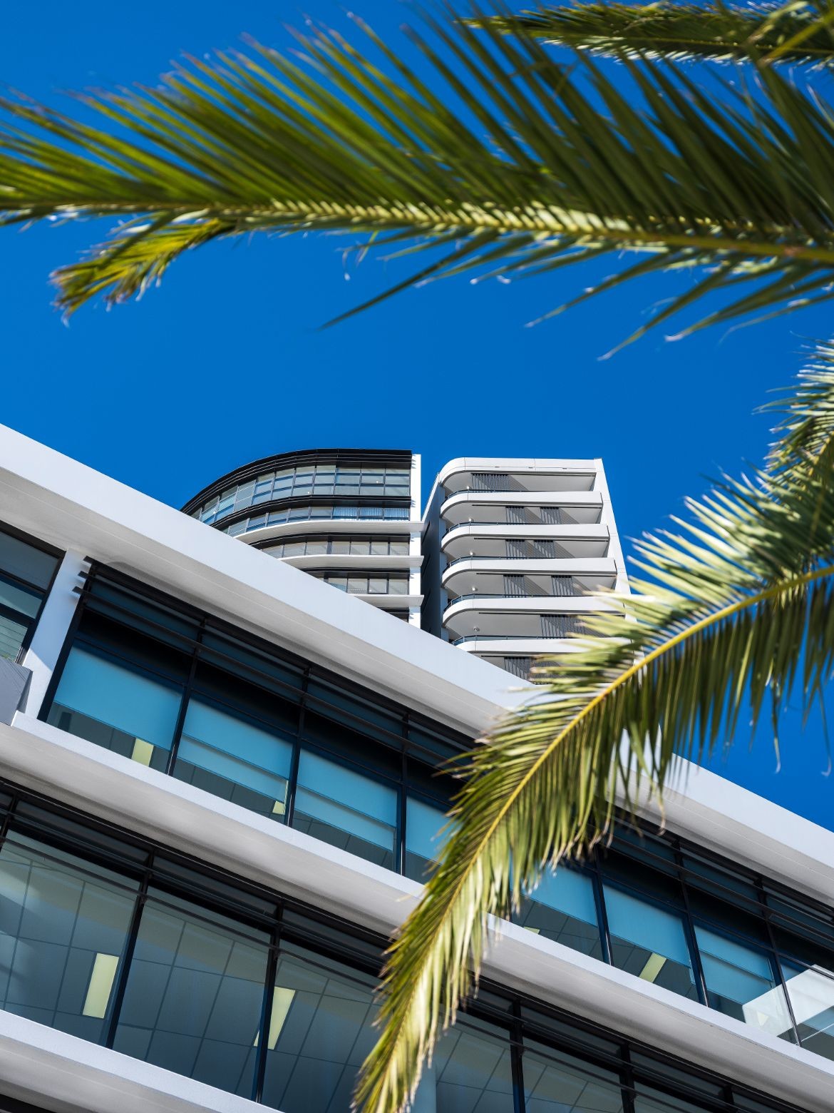
It’s the first major high-rise in the vicinity, with two 20-storey towers and offices spread across the podium level comprising three floors. And unique for this development is a highly developed food and beverage offering at ground level, used by residents and those working in the strata offices.
Related: FMD Architects’ Queens Chambers delivers relaxed beauty

Benefiting from the lakeside views, as well as the landscaped forecourt, Esplanade includes over 4000 square metres of office space, with individual tenancies ranging from 50 to 200 square metres in area. And while not obvious, the car parking facilities have been partially concealed within the architectural form rather than the usual on-grade parking arrangement that detracts from most settings. There are also end-of-trip facilities, including showers and change areas for those preferring to commute by bike.
“We wanted to respond to this wonderful setting and create an environment where people would enjoy both living and working with some fortunate to do both,” says Turner, who recalls that many workplaces from the past have survived with only a corner coffee shop or milk bar. Narrow balconies were also a hallmark of many offices built as recently as the 1990s.

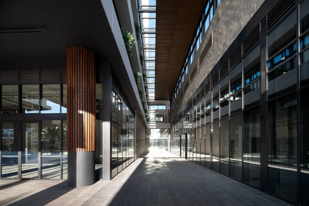
Turner and his team were also conscious of articulating the uses at Esplanade. So it’s clear upon arrival as to where the 250-odd one, two and three-bedroom apartments are located, and where to head for the offices. Separating the two uses is an atrium/walkway from north to south, filled with plants, cafés, and also places that can be used as an extension of one’s office.
“These types of spaces are common within CBDs but they’re considerably more difficult to find, as well as to achieve, the further out you travel,” says Turner. The recent North West Metro station, only a couple of hundred metres from Esplanade, also makes this development attractive to those living in the inner city.

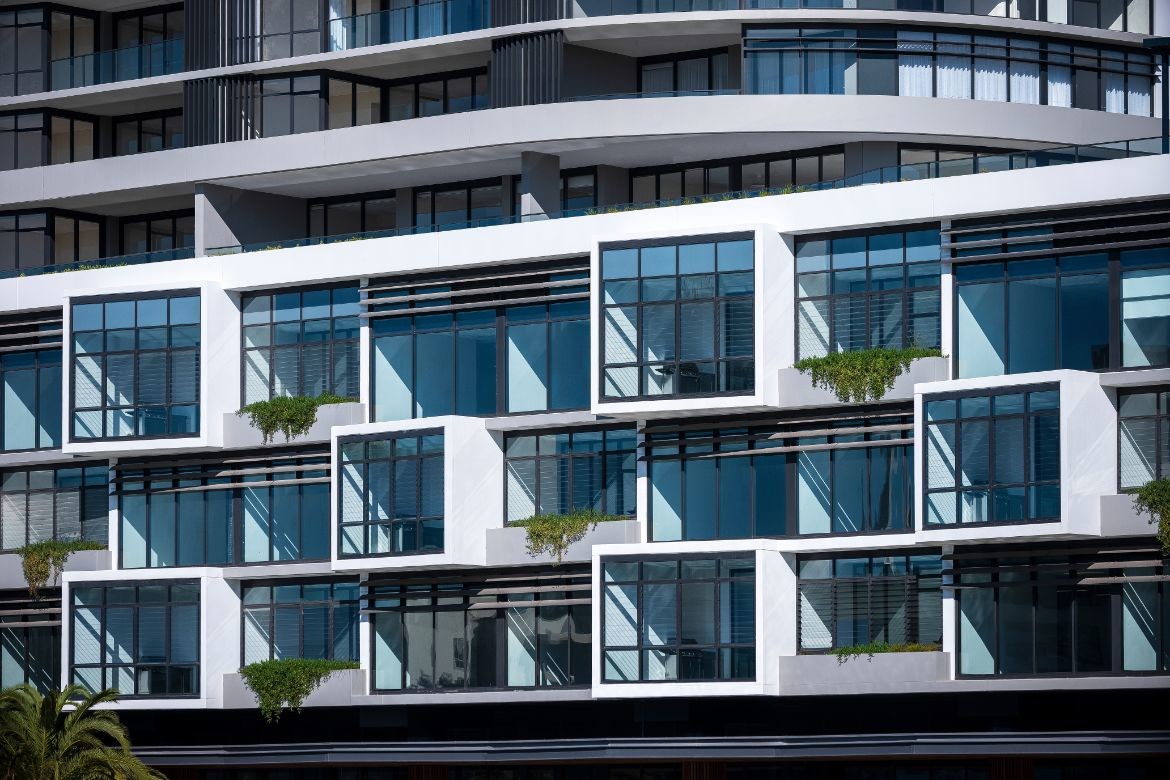
For Esplanade, the exterior of the office levels was treated as a series of punctuated wintergardens, orientated to the east and with views over the lake. Although these wintergardens, which are an extension to the offices, are weather protected, according to Turner, “they are not completely weatherproof. But the pleasure of being in these spaces (wintergardens) is that you can feel the breeze (through louvred windows) if you choose and enjoy the connection to nature.”
Other windows in these offices are operable, a change from most high-rise city buildings. And because the offices occupy a relatively shallow floorplate, the winter sun can penetrate to the core of each office.

Given the shortage of this type of development at Norwest, it’s not surprising that people were keen to purchase here, with most of the studio spaces being approximately 125 square metres in area. Some purchased individual suites, while others opted to combine two into one, removing party walls in the process. As one would expect with these fit-outs, the spaces were delivered in a fairly minimal state, with individual tenancies creating their own work environments.
However, many have polished concrete floors, exposed services across the ceiling and a combination of workstations and lounge areas, the latter regularly interchanged by staff. And for those who prefer to catch up over lunch, there are numerous cafés along the eastern edge, allowing views over the lake.

Esplanade is the ideal name for this project, with staff, residents and visitors alike being able to stroll around the lake, meander through the atrium, or simply enjoy the grounds. And unlike the usual approach, where work and leisure are kept separate, here the two are finely enmeshed.
This article appeared in Indesign magazine, issue #86, purchase here or subscribe.
Turner Studio
turnerstudio.com.au
Photography
Tom Ferguson
We think you might like this article about designing our future with Tzannes architecture studio.
A searchable and comprehensive guide for specifying leading products and their suppliers
Keep up to date with the latest and greatest from our industry BFF's!

BLANCO launches their latest finish for a sleek kitchen feel.

The Man x Machine x Material collaboration by Jarrod Lim and The American Hardwood Export Council explores how generative AI can enhance design processes while also revealing the areas where human intuition remains irreplaceable.

With the exceptional 200 Series Fridge Freezer, Gaggenau once again transforms the simple, everyday act of food preservation into an extraordinary, creative and sensory experience, turning the kitchen space into an inspiring culinary atelier.

Melbourne-based architects Breathe have constructed an unfinished house at the NGV that puts the question of house sizes in Australia on the agenda.

Resonant colour, rich materiality and thoughtful spatial planning create a highly functional and beautiful office for BresicWhitney in Mosman, Sydney.
The internet never sleeps! Here's the stuff you might have missed

Following a packed August event attended by architects, designers, overseas product suppliers and many more, the stunning new 600-square-metre showroom in Redfern is officially open to the public.

This Tin Sheds Gallery exhibition delves into complexity and contradiction in the Hunter Region in the context of coal and climate crisis.

This insightful interview reveals how CCD Singapore plans to lead the luxury design industry through design innovation and adoption of AI technology in creating unique user experience.

Knoll’s revolutionary legacy, from its pioneering mid-century modern origins to its current place within the MillerKnoll collective, continues to shape the spaces we inhabit. Here, we explore the iconic institutions, influential collaborations, and groundbreaking ideas that have shaped Knoll’s unique understanding of the human-space connection — the bedrock of the brand’s enduring relevance.