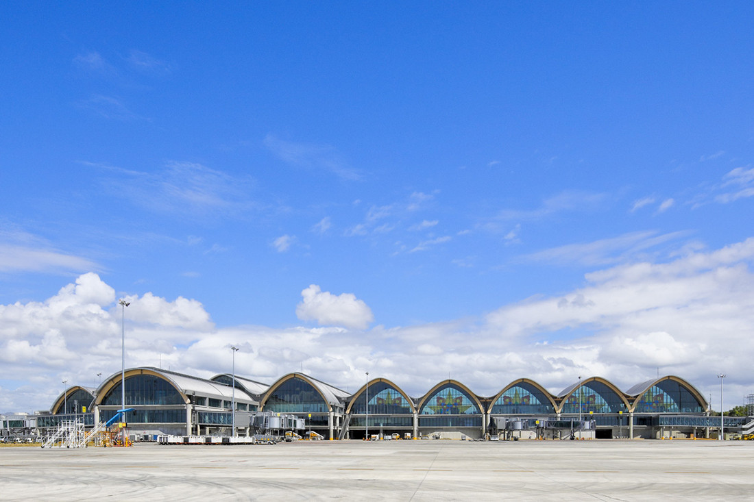
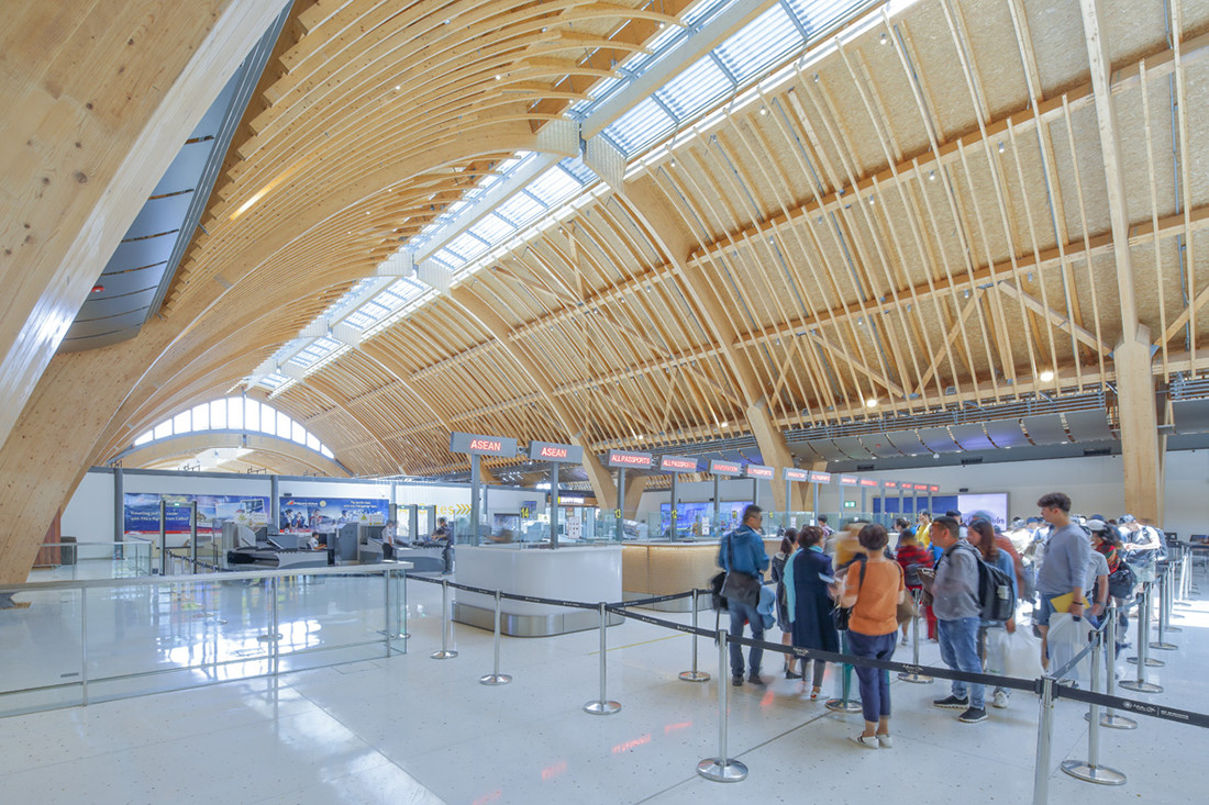
After edging out stiff competition in the 2019 World Architecture Festival, Winston Shu reflects on 40 years of designing airports and the shifting politics of our “gateways on the world.”

February 3rd, 2020
He will not praise his own work. Instead, Winston Shu will politely evade the request, humbly offering, “The jury’s comment summed it up well – “very confident, and yet very modest.””
While this may be controversial for some, I, too, am of this opinion. It was a photo finish when Shu’s Mactan-Cebu International Airport (T2) bested Singapore’s Jewel Changi and the High Speed Railway Terminal at West Kowloon at the World Architecture Festival last year. The adrenaline was palpable, sending some into fits of prideful joy. “A win for Cebu and the Philippines!” lauded the Philippines Airport Authority, an echo of the Department of Transportation’s “yet another big win” for President Rodrigo Duterte’s ambitiously scaled infrastructure campaign. Everyone, it seems, is basking in the accolade, but according to Shu “that’s a natural thing.”
“First of all,” he tells me, “an airport is a very special building typology. Every city regards the airport as the gateway; every city wants its own signature; every city treats it like its advertisement; in every city, individualism is driving the need to be different. Airports stand for so much.”

So, with Shu at the helm, what set Integrated Design Associates’ Mactan Cebu airport apart from the hotly anticipated Changi, arguably the biggest competition? Sure, every square-inch of Changi’s hellbent, high-octane acrobatics – overwhelming and/or breathtaking as they are – feel individualistically Singaporean, manifestly advertising. But I’m not the first to sense that Changi also feels like a drive-through luxury mall for airplanes, potentially out of step in today’s ‘flygskam’ (flight shaming) world in which a growing number are reckoning with the hard facts of air travel and reviling the glamorous, consumerist marketing machine that is jet-setting.
“When you compare our airport project to Changi Airport, such as at the World Architecture Festival, Changi seems a very complex solution. And it seems like a solution where money is no object. You throw a lot of technology into it and a lot of money to create this focal point. Whereas our project is trying to be very understated. [It’s aware] of its purpose as an airport, for transport, and aware of its main task of processing, accompanied by other more social benefits. Our project’s biggest competitor is about a shopping centre within the situation of an airport. The objectives are different.”

The Festival judges identified as much. Mactan Cebu International Airport “is integrated into the local area through the development of a local hub and a landscape plan,” read the jury comments. But that’s putting it rather lightly. The project has subsequently garnered praise for proactively integrating the whole life cycle of the building with the livelihoods of the Cebuano population and its local economies.

“When the design was first conceived, it was to be constructed in steel. But we didn’t want to do it in steel because you need its profile to be absolutely true, which means spending a lot of time in architectural steelworks, and unfortunately the Philippines doesn’t have this. So, we wanted to find a material that the local craftsmen can work on, not just in the initial build, but also in the longer-term maintenance of it of the structure. In other words, if the building life is 35 years, we need to allow for repairs. How can you find a steelworker to come in and repair something ten years down the line when the community doesn’t have this industry? We worked with local craftsmen who specialised in furniture and boat building and are very talented at curving and forming timber into compound shapes. This is where the building’s signature arches came from: our desire to engineer a timber arch that can withstand the physical dimensions of the structure, but can be created by the local craftsmen, and then maintained by them overtime. It’s part of that broader view of sustainability.”

Later, Shu draws my attention to this socially sustainable focus as one of the biggest evolutions in practice he has observed over 40 years of designing airports. I’m reminded of his work on London Stansted Airport with Norman Foster (1980-1991), noticing in Mactan Cebu Airport some variations on a theme: an incredible lightness; an openness toward the exterior; the magic trick of integrating all airport mechanical, electrical and ventilation systems within the structure –– airport as machine.
“My very first airport was Stansted, which ended up becoming the most revolutionary of the time. It was the first airport to create the ‘big shed’ idea: a floor, a large space, covered by a single larger roof. That concept for a terminal building was the very first time, or certainly in the UK. Stansted was so different from its predecessors developed by the British Airport Authority such as Gatwick Airport [Terminal South] where you would go from one room in a big concrete building to another room to another room until you were on the plane. You could never experience the building as a single space, instead relying on signage to navigate the building, no natural light and little external awareness.”
The groundbreaking moment later won Shu the improvement works on Hong Kong’s International Airport (2002), marking a decade long architectural skirmish of roof oneupmanship. Following Stansted’s widespread and enthusiastic acclaim, the “big shed” craze had set in. “For years, every airport was looking for a big roof, and they all wanted a bigger one than the last. Hong Kong airport comes along, and it has the ultimate roof! 250,000sqm in one space. One mega roof on one mega shed. We proved it could be done, and then asked ourselves, “Well, where do we go from here?––””
“We all learned something important on this project in Cebu. We learned that you can’t forever be relying on an architectural expression to create the identity. We can’t be thinking “What’s the next exciting roof?” – which is what you still see a lot in new builds for this typology. Rather, I think we have to turn to questions such as “What kinds of historical, cultural and local contexts can we introduce? How can we create these gateways to really reflect their context?” This to me is the next challenge.”

We think you’d like this From clicks to bricks. Stay in the loop, join our weekly newsletter.
A searchable and comprehensive guide for specifying leading products and their suppliers
Keep up to date with the latest and greatest from our industry BFF's!

Elevate any space with statement lighting to illuminate and inspire.

In this candid interview, the culinary mastermind behind Singapore’s Nouri and Appetite talks about food as an act of human connection that transcends borders and accolades, the crucial role of technology in preserving its unifying power, and finding a kindred spirit in Gaggenau’s reverence for tradition and relentless pursuit of innovation.

Another Sydney project has taken out the top prize this year in Singapore, with a wide range of other winnings works from around the world.

Fresh from Singapore, the first round of winners from day one of the World Architecture Festival have been announced.
The internet never sleeps! Here's the stuff you might have missed

The Four Seasons Hotel Hangzhou at Hangzhou Centre, designed by Avalon Collective, officially opened 1st September, 2024.

Michael Carr Architect is leading the way with education design that enhances teaching and supports learning for our most precious resource – our children.