Our fourth annual ‘Milan In Review’ night At Xtra was a thematic voyage through the themes that are currently driving design in new directions.

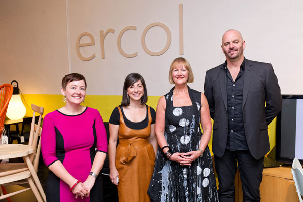
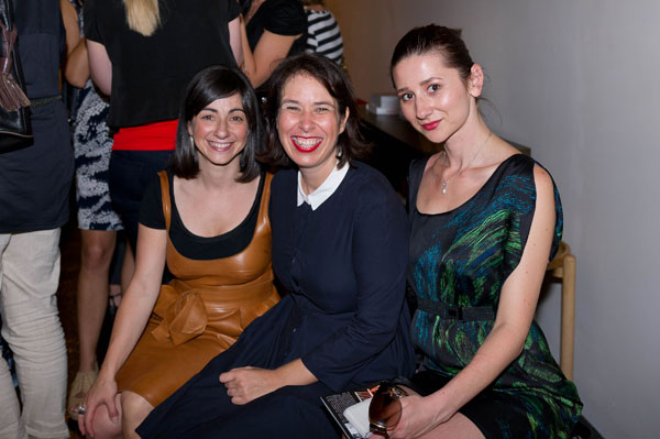
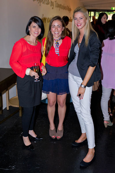
From left: Timo Wong and Priscilla Lui (Studio Juju), Narelle Yabuka (Indesignlive.sg and Cubes), Holly Cunneen (Habitus)
May 24th, 2019
Indesign Media’s ‘Milan In Review’ nights have taken various forms over the last few years. After last year’s trip around the city in 80 slides, this year we tested our grey matter with an exercise in thematic mindmapping.
The world’s week of weeks for design is about far more than furniture and lighting these days. But what should we take away from it given its enormous and ever-expanding scope?
Analysing the offerings of Milan Design Week in terms of themes that encapsulate the major currents at play in design – this was our way of making sense of things, and opening up a dialogue about the developments and directions that all of us in the design industry should keep front of mind.
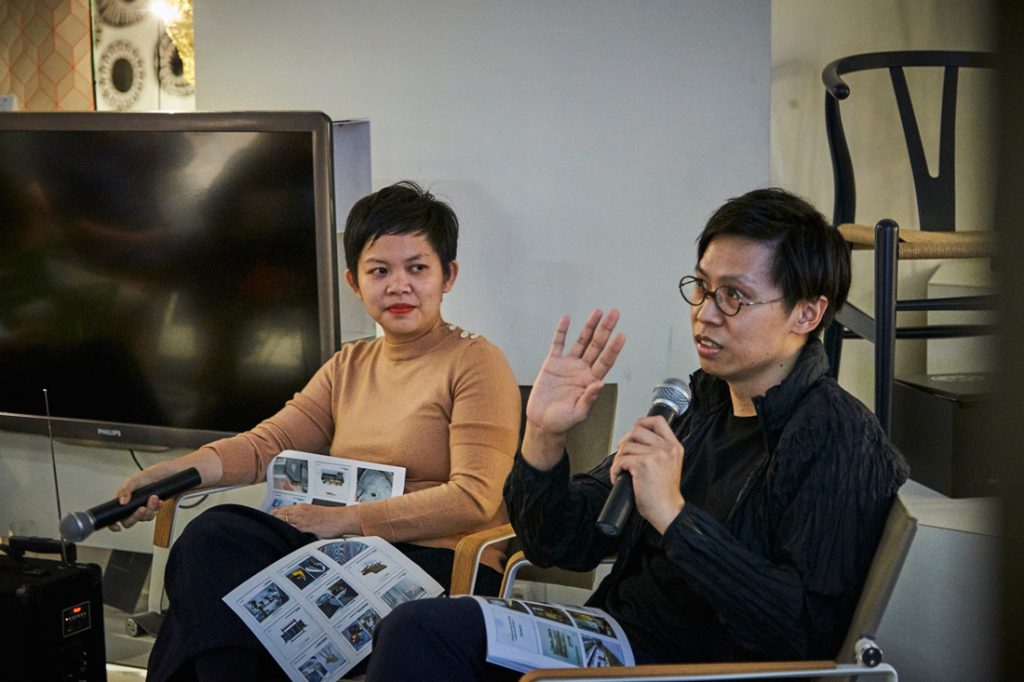
Priscilla Lui and Timo Wong, Co-Founders of Studio Juju
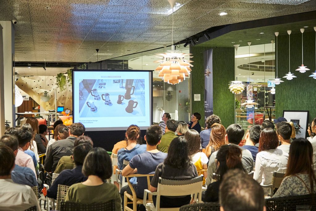
Guest panellists Priscilla Lui and Timo Wong (Co-Founders of Studio Juju) teamed up with Holly Cunneen (Editor, Habitus and Habitusliving.com, joining us from Indesign Media’s Sydney office) and myself (Narelle Yabuka, Editor, Indesignlive.sg and Cubes, and Asia Co-Editor of Habitus) to investigate the major themes of Milan Design Week 2019 – and what they mean for everyday design practice.
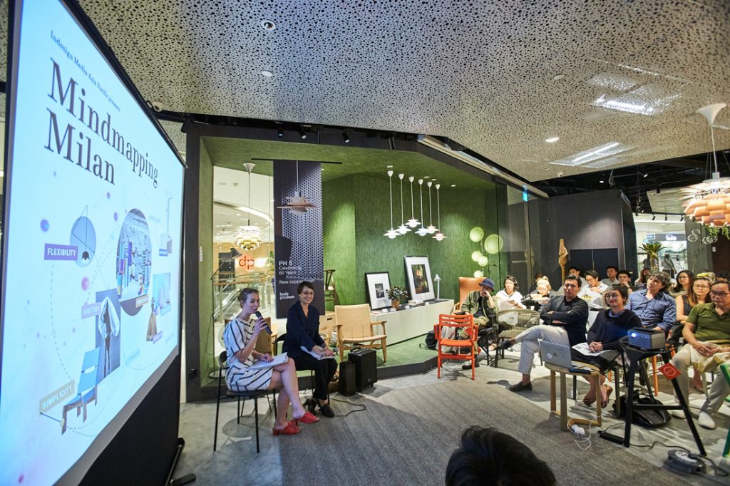
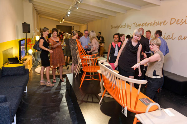
Our analysis of the week’s offerings – from the halls of the Salone del Mobile to the Triennale di Milano to the city’s showrooms and the very soil on which they sit – led us to a collection of thematic terms that we investigated over the course of an hour at Xtra (Marina Square) on the evening of Thursday 16 May 2019.
We tracked the tendency toward optimisation through brand acquisitions – such as the coming together of multiple brands under the Herman Miller umbrella, and the union of B&B Italia, FLOS and Louis Poulsen as a new entity called ‘Design Holding’. This trend will optimise market reach for the brands, as well as ease of specification for designers. And it may well affect retail habits, said the panel.
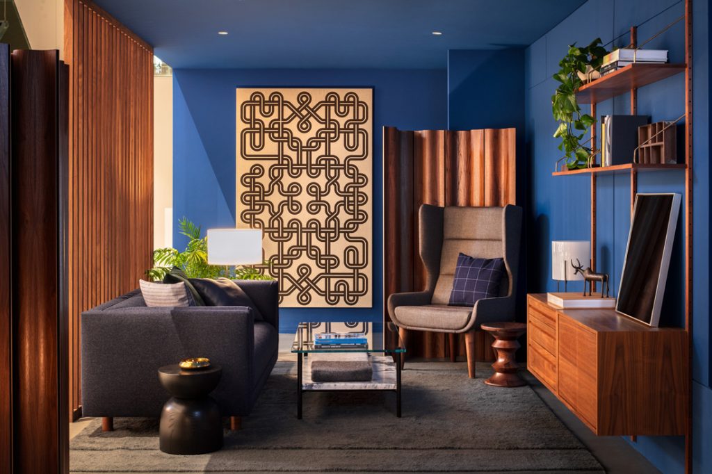
Herman Miller Group’s exhibition ‘All Together Now’. Photo: Nicholas Calsott / Herman Miller
Optimisation also appeared in some impressively malleable lighting systems from FLOS, which, on top of offering flexibility to meet the needs of any space, can also be packed extremely efficiently for shipping thanks to their soft materiality. It emerged too in the reduced output of some brands that preferred to tweak existing products for better performance or contemporaneity rather than push out expansive catalogues of the new. (And isn’t that a sustainable thing to do!)
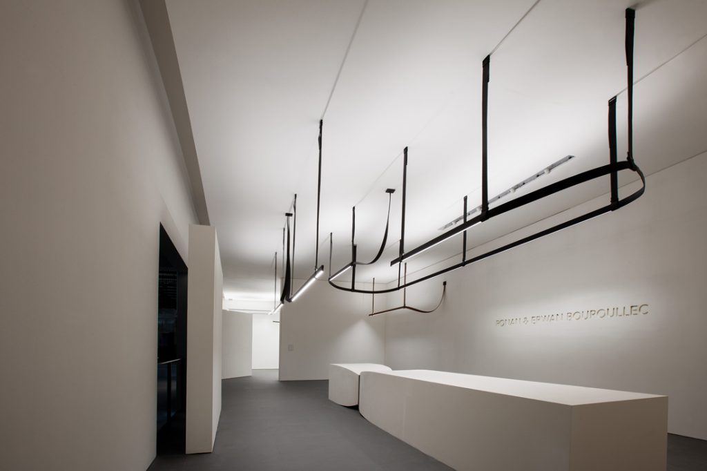
Belt by Ronan and Erwan Bouroullec at the FLOS (Design Holding) stand. Photo: FLOS
A discussion of the prominence of history in furniture re-issues from a good number of brands led us easily into the theme of handcrafting and the human touch. Brands ranging from Loewe to Hermès to Vitra showed how they value simplicity through pared-back installations or deliberately lo-fi products. The reassuring backdrop of narrative and the presence of human hands in the production process was a striking counterpoint to the ever-intensifying infiltration of technology in our lives.
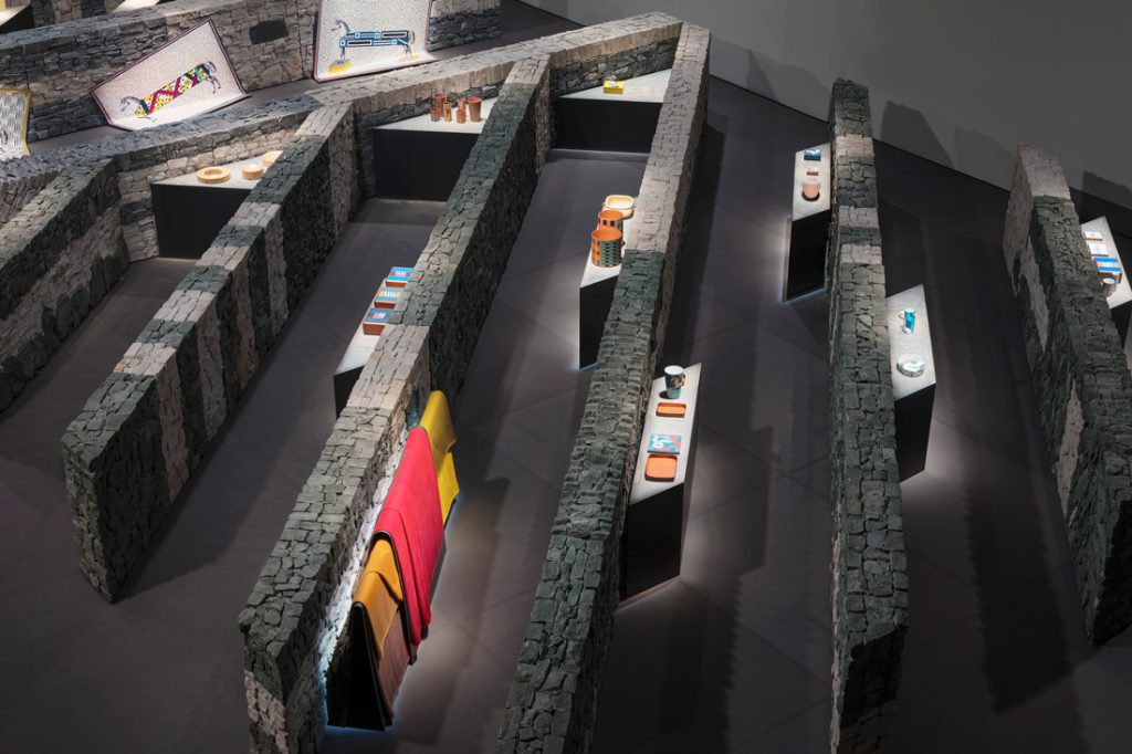
Hermès installation, scenography by Charlotte Macaux Perelman of Hermès. Photo: Hermès
The ultimate antithesis to speed and excess was Typologie’s Fuorisalone exhibition focused purely on the development over time of the simple wine bottle and cork. Its presentation on simple plywood plinths in a white-painted room could not have been more pared back.
Simplicity was dominant in a number of – almost reductionist – solid wood furniture pieces presented at the Salone. Compositions of deliberately simple shapes (Kettal’s Band chair by Patricia Urquiola), knock-down items (Taut table from Zeitraum, designed by Klemens Grund), and stools made with the minimum of technology (Mattiazzi’s CUGINO by Konstantin Grcic) were all evidence of a tendency to keep things simple.
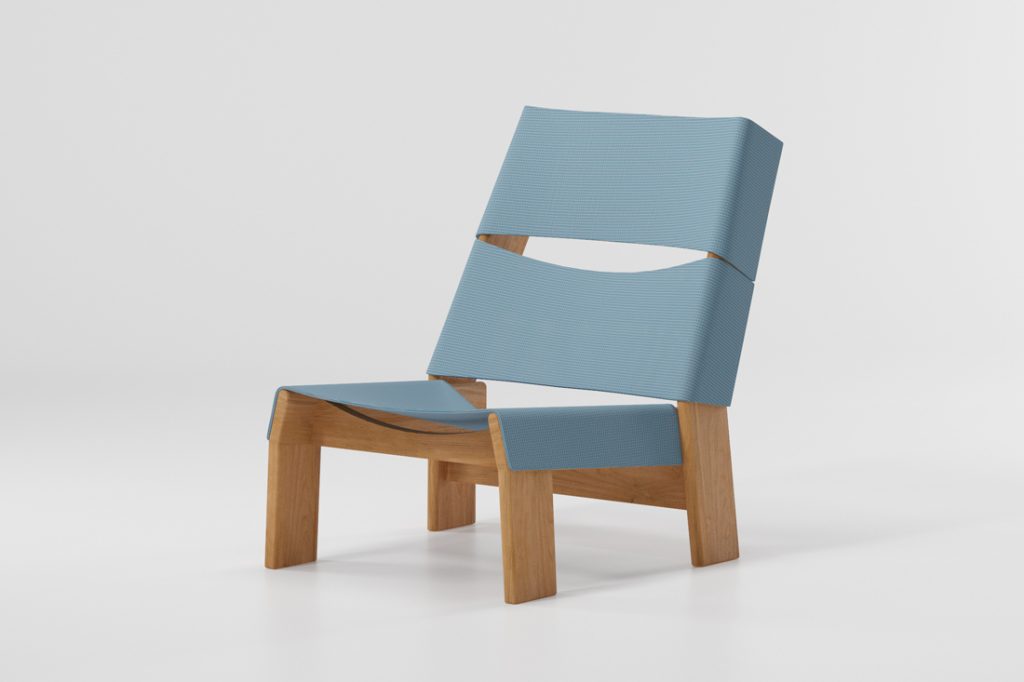
Band chair by Patricia Urquiola for Kettal. Photo: Kettal
Simplicity and sustainability often go hand-in-hand, and this emerged in the fairly scant emphasis on sustainable design among the brands exhibiting at the Salone. Stalwarts of sustainable design such as Emeco are well placed to continue this important trajectory (the 70-per-cent rPET On & On chair by Barber & Osgerby being a great example); but for others, the journey toward sustainability is more of a challenge.
Kartell is giving sustainability a good go with a new bioplastic edition of its Componibili of 1967 (designed by Anna Castelli Ferrier; although according to some sources, the actual sustainability of bioplastic is still somewhat in question due to the vast amount of farmland needed to produce it). In other cases, designers are taking the lead – for example, Stefan Diez, whose Costume sofa for Magis is a bright light in the development of less resource-intensive construction approaches for an item that’s typically very poorly recycled.
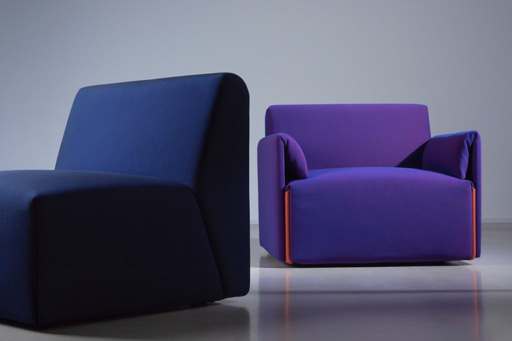
Costume by Stefan Diez for Magis. Photo: Daniela Trost / Magis
Outside the fairground, sustainability concerns seemed stronger. Rossana Orlandi challenged the “abuse and misuse of plastic” with an international design competition and an exhibition of recycled plastic products by some of the design industry’s biggest names.
And Carlo Ratti Associati with Eni grew ‘proof of concept’ for vegetal structures with The Circular Garden – an architectural structure grown from the soil with mushrooms (or more specifically, mycelium – the fibrous root of mushrooms). It was returned to the soil after a month – a beautiful union of humans and nature.
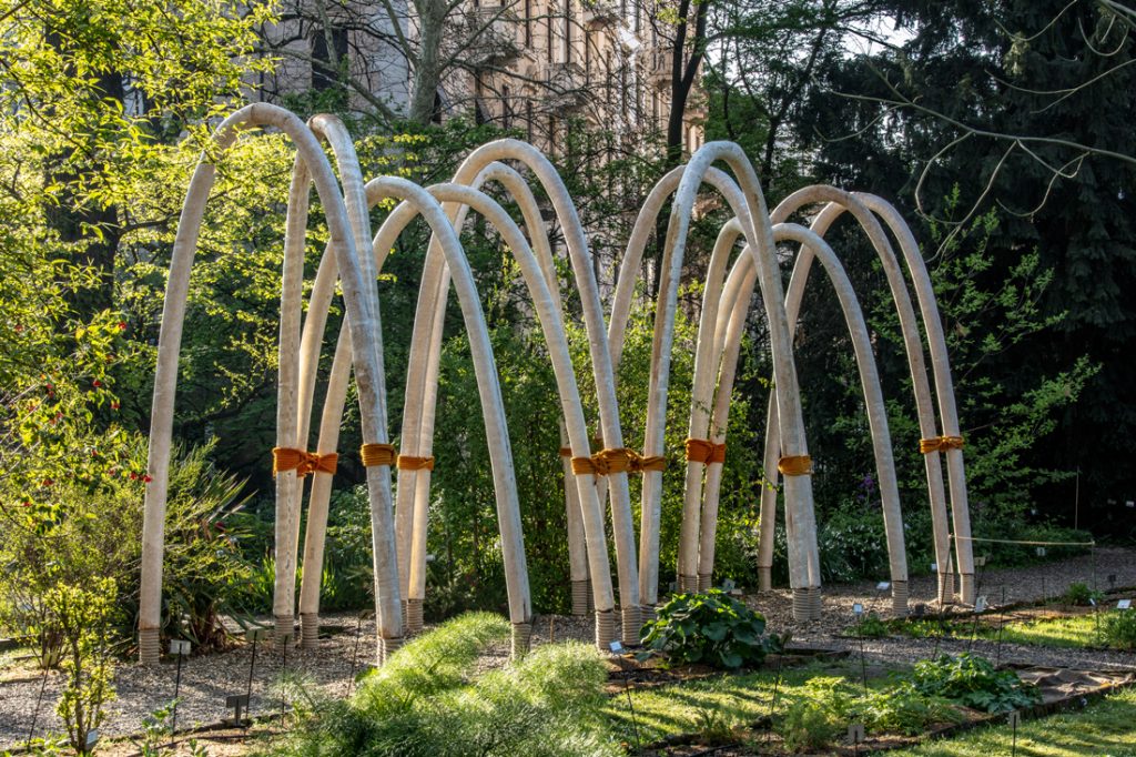
The Circular Garden by Carlo Ratti Associatti and Eni. Photo: Marco Beck Peccoz / Carlo Ratti Associati
Anxiety-inducing issues such as rising sea levels and declining insect populations were behind some fascinating presentations at Ventura Future. But the epicentre of both the distress and the spectrum of possibility tied to the ‘natural world’ was the Triennale’s headline exhibition Broken Nature.
In a vast and at times confounding display, curator Paola Antonelli pushed for a deeper conception of our relationship with other species, a longer perception of time, and an expansion of design into every realm of human activity.

Broken Nature exhibition at the Triennale di Milano. Photo: © La Triennale di Milano / Gianluca Di Ioia
Amidst this pervasive state of anxiousness, it was not surprising that technology companies – and others – promoted softness and emotional resonance with installations that brought human experience and engagement to the fore.

SONY’s installation Affinity in Autonomy. Photo: SONY
But the week also presented cold hard analysis of new realities such as the Design Academy Eindhoven’s GEO-DESIGN exhibition of projects about Alibaba. These investigated the online platform’s capacity as a powerful new agent in the design process.
Our discussion concluded with a web of connections drawn between our key themes. But what does it all mean for designers? For one thing, design can be interpreted in many ways. But also, the more linear development of design that dominated in the past has been surpassed by an explosion of influence today.
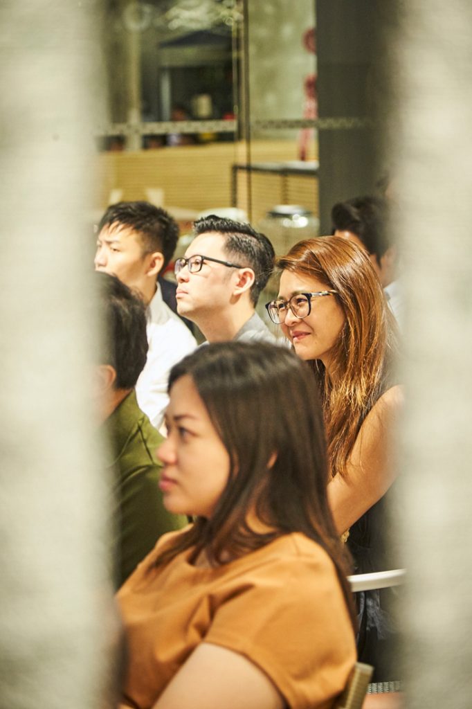
As Lui summarised, “We’re in an age when anything can be an influence, and anything you do may not be wrong. Before the internet, designers were probably most influenced by their culture and context… These days we have so many more things to consider. For designers, it’s about knowing where we are and which influences we want to hold on to.”
All the more reason to keep abreast of the offerings of Milan Design Week, and be vigilant about positioning and repositioning oneself in the currents and tides. The relevance of the designer depends on it.
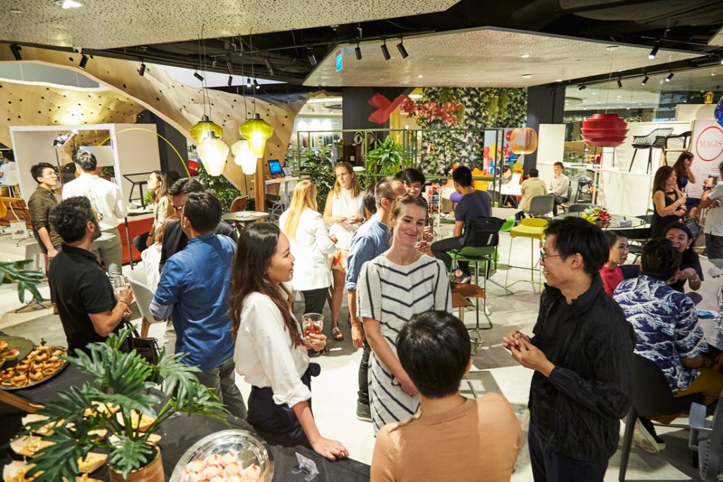
Special thanks to Xtra for hosting Milan In Review for the fourth year running, and to Kith café for fuelling our thematic investigation.
Event photography by Mark Lee.
We will be publishing an audience member’s account of Milan in Review 2019 in the July issue of Cubes (#96.) Look out for contributor Yvonne Xu’s article!

A searchable and comprehensive guide for specifying leading products and their suppliers
Keep up to date with the latest and greatest from our industry BFF's!

Following its successful inaugural event in early 2024, the Vietnam International Trade Fair for Apparel, Textiles, and Textile Technologies (VIATT) is gearing up for its next instalment in 2025.

BLANCO launches their latest finish for a sleek kitchen feel.

XTRA and MillerKnoll are bringing global icons to the Singapore design scene.

XTRA celebrates the distinctive and unexpected work of Magis in their Singapore showroom.
The internet never sleeps! Here's the stuff you might have missed

Warren and Mahoney’s (WAM) design for the newly opened Oran Park Leisure Centre (OPLC) celebrates the facility’s unique location – promoting an active lifestyle at the literal core of this thriving community.

Tonya Hinde, BLP Principal, comments on the importance of gender separation in the context of mental health design.