Collaborative installations have always been a key component of Saturday Indesign. This year six Singaporean studios partnered with four exhibitors to bring something special to the day. We recap their impressive interventions.

October 23rd, 2019
Creating an installation that effectively communicates a brand’s products as well as a festival theme (‘Community’), engages the attention of visitors from the design and architecture industry, is legible to non-trade visitors, and takes into account the one-day nature of its existence, is no simple feat. Deep consideration is needed alongside creative ingenuity.
But we like to lay out a good challenge. And the Saturday Indesign Singapore 2019 collaborative installations provided exciting manifestations – with ongoing impact.
Journey East took the bull well and truly by the horns with the decision to produce not one but three collaborative installations for Saturday Indesign – each one a fascinating design outcome in its own right.
“All the visitors who have come into our showroom have been very impressed by the ingenuity, care and effort that has gone into all three installations,” says Terence Teh, Marketing Manager at Journey East, referencing the fact that all three are still on display.
Journey East’s collaboration with UPSTAIRS_ focused on the sculptural mouth-blown Tala bulbs sold in the showroom, each of which contains a mesmerising spiral LED filament.
Explains Dennis Cheok, Creative Director at UPSTAIRS_, “Taking a cue from Tala’s singular manifesto – elevating the humble bulb into a self-sufficient lamp in itself – we decided to pair and contrast this modern, highly technical luminaire with its oldest, most traditional counterpart, the plaster ceiling rosette, and make it a singular entity that marries the old and new.”
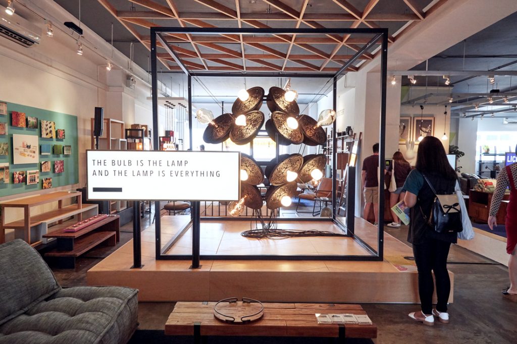
For dramatic impact, UPSTAIRS_ multiplied the pairing to create a levitating geometric structure and also incorporated interactivity via a dimming function. “We witnessed the impressive dimmable range of the individual bulbs and amplified its visual impact by connecting all 24 bulbs to a single old-school rotary dial,” explains Cheok.
Carrying forward Tala’s sustainable ethos, the installation was designed and constructed (at UPSTAIRS_’s workshop) as a modular kit of parts. The intention of reusing the components and creating zero waste has been thwarted somewhat – in a good way! – by Journey East’s decision to keep the installation on display in the showroom.
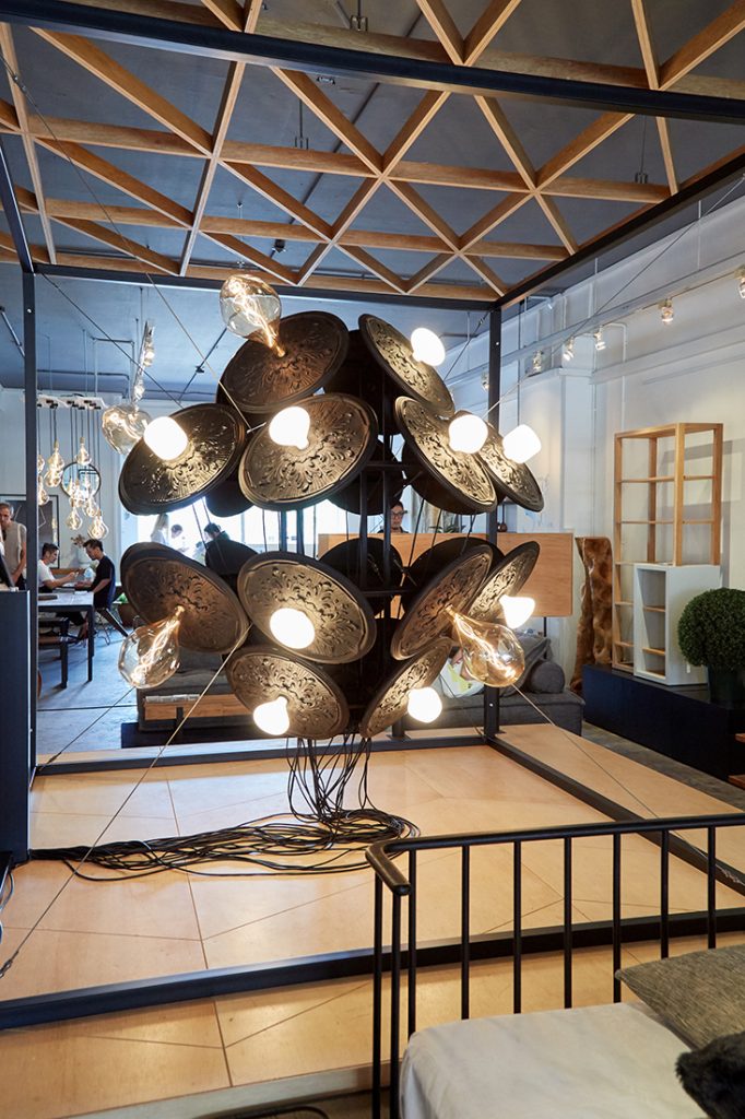
“It’s all very simple, yet at the same time immensely complex,” says Cheok. The production of the installation certainly incorporated a fair amount of complexity. He explains:
“We recently acquired a CNC machine, and wanted to make use of that to create our own ceiling rosettes. The team started designing the most fascinating series of traditional rosette patterns, each one ‘glitched’ by skewing their geometries and grafting new patterns over the original. We ended up with a series of six unique patterns and set off to test-drive the new machine.
“It took over six days of preparation and test milling before we came to the realisation that the complex curvatures and intricate patterns require lengthy trials and troubleshooting to accomplish. It was a mammoth task ahead, and we were left with a mere two days before the event date.
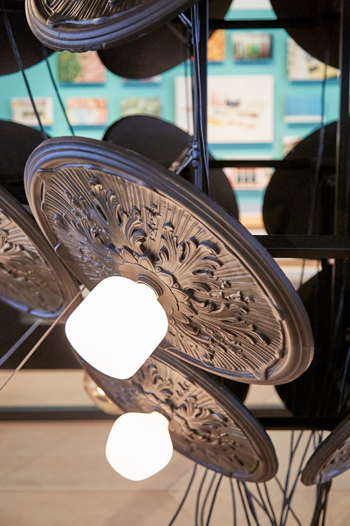
“I had to halt the trials and we drove across the causeway to Johor Bahru to a plasterwork factory. We brought in the plaster rosettes that were eventually used for the final product. That was super intense!”
But it was all well worth it in the end. “The positive response and encouragements we received for the installation on Saturday really blew me away,” says Cheok. Congratulations to the team from UPSTAIRS_!
Journey East’s collaboration with Wynk Collaborative spawned the growth of a series of prototype objects that attach themselves to pieces of vintage furniture in the Journey East showroom. Far from being simply ornamental, these bent metal objects are also functional – creating display surfaces, storage spaces and hooks.
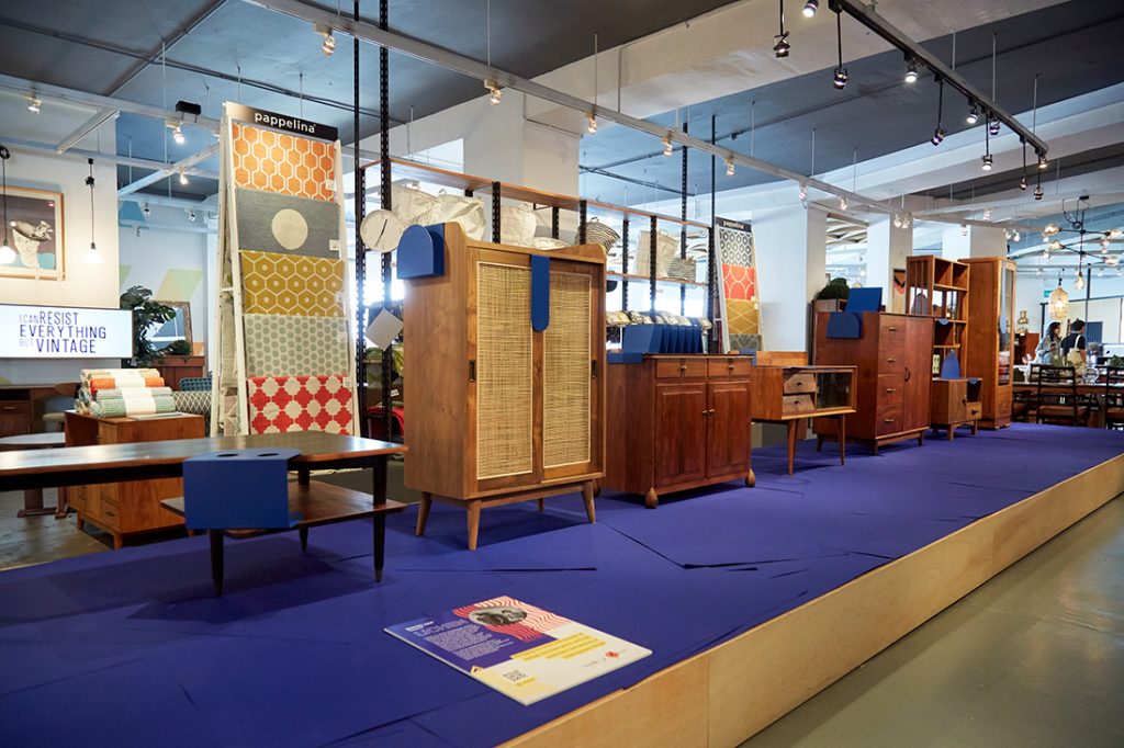
“We wanted to broaden the appeal of vintage furniture pieces to a wider audience,” says Leong Hon Kit, Founding Partner at Wynk Collaborative, “but at the same time we wanted to retain the spirit of the original pieces. Lichen is about bridging the gap between the aesthetics of the vintage pieces and the look of more contemporary furniture design.”
Spray painting the objects in bold solid colour created a strong juxtaposition with the mellow wood grains of the vintage pieces. “The attachments form a relationship with the vintage pieces that is jarring and harmonious at the same time,” says Leong.
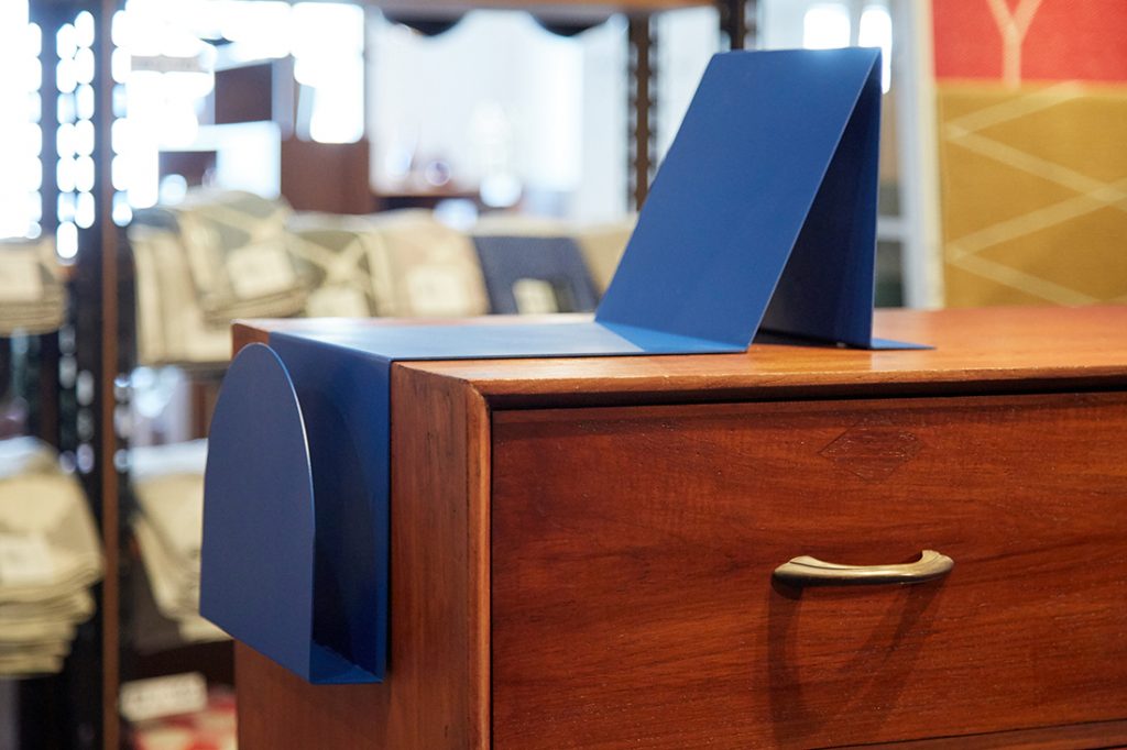
The Lichen can be used individually or in combination, bringing a variety of new functions to their hosts and breathing new life into ‘charming’ pieces with their own histories. But much sensitivity was needed.
“The most difficult part of conceptualising the installation was finding a way to treat and augment the vintage pieces that is not destructive or detracting to the nature of the item,” says Leong.
“The best compliment we got was from people who enquired about whether the Lichen were for sale,” he adds. We’re hoping we’ll see a new product line at Journey East in the near future!
Creative and branding agency Feral took a community-building approach to their installation for Journey East by inviting a diverse team of creatives to participate in a collective gathering of rabbits.
Seven of Qeeboo’s Rabbit Chairs were given all manner of treatments and clustered together under a giant carrot-shaped disco ball.
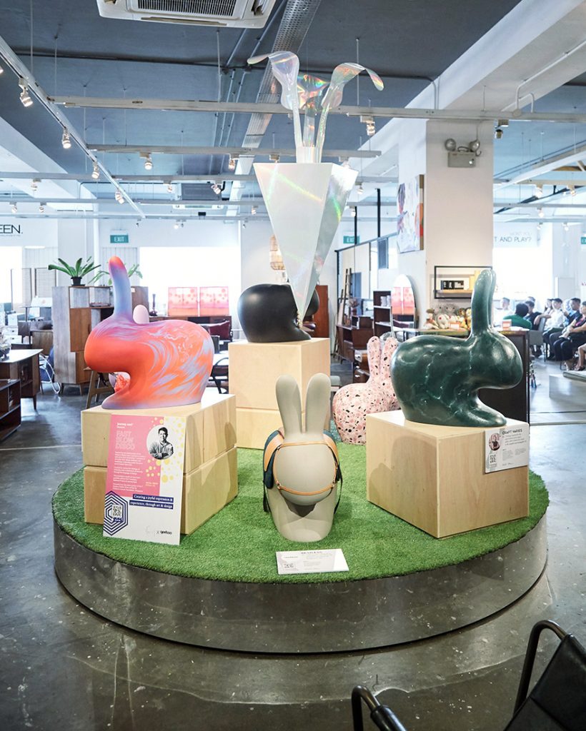
The participating creatives – drag artist and performer Becca D’Bus, jewellery design studio State Property, stylist and club kid Aaron Han, calligraphy studio Craft Varies, illustrator Messymsxi, branding and design studio Restless, and artist Kristal Melson – were each encouraged by Feral to express themselves.
“I wanted to convey the idea and message of aesthetic inclusivity,” says Rafiq Mohamad, Creative Director at Feral. “I wanted to provide a safe space for the creatives to express themselves,” he says, adding: “It was heartwarming to see the reaction of all seven creatives upon seeing their Rabbit Chairs assembled in the installation. There was such a positive synergy.”
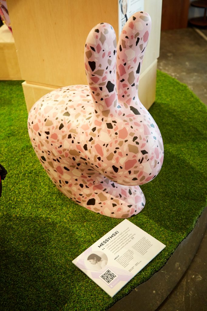
For Mohamad, the icing on the cake was the addition of a silent auction to the activation. Journey East will donate 100-per-cent of the nett proceeds of the sale of the Rabbit Chairs in the installation to the Children’s Cancer Foundation.
“I’m extremely grateful to Journey East for giving Feral this wonderful opportunity. The support the Journey East team has provided has been amazing,” he says, noting how the very inclusion of Feral in this year’s Saturday Indesign has been a great outreach beyond the interior and architecture disciplines.
The silent auction is open until 23:45 on Sunday 27 October 2019. Click here to bid!
Saturday Indesign Singapore 2019 was the B2B debut of rug specialist The Cinnamon Room to the design and architecture industry. So the store’s founder Visha Nelson naturally had some nerves. “I wanted our first impression to designers, architects and design enthusiasts to be a truly memorable one,” she recalls. And it certainly was.
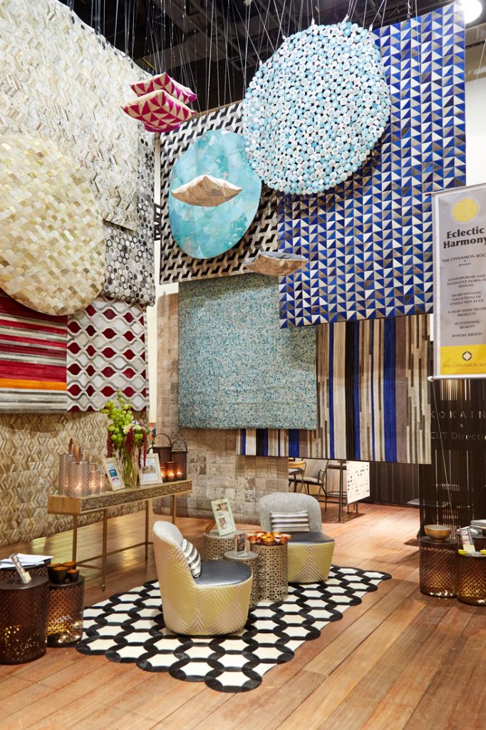
She worked with Celine Ng and Nicholas Chew of design studio Fraction to create a 7.5-metre-high colourful oasis of vertically displayed rugs and suspended cushions – a community of textures and colours. All of The Cinnamon Room’s categories of rugs – vibrant hues, neutral tones, metallic hides, laser-etched designs, round rugs and monochrome designs – were presented, reaching up overhead in a layered arrangement at our Curated Space.
“Quite often a display may be effective in design but not so effective in relating to the audience what the actual product being showcased is. So when we discussed the various alternatives of using hide samples, I was adamant that the rugs should be showcased in their entirety,” says Nelson.
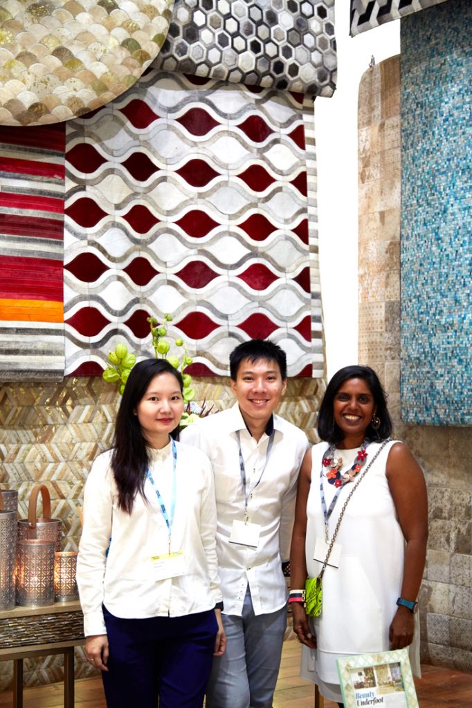
Celine Ng and Nicholas Chew of Fraction with Visha Nelson of The Cinnamon Room
“We spent a fair bit of time configuring different pairings to bring out the best of each category… All our rugs can also be customised as cushion covers as well, so we wanted to add a touch of the whimsical by suspending the hide cushions in a wave-like effect for extra impact,” she explains.
Of course achieving this ambitious installation required a lot of work behind the scenes in terms of calculating the measurements of the wires and clips needed to attach the rugs and cushions to the overhead trusses without snapping. With rugs presented in a two-layer arrangement (for viewing within and outside of the stand area), explains Nelson, “the wiring and clips had to haul up 27kg of rugs per layer, so a lot of planning was required. Fraction’s meticulous calculations and dedicated commitment to the brief was very impressive and reassuring.”
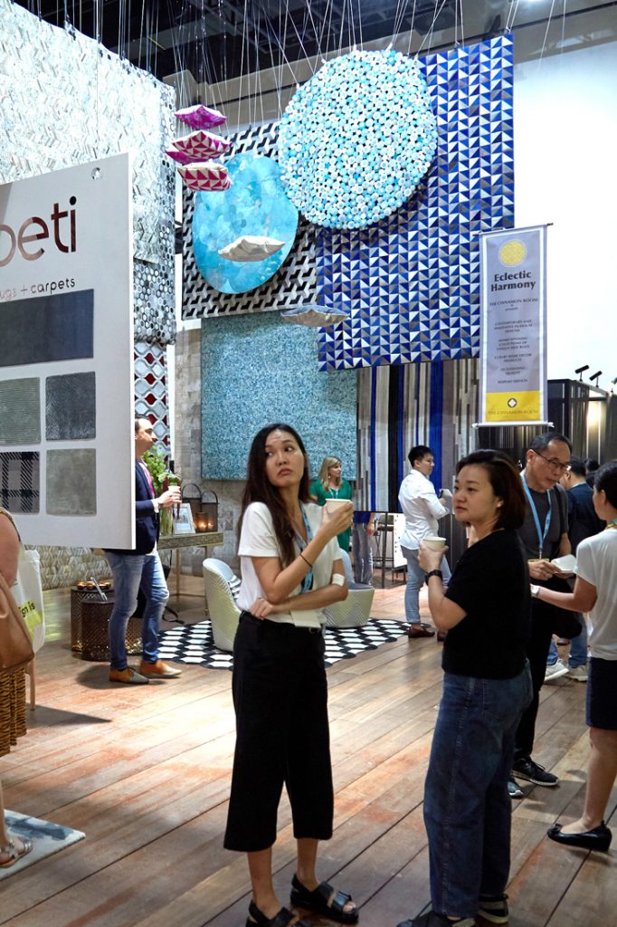
“I had several of the panel speakers come up to me during the course of the day to say how impressed they were with our installation. To have industry experts give us a vote of confidence was humbling, and I will always be so grateful for the kind words expressed by so many,” says Nelson.
Kreon is well known for its minimal architectural lighting products, but less well known are the brand’s ceiling systems – equally refined and resolved in design. To produce its Curated Space installation for Saturday Indesign Singapore 2019, Kreon teamed up once again with long-time collaborator studiogoto. The result was a neatly resolved zone of crafted planes and spaces that invited visitors to take a seat and pause to contemplate and chat over refreshments.
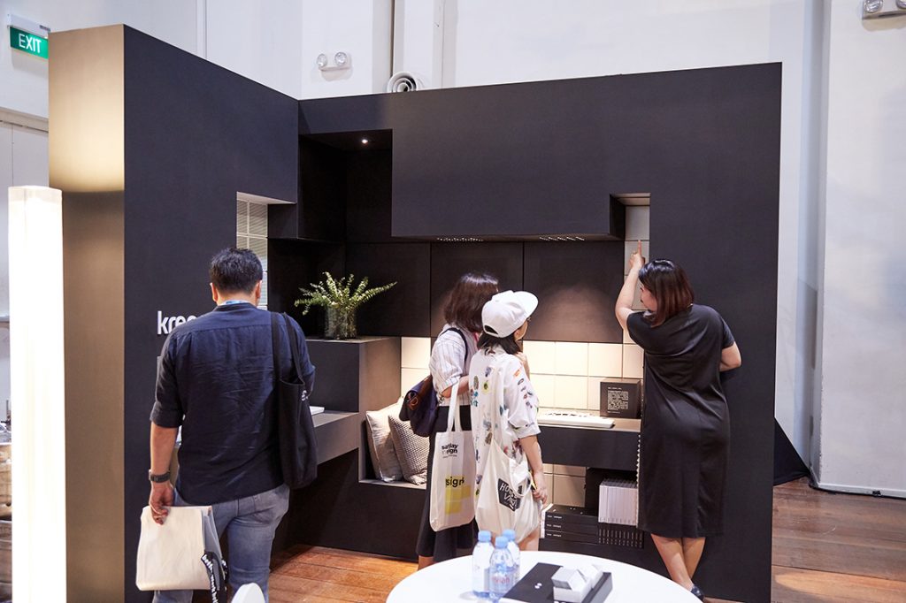
“We wanted people to rethink the positions of building elements,” says Chioh-Hui (Chiok) Goh, Co-founder of studiogoto. He continues, “Three-dimensionality may be viewed from another angle – the vertical becoming the horizontal and vice versa.”
“Kreon has these modular products that can be used on both ceilings and walls; they’re interchangeable and seamless. And the fact that modular fittings and accessories can be integrated onto these surfaces makes it even more important that designers rethink their perceptions of architectural planes,” he says.
studiogoto used both Kreon’s lighting products and its surface panels in the installation, which referenced an office environment. “Selected light fittings enhanced the geometry created by the modular wall and ceiling panels,” explains Goh.
He delighted in seeing how visitors were genuinely interested in knowing more about Kreon’s surface panel systems as well as its lighting. Job well done, studiogoto.
Greenlam and Index Design teamed up to reference a communal activity that is rapidly becoming a thing of the past in Singapore: listening to song birds in HDB estates. They created an enormous tree of layers of laminated plywood whose roots spread out to create places to sit in our Curated Space.
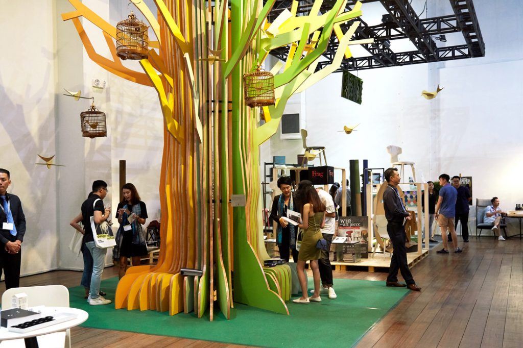
The colour of the laminate changed gradually from layer to layer – depicting the passage of time through a visual effect. The vibrant colours referenced the vibrancy of this dwindling practice. The installation was envisaged as a gathering point and a conversation starter.
A searchable and comprehensive guide for specifying leading products and their suppliers
Keep up to date with the latest and greatest from our industry BFF's!

Within the intimate confines of compact living, where space is at a premium, efficiency is critical and dining out often trumps home cooking, Gaggenau’s 400 Series Culinary Drawer proves that limited space can, in fact, unlock unlimited culinary possibilities.

XTRA celebrates the distinctive and unexpected work of Magis in their Singapore showroom.

Saturday 6th September – mark your calendar, rally your colleagues and prepare for an event that will ignite your passion for design with Saturday Indesign 2025.

The Heffron Centre in Maroubra, Sydney, stands as a testament to how authentic public art powered by collaborative project teams can transform urban spaces.
The internet never sleeps! Here's the stuff you might have missed

These early product standouts — from sculptural forms to reflective surfaces — capture just a sliver of what Milan Design Week 2025 has begun to unveil.

Jasmax merges with Melbourne’s Canvas Projects to expand in Australia, following its 2022 Sydney launch and targeting Victoria’s public sector.