The interiors referenced the metropolis’ culture and heritage, interweaved with contemporary vibrancy of the locale.

November 16th, 2023
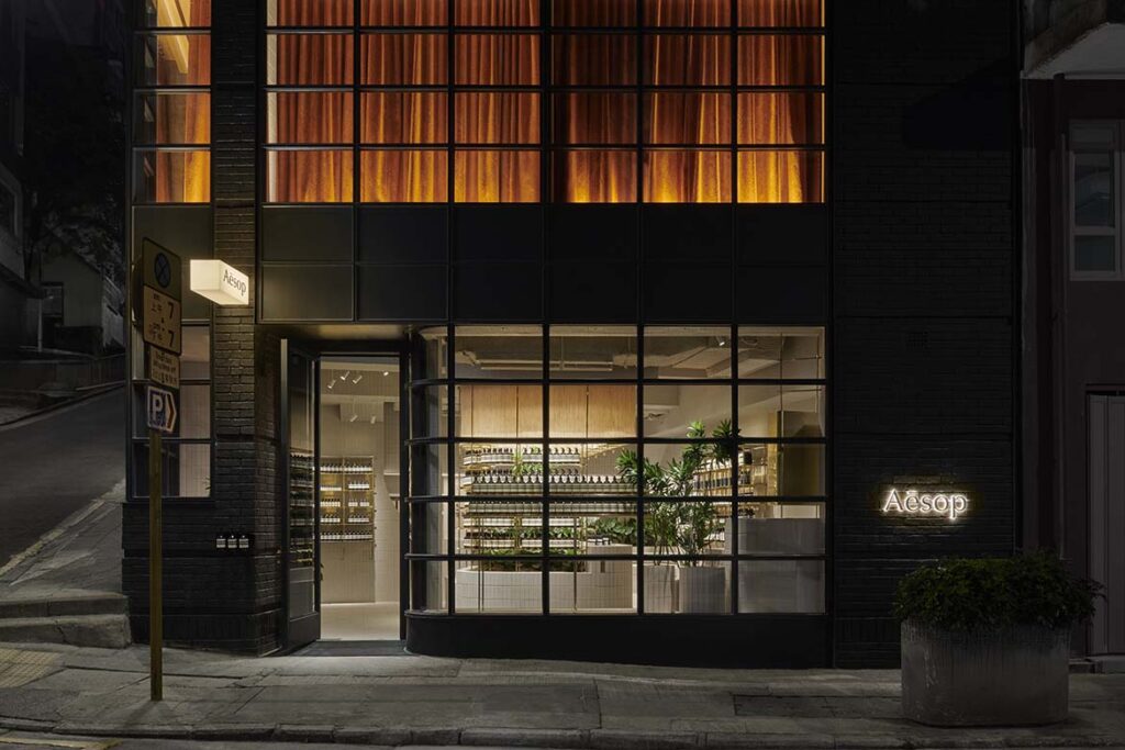
Previously occupied by Tom Dixon’s Asia flagship, Aesop’s newest Hong Kong store on Hollywood Road is a calm respite amidst the city’s chaotic street life. The Australian cosmetics brand’s minimalist aesthetic echoes throughout the interior and exterior of the double-storey retail store conceived by its in-house designers.
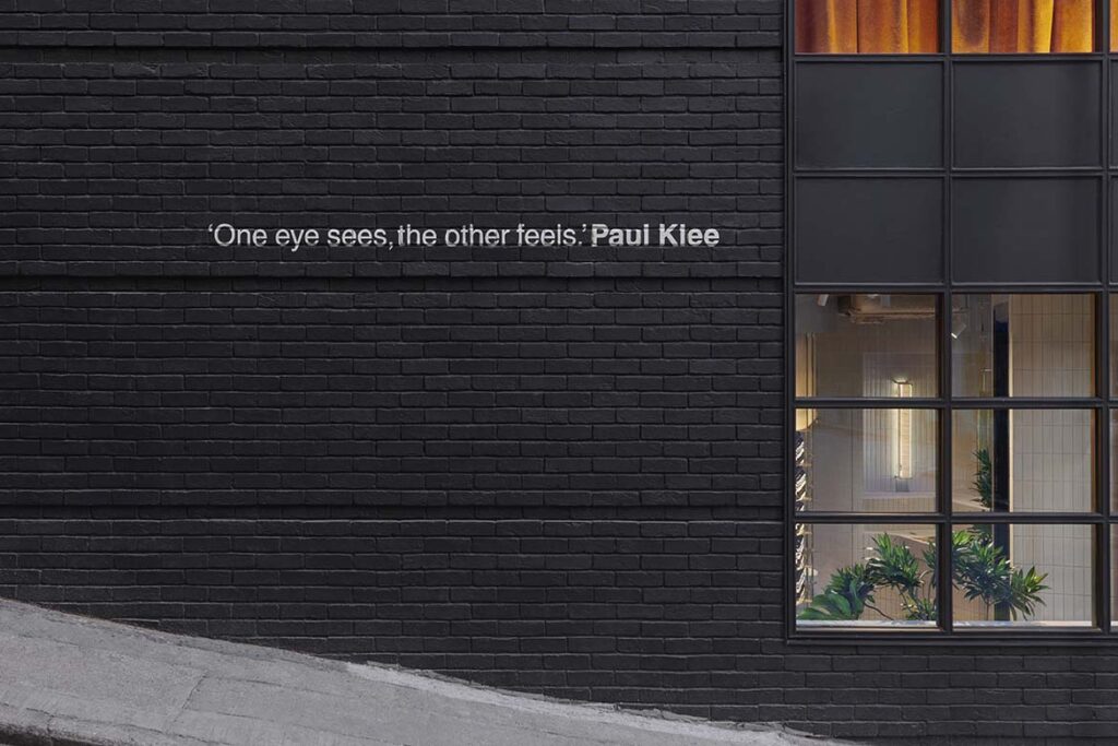
The building’s original black façade has been retained with only one line of quote by Paul Klee added to the side, as a nod to Aesop’s signature amber coloured bottles with distinctive black and white labels. Meanwhile, the full-height black steel French doors and windows provide a peek into the stunning store covered in custom white tiles – from the ceilings to the floors – adorned with a striking graphic grid featuring contrasting grouts for added dimension.
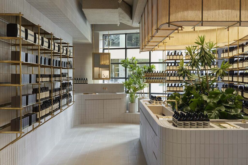
This durable surface is a clever solution in combatting Hong Kong’s humid climate while celebrating the city’s rich tiling heritage. Suspended brass structures that wonderfully display Aesop’s range of products strategically juxtaposed against the tiles as a tribute to the traditional local construction technique of bamboo scaffolding.
The brass elements, featuring visible and uncomplicated pins that secure the metal assemblies, abstractly echo the knots used in tying bamboo frames together. This abstraction not only embodies strength and endurance, but also pays homage to the local craftsmanship, creating a visually compelling narrative within the store’s interior.

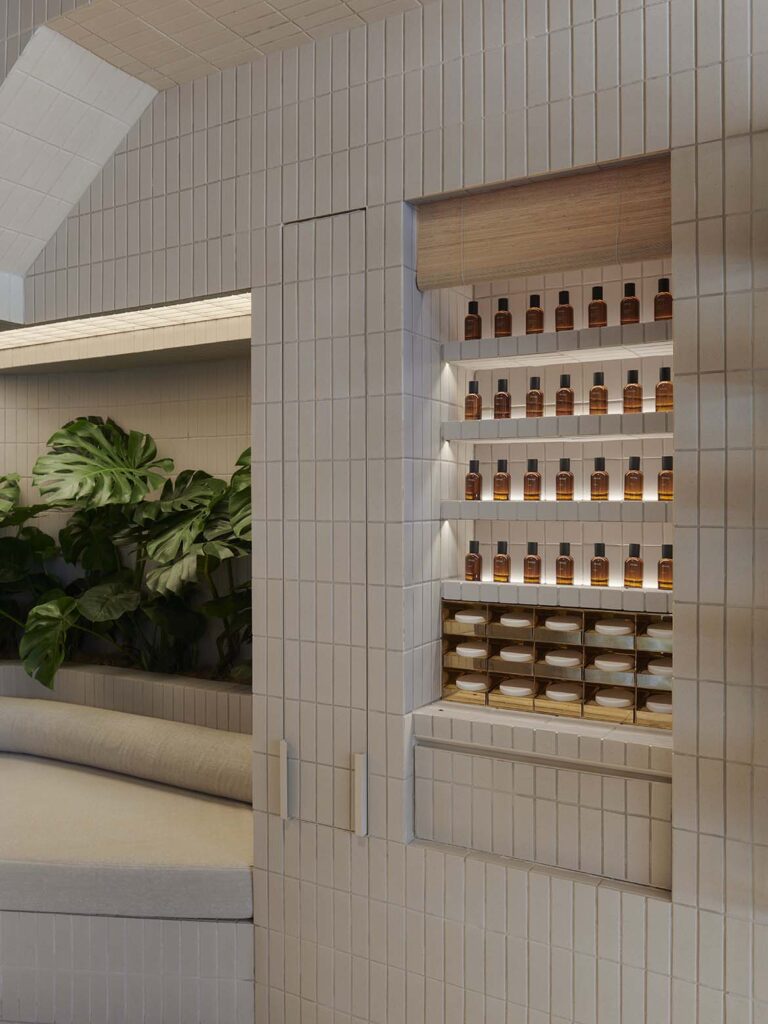
At the heart of the store is a wraparound island of communal basins for visitors to test out Aesop’s complete range of formulations for the skin, hair, body and home. Within the island are green foliage that evoke the lush landscapes of the city’s botanical gardens. More greenery can be seen at the storefront and by the corner seat, where the planters are composed of the same custom white tiles to ensure design homogeneity.
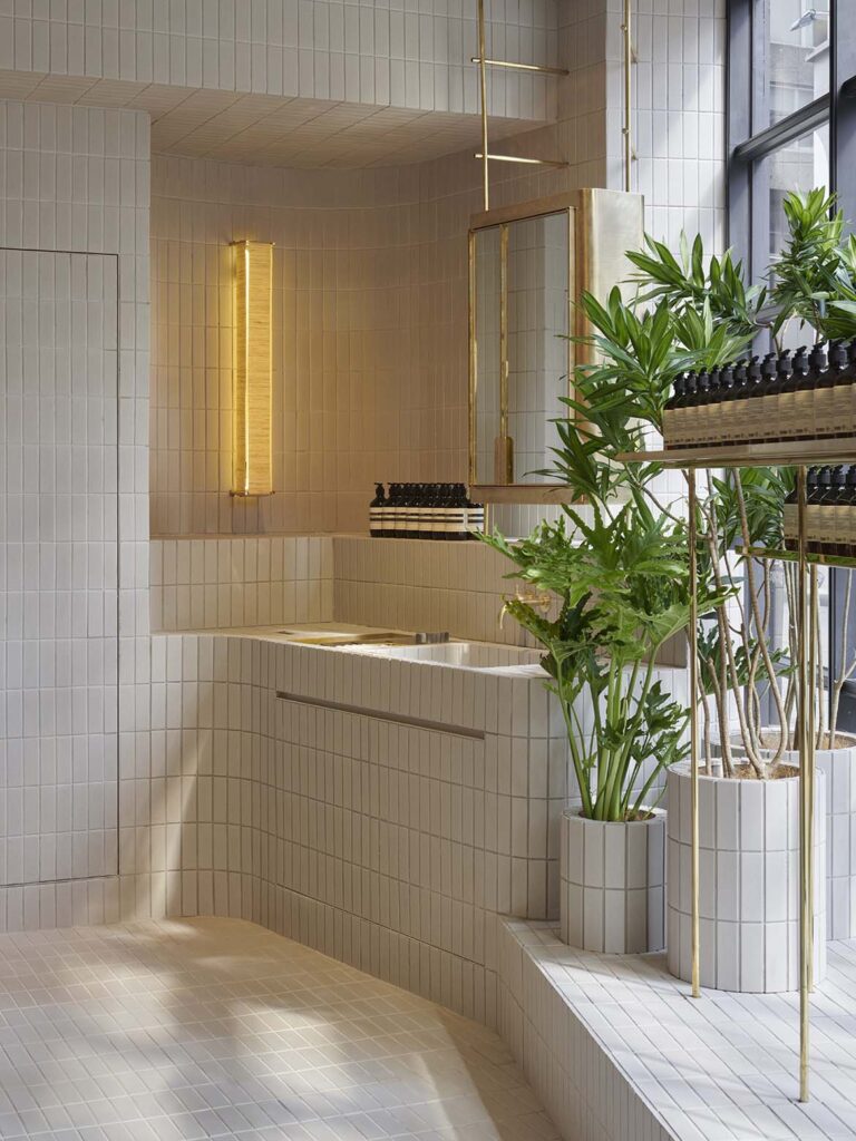
While individual basins are tucked to the side for one-on-one, in-depth consultations, the ample corner seat allows customers to rest briefly or await the start of a facial appointment conducted upstairs.
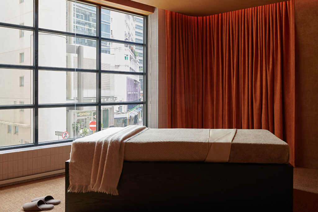
The two facial suite studios on the second floor are a cocoon of composure, furnished with bamboo fibre ceilings and burnt orange curtains. Here, gentle illumination sets the scene for an unforgettable and restorative experience. Similarly, lighting throughout the retail store downstairs is soft and diffused, creating a warm and calming atmosphere for customers.
This new Aesop Hollywood Road store is significantly bigger and markedly different compared to its previous store located along the same street. With a total of eleven stores in Hong Kong, each bearing a unique identity, Aesop’s reopening on Hollywood Road adds to the vibrant and creative scene of the art district for those seeking a more eclectic and unconventional experience in Hong Kong.



A searchable and comprehensive guide for specifying leading products and their suppliers
Keep up to date with the latest and greatest from our industry BFF's!

The Man x Machine x Material collaboration by Jarrod Lim and The American Hardwood Export Council explores how generative AI can enhance design processes while also revealing the areas where human intuition remains irreplaceable.

Elevate your outdoor spaces with pieces that are beautiful, functional, and engineered for you.

In this candid interview, the culinary mastermind behind Singapore’s Nouri and Appetite talks about food as an act of human connection that transcends borders and accolades, the crucial role of technology in preserving its unifying power, and finding a kindred spirit in Gaggenau’s reverence for tradition and relentless pursuit of innovation.

Re-interpreting retail design for the future, HAS design and research is leading the way in Hefei, China with a Ligne Roset showroom that is a winter wonderland delight.

RIZEN Atelier has created an exceptional retail experience for Fanuli that shines a bright light on all things design.
The internet never sleeps! Here's the stuff you might have missed

Tasmania’s most popular architecture and design event, Open House Hobart, kicked of this past Sunday with fabulous crowds and some spectacular architecture.

Michael Carr Architect is leading the way with education design that enhances teaching and supports learning for our most precious resource – our children.