The Love, Bonito store designed by Wynk Collaborative at Funan merges physical and digital retail for an optimal brand experience.

October 25th, 2019
“Retail is not dead, but its role is shifting,” says Leong Hon Kit, Co-founder of Wynk Collaborative. “As designers, we need to be at the forefront of that.”
Key to that shift, he suggests, is the emotional engagement of customers via an omni-channel strategy. “Brands need to stay in the consciousness of customers,” he says. “And both clients and designers are getting used to broader strategic discussions these days.”
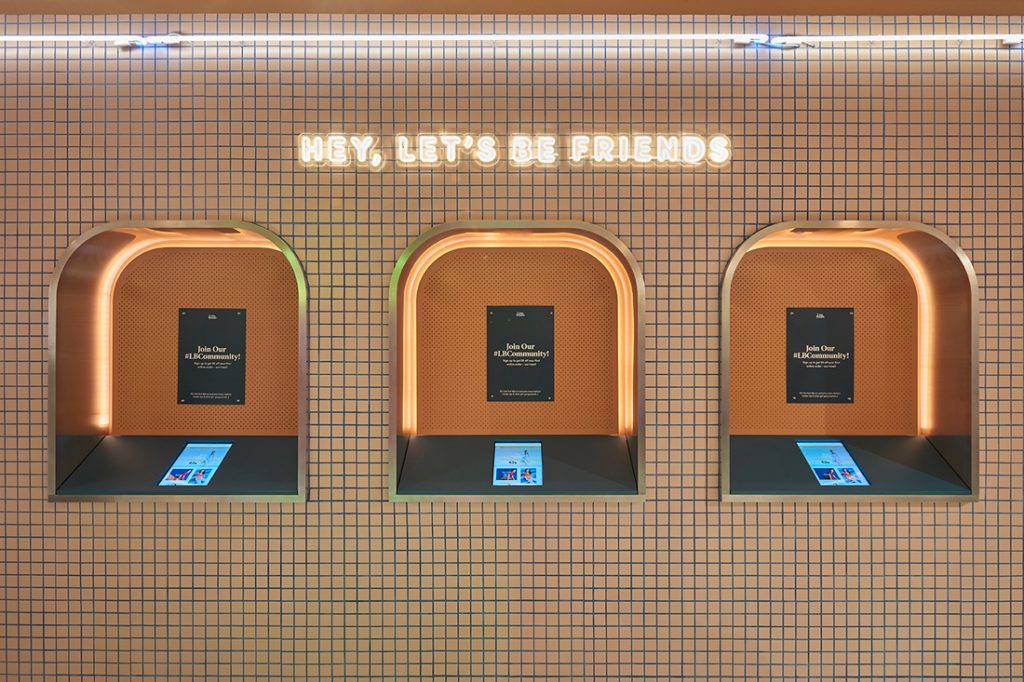
The physical store is now just one of multiple points of contact with the customer, but it is one that must appeal to their values and engage them sensorially. Wynk’s design for the Love, Bonito store at Funan is a strong demonstration of how physical and digital retail are merging with engaging effect. It also makes apparent how social aspects are infiltrating the retail environment – all in the name of an optimal experience.
The 6,000-square-foot store has a narrow frontage, which made the function and visual performance of the threshold zone critically important. The counter needed to be at the front to facilitate the easy pick-up of online orders as well as merchandise returns. But Wynk was keen to avoid the dominance of potential queues in a customer or passerby’s first impression. A visual merchandising display was adopted as a masking mechanism.
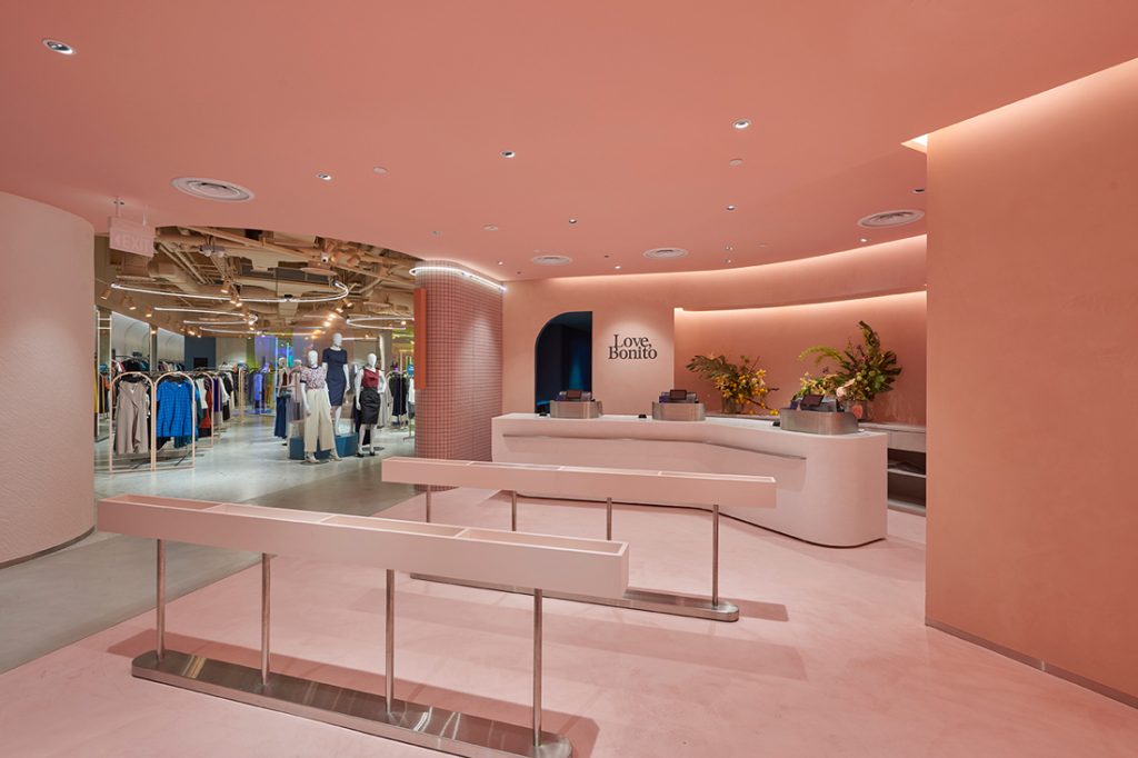
“We also wanted the threshold to be quite clean, because malls – especially newer ones – tend to be quite cacophonous with multiple textures and materials,” explains Leong. A block of colour – brand-specific peach – was applied via paint, stucco and cement.
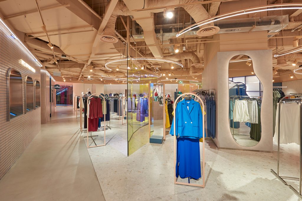
The store slowly reveals itself from this threshold area. A spine of cement flooring bisects the store into a merchandise display area on one side and the back-of-house and fitting rooms on the other. At the far end of the spine is an events space, which can hence be easily accessed without the need to filter through racks.
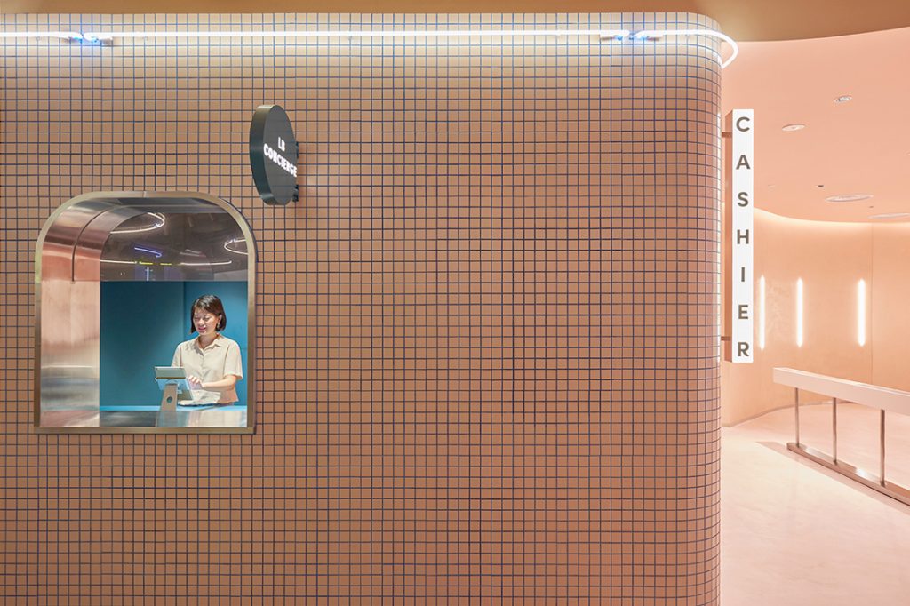
A concierge counter set into a peach-coloured tiled wall is used for the sale of special products. Further along the spine-facing wall, kiosks fitted with tablet screens allow customers to sign up to the store’s online system, check stock and make orders. Staff assist with samples for trying on.
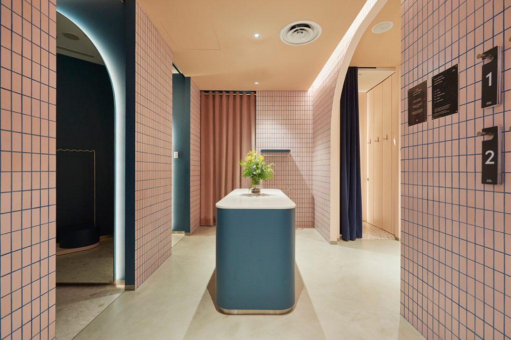
The peach-coloured tiles flow into the fitting room area where a closer, more personal connection between customers and staff is encouraged by the positioning of the counter centrally in the space rather than against a wall. “We wanted staff and customers to be able to walk around the counter – to make it less transactional and more friendly,” says Leong.
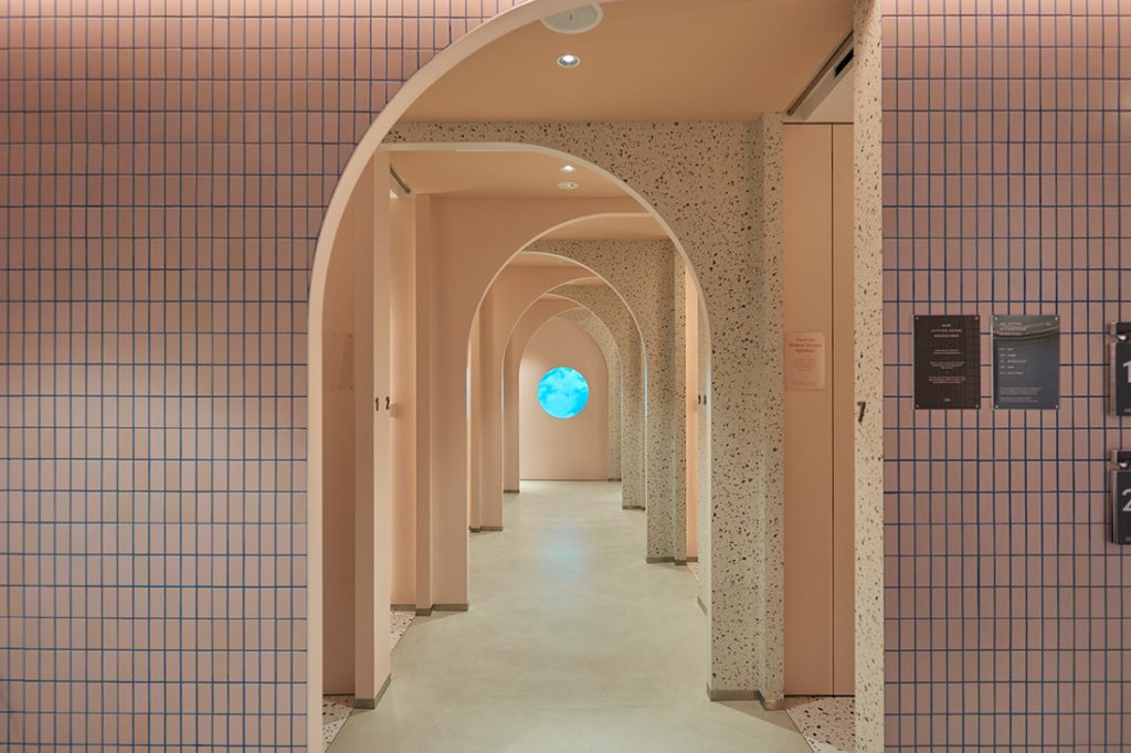
Fittings are governed by a queue number system (broadcast via screens and by phone alerts) rather than a physical queue.
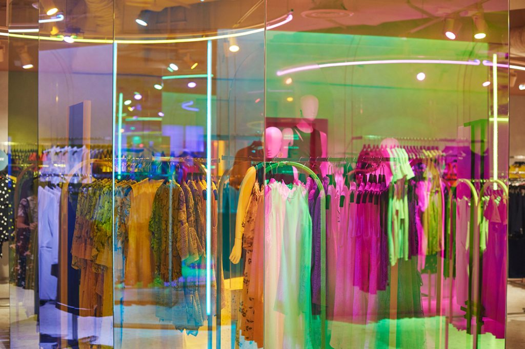
The retail area is divided into two broad sections: casual clothing and office-oriented clothing. Preferring to avoid solid partitions, Wynk adopted dichroic film on glass, which, says Leong, “gives the other side a nice filter. It’s one way of encouraging people to take a photo – through the coloured partition.”
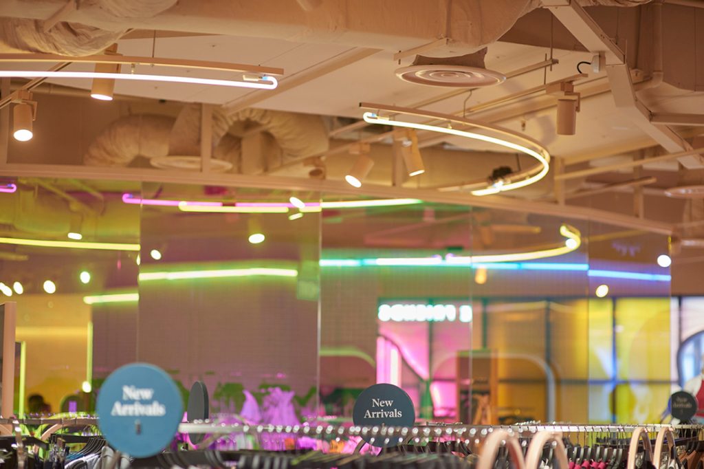
Wynk also designed the display rack – a singular design on which clothing can be hung to face multiple directions. A rod can also be removed to adjust the hanging style. “We wanted to allow a lot of flexibility,” says Leong, “so the store can be rearranged easily. This is important – you need to rejig the space every now and then so it feels fresher.”

At the rear, beside the perimeter of the building, is an event space where brand values can be reinforced through activities that may be unrelated to clothing retail. An array of lighting tubes on the ceiling was purposefully placed to maximise engagement with the street – to catch the eye of passersby and pique curiosity about what’s inside.
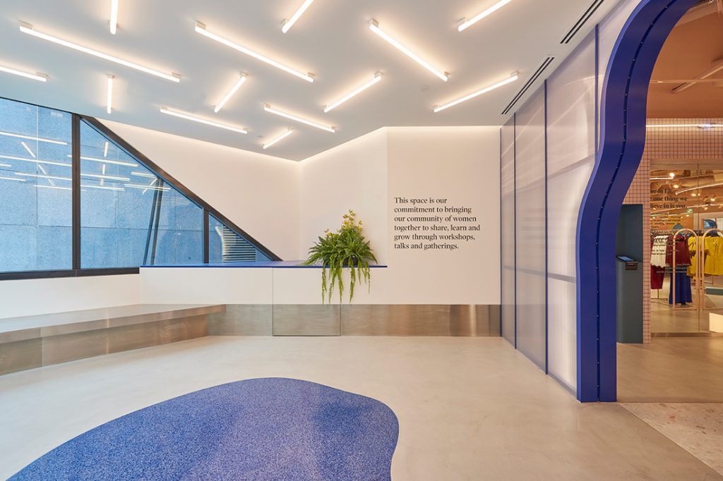
Lettering on the wall spells out Love, Bonito’s “commitment to bringing our community of women together to share, learn and grow through workshops, talks and gatherings.”
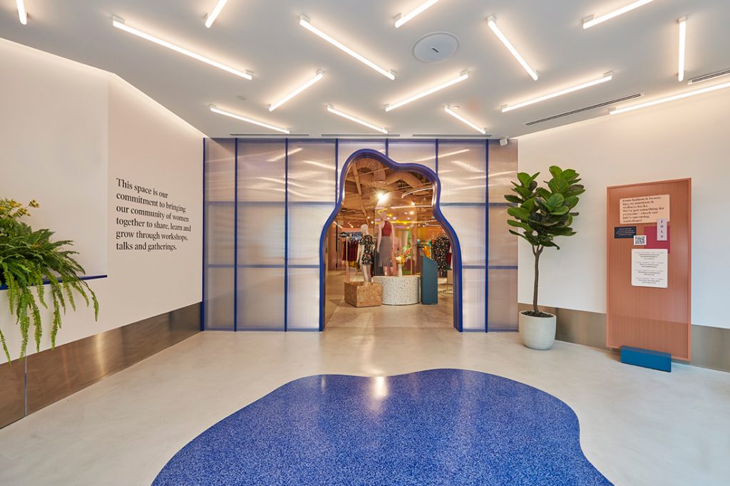
As Leong said during a recent Saturday Indesign panel discussion: “It’s no longer a company that influences you to buy things or to consume a service; they are your friend – they’re trying to be your friend and to build this very, very long term relationship and to kind of grow with you and change with you along your life.”
A searchable and comprehensive guide for specifying leading products and their suppliers
Keep up to date with the latest and greatest from our industry BFF's!

The Man x Machine x Material collaboration by Jarrod Lim and The American Hardwood Export Council explores how generative AI can enhance design processes while also revealing the areas where human intuition remains irreplaceable.

Elevate your outdoor spaces with pieces that are beautiful, functional, and engineered for you.

With the exceptional 200 Series Fridge Freezer, Gaggenau once again transforms the simple, everyday act of food preservation into an extraordinary, creative and sensory experience, turning the kitchen space into an inspiring culinary atelier.

Re-interpreting retail design for the future, HAS design and research is leading the way in Hefei, China with a Ligne Roset showroom that is a winter wonderland delight.

RIZEN Atelier has created an exceptional retail experience for Fanuli that shines a bright light on all things design.
The internet never sleeps! Here's the stuff you might have missed

New forms and patterns have taken shape in the latest acoustic panels from Woven Image – bringing together cutting-edge design to create an immersive, sensorial product.

For the Year 7 and 8 students of Xavier College, their dedicated Kostka Building feels warm, welcoming and offers myriad spaces for all types of social interaction. Living Edge has played an important role in this, working with MGS to supply furniture solutions that support their different learning activities.