From Singapore to China, these 5 projects create memorable experiences for its visitors, beyond buying and browsing products.

K11 Art Mall Wuhan by Hassell. Photography by Dirk Weiblen.
January 12th, 2023
In this digital era, how can retail brands win the hearts of consumers? Offering a holistic and immersive way of encountering products is the way forward. “As consumer habit is increasingly shifting toward online shopping, the offline experience and exposure are key to attracting new customers and retaining existing ones,” shares Edward Tan, founder and director of Spacemen Studio.
When done immaculately, experiential retail not only increases brand awareness and loyalty, but could potentially become tourist destinations as Swarovski Kristallwelten in Austria has successfully demonstrated for the last 28 years. Here are five wonderful examples of experiential retail that challenge the convention.
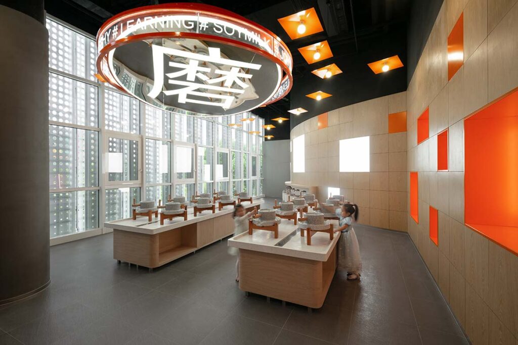
In what used to be a dilapidated carpark in the head office and factory grounds of China’s first and largest maker of automatic household soymilk machines, Joyoung, a gleaming white structure has emerged. Designed by Spacemen Studio, the 6,000-square-metre Joyoung Experience Centre is envisioned as a destination to showcase its history, vision and technology through a fun, interactive, educational and hands-on experience.

The experience centre is divided into three three distinct spaces, where the first floor is dedicated to retail, the second floor serves as the experiential hub and the third floor functions as the collaboration zone. The S.K.Y. Product Bar on the first storey – an illuminated cylindrical orange shelf and counter – allows visitors to experience live demonstrations on both sides. Likewise, the Joy Dome on the second storey above the spiral staircase is a multi-media theatre that choreographs the brand’s story into a cinematic experience. Here, the enveloping LED ceiling screen glows like the rising sun when it detects visitors entering from the lobby, turning a typically visual encounter into a visceral one.

Read more about Joyoung Experience Centre in the latest issue of Cubes. Purchase your digital copy here or a print copy at Singapore’s major bookstores and newsstands.
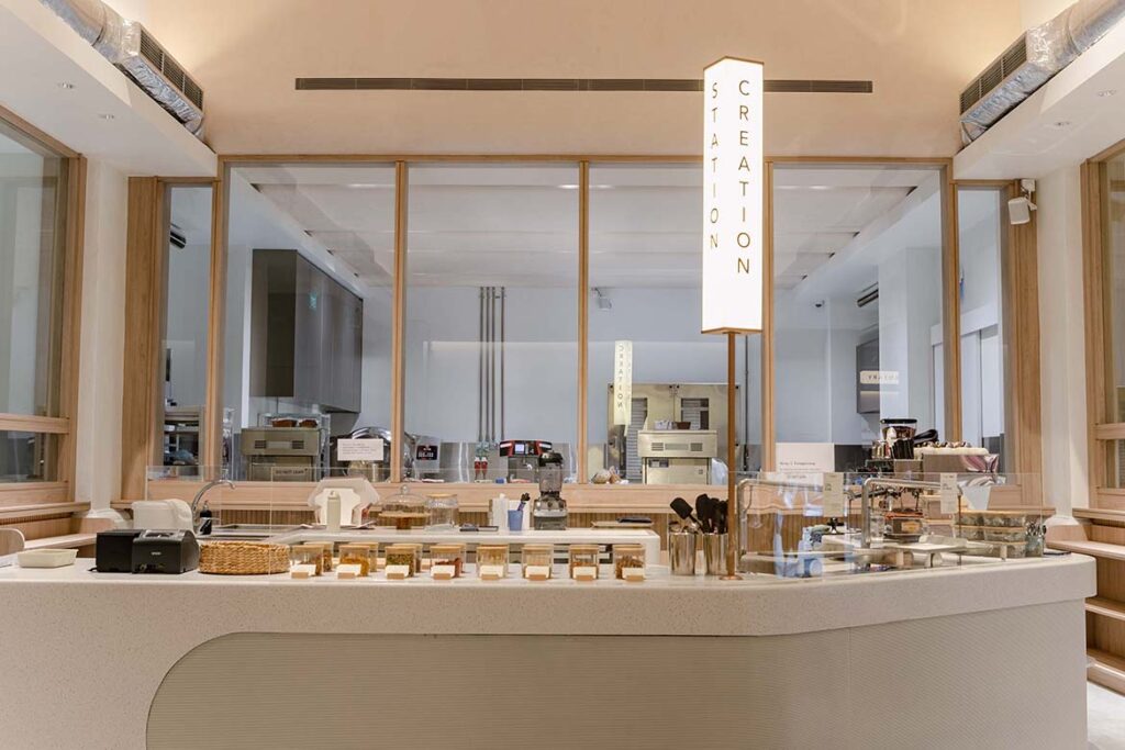
With rounded archways that resemble Mr. Bucket’s signature bon bons, warm wood finishes and rainbow-hued cacao pod decorations hanging from its high ceilings, Mr. Bucket Chocolaterie (Dempsey Factory) reinvents the traditional definition of a chocolate factory and serves up a series of engaging and inspiring experiences that immerse fans deeper into the world of chocolate.

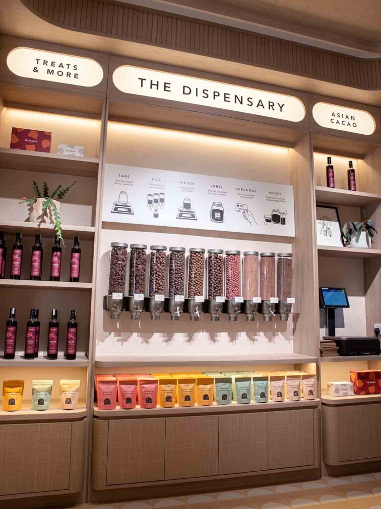
Designed by millihaus, the chocolate factory spans close to 5,000 square feet and houses multi-sensory zones to improve visitor experience. The space features Singapore’s first ever build-your-own chocolate slab station, an indoor and outdoor dining experience, glass enclosed kitchens that showcase the bean-to-bar process, as well as a new chocolate dispensary where customers can purchase their chocolate treats sustainably with their own containers. The experiential retail design is further elevated with a workshop and event space dedicated to cultivating a deeper appreciation for the Asian cacao industry.


An immersive blend of art, commerce and gastronomy, the 43,000-square-metre mall is proof that retail is not dead. Designed by Hassell and envisioned as an art playground, the project brief called for a complete rethink of the existing mall and the designers delivered an amenity-driven concept. Three spectacular, interconnected circular chambers with retail stores wrap around the outside, where people can experience products as ‘masterpieces’, and shopping as a series of exciting discoveries.

A pink accessories chamber in a museum-style setting with displays towering up to the mirrored ceiling makes visitors feel like they’ve stepped into a space that extends into infinity. The five-storey yellow toy chamber draws on elements of amusement parks and playgrounds and the fantasy many children have of living in a toy factory. The sci-fi-inspired blue technology chamber housing escalators lets visitors get lost in a world full of their favourite tech products, with pop-up stores and seasonal themes taking over the space at different times of the year.

Read more about K11 Art Mall Wuhan in the latest issue of Cubes. Purchase your digital copy here or a print copy at Singapore’s major bookstores and newsstands.
The Instagrammable Beta Cinema by Module K breaks away from traditional cinema design with bold colours, strong geometric shapes and a ‘flashback’ to the famous buildings of old Saigon. Located on the ground floor of an existing shopping mall, the 2,000-square-metre cinema seats 1000 and is aimed at millennials who appreciate a visual and sensory immersion that begins not just at the roll of the reel, but at the doorstep.

Traversing Beta Cinema is like an eclectic journey through time in Ho Chi Minh City, beginning with the Ben Thanh market tower at the main entrance with its symmetrical staircases, and the rhythmic arches of the Saigon Central post office, rendered in aqua to house the ticket counters. An array of alternating arches along the hallway corridors captures the intimate granularity of street alleys in Ho Chi Minh City. Asymmetrical arch pillars on the right side of the space are doused in pink, in reference to the rose-coloured Gothic style of the iconic Tan Dinh Church. Many visitors take up the invitation in such a photogenic space, snapping pictures and selfies for the record, while interacting with the spatial details to identify their national architectural icons.

Read the full feature of Beta Cinema here.
Linehouse worked in collaboration with Louis Li, Principal and Creative Director of Black Star Pastry, to convert an old, red-brick villa in Shanghai into Black Star Pastry’s first flagship store outside of Australia. Conceived as two venues over two floors, the ground floor operates as a cake and coffee retail space that provides guests an incredible sensation of being aboard a spaceship. Stainless-steel shelves holding thousands of meteorites, ascend, bend and turn towards the ceiling, creating the illusion of rocks transfixed in space.

A staircase clad in rough cast concrete terrazzo transports guests upstairs to the exhibition-style space of Black Star Gallery. The gallery is a tearoom in the afternoon and a cocktail lounge by night. A metal grid lines the ceiling and the floor is a rough concrete cast terrazzo tile, giving the space a hint of wildness and creating a museum-like mood for the whimsical collection of artwork. A deep blue curtain separates the main dining space from the private room named There There, featuring an intimate bar wrapped in acid etched blue metal.

A searchable and comprehensive guide for specifying leading products and their suppliers
Keep up to date with the latest and greatest from our industry BFF's!

BLANCO launches their latest finish for a sleek kitchen feel.

XTRA celebrates the distinctive and unexpected work of Magis in their Singapore showroom.

With a joint design by Hassell and Snøhetta, Harbourside Residences is set to bring significant change to a famous Sydney spot.

Re-interpreting retail design for the future, HAS design and research is leading the way in Hefei, China with a Ligne Roset showroom that is a winter wonderland delight.
The internet never sleeps! Here's the stuff you might have missed

RIZEN Atelier has created an exceptional retail experience for Fanuli that shines a bright light on all things design.

Fresh from Singapore, the first round of winners from day one of the World Architecture Festival have been announced.