Piero Lissoni designed the darkly glamorous new addition to the Swire Hotels’ House Collective. Here, he talks about bringing an Italian perspective to a China-based hotel.

July 10th, 2018
Dark, moody intimacy is what The Middle House offers at the centre of Shanghai. It’s a strong contrast to the bustling Dazhongli neighbourhood it sits in, made even busier by the opening of mixed-use development HKRI Taikoo Hui, which The Middle House and its accompanying serviced apartments are part of.
HKRI Taikoo Hui is a joint effort on the part of Swire Properties and HKRI International, and it involved the shifting of an entire 1920s building 57 metres down the road back in 2010. HKRI Taikoo Hui opened in November last year, comprising a mall and two Grade-A office towers, with two hotels and a set of serviced apartments – HKRI’s The Sukhothai Shanghai, plus The Middle House and its Residences – following in April this year. And let’s not forget the gigantic Starbucks Reserve Roastery Shanghai situated right next to the mall; it’s the coffee company’s largest globally.
There’s clearly plenty happening here in the Jing’an district, so it’s not surprising that Piero Lissoni – the man Swire Hotels tasked with designing the fourth hotel in The House Collective – wanted to make the hotel and residences feel like calm and cosy retreats.
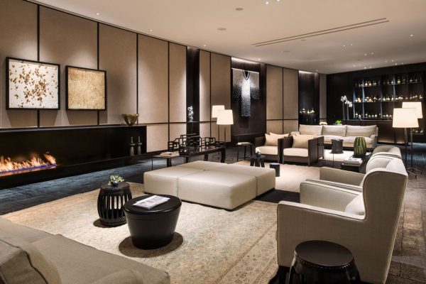
“Contemporary luxury, a sense of home and exclusivity are the words that best describe the ideology of The House Collective. We have consequently used these concepts to develop tranquil and elegant spaces that possess a simple elegance and are studied down to the last detail,” says Lissoni, who used predominantly darkly neutral hues, as well as accents in bold, jewel-like tones, to deliver spaces that draw on Italian and Chinese culture.
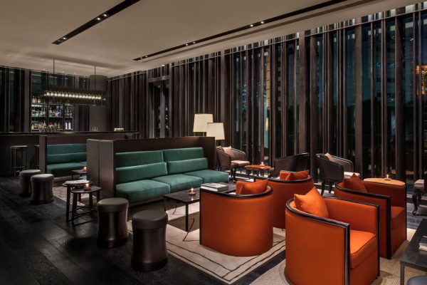
As an Italian designing in Shanghai, Lissoni faced certain challenges: how do you create apartments and a hotel that feel locally relevant and timeless, while steering away from anything derivative? “China and Italy have been closely connected since Marco Polo, and our two cultures are not so far apart as it may appear,” answers Lissoni.
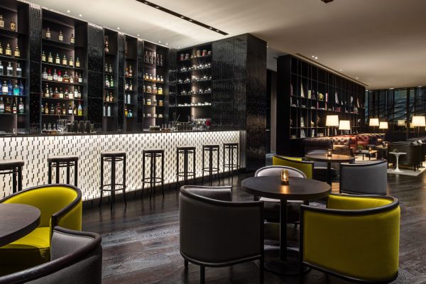
“As a European, I organised the space in a different way, using only materials from the traditional culture like porcelain and ceramic, but I redesigned everything with a contemporary approach. I tried to think in terms of contemporary architecture, without pretending to be Chinese. My reasoning was based on a very simple element, in that my starting point was the observation of a traditional element in Chinese architecture that is always perceived as filtered through the use of screens.”
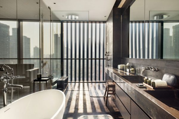
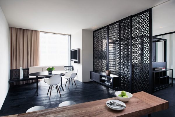
Glazed screens divide bathroom from bedroom in the hotel rooms, while lovely lattice screens separate living and bedroom in the Middle House serviced apartments. Aluminium louvers on the curving facades of the hotel and the Residences offer a contemporary take on screens, and on the louvers commonly found in Shanghainese architecture.
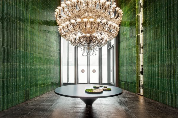
Inside the hotel, Lissoni drew on other aspects of Shanghainese art and craftsmanship – the most striking of these are the hand-made, emerald-green tiles that line the hotel lobby. Decorated with bamboo stalks, these tiles rise up two storeys to create a striking entrance topped with a vast Murano-glass chandelier. “The oversized and impressive Venetian chandelier defines the entrance and contrasts with the calm luxury of the lobby lounge and the neutral colours of its bespoke furniture,” says the architect.
With the Middle House, Lissoni played with contrasts: light and shade, muted and bold, Chinese and Italian, shikumen heritage and modern, craft and contemporary. “We carried out a great deal of research regarding the history and culture of local crafts; for example, by visiting local artisans, seeking to assimilate the characteristics and particularities typical of the context,” says Lissoni. “We then placed these elements in relation to contemporary features to generate an unexpected and intriguing dialogue.”
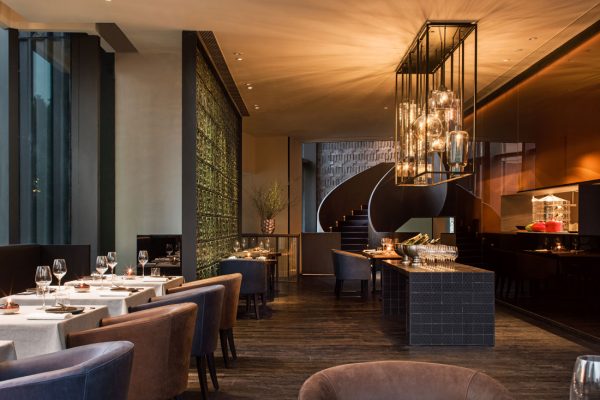
These juxtapositions come into play in the hotel and the Residences, and this is part of what gives the pair a consistent language that connects them, yet allows them their own identities – identities that come through as soon as you enter each building. Like the hotel, the Residences have a striking reception area that is calm in terms of its minimalist lines, and yet bold in terms of its metal-clad staircase and hand-made stone-tiles on the walls. It is vignettes like these that give The Middle House its character – this and the hotel’s green-clad lobby – and it is in these spaces that Lissoni really shines.
A searchable and comprehensive guide for specifying leading products and their suppliers
Keep up to date with the latest and greatest from our industry BFF's!

With the exceptional 200 Series Fridge Freezer, Gaggenau once again transforms the simple, everyday act of food preservation into an extraordinary, creative and sensory experience, turning the kitchen space into an inspiring culinary atelier.

In this candid interview, the culinary mastermind behind Singapore’s Nouri and Appetite talks about food as an act of human connection that transcends borders and accolades, the crucial role of technology in preserving its unifying power, and finding a kindred spirit in Gaggenau’s reverence for tradition and relentless pursuit of innovation.

XTRA celebrates the distinctive and unexpected work of Magis in their Singapore showroom.

The Man x Machine x Material collaboration by Jarrod Lim and The American Hardwood Export Council explores how generative AI can enhance design processes while also revealing the areas where human intuition remains irreplaceable.

It’s easy to dismiss designer furniture as frivolous. Discover what really drives the price from renowned designer Piero Lissoni and decide if it’s something you value.

Architect, designer, art director: the Italian multi-disciplinary creative, Piero Lissoni, is what many of us would refer to as a living legend. His output is prodigious. Alice Blackwood absorbs some life lessons from this orchestrator of architecture and space.
The internet never sleeps! Here's the stuff you might have missed

Designing people-first buildings with flooring that contributes to achieving WELL features in the WELL Building Standard. Works with WELL is a new trademark created by the International WELL Building Institute for use by manufacturers to show when their products align with features in the WELL Building Standard.

Fresh from Singapore, the first round of winners from day one of the World Architecture Festival have been announced.