The public spaces of YTL Corporation’s new Kuala Lumpur headquarters walk a fine line between celebrating legacy and embracing the future.

August 27th, 2021
Malaysian infrastructure conglomerate YTL Corporation (YTL) has just moved into its new headquarters: a pristine tower along Jalan Bukit Bintang, one of Kuala Lumpur city’s most coveted plots.
YTL has come a long way from its humble beginnings as a small construction firm. Today, its vastly diversified portfolio ranges from property development and cement manufacturing to power and technology. The new address brings together more than a dozen departments that were previously spread out across different offices in the city. Beyond operational and economic efficiency, the freshly minted headquarters is a totem of the company’s legacy and vision.

The importance of how the company presents itself to the public, indeed the world, through its new headquarters was not lost on YTL. The conglomerate engaged Singapore-based studio Ministry of Design (MOD) to design the building’s public areas, namely the ground floor lobby and three upper floors comprising event spaces, meeting zones and a café. Acknowledging the power of first impressions, there was a desire for these spaces to reflect all that the company stands for.
Portraying a company’s ideals in a physical space is a tall order for any firm. For MOD, known for its incisive work in branding through space, a clear objective was the launchpad into a rich spatial narrative.

“I was interested in the notion of its people coming together as a corporate whole,” shares MOD’s founder and design director Colin Seah. Equally important was a desire to “balance YTL’s legacy of corporate professionalism with a future-forward attitude that embraces change”.
“There’s a symbolism that I wanted to try to impart. How can you do that just through space without obvious iconography? That was the desire,” says Seah.
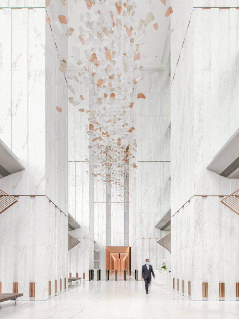
The journey starts with an encounter of a soaring 25-metre-high lobby area—a double edged space that inspires awe as easily as it can alienate. Wielding light, materials and a keen sense of proportion, MOD at once highlighted the grandeur of the architecture and took care of one’s experience at a human scale.

Seah shares, “The legacy of the company is founded on very strong underpinnings—they have a very good reputation and they’re respected. So there needs to be a bit of gravitas, a jaw-drop moment that fills you with awe.”
Marble-clad columns are detailed to create a denser rhythm closer to the ground but become visually lighter towards the top. The sense of ascending lightness is echoed in an ethereal art installation that floats overhead.
A strategy to humanise the space was also prioritised. Bronze accents break up the visual expanse of marble while pavilions that arch elegantly over couches help to introduce a more relatable scale within the cavernous lobby space. At the far end, a bronze entryway leads to the lift lobby – a literal and figurative departure point from the grandeur of the lobby into a different realm.

The public zone on the upper floors is confined to levels eight, nine and ten and “is conceived to be an extension of the lobby area”. And yet, the tone of the space changes on these floors—intentionally so.
“What you realise immediately is that there’s a change of scale and an atmospheric embrace,” Seah describes. In these spaces, there is a sense of casualness and intimacy that was not evident in the lobby.
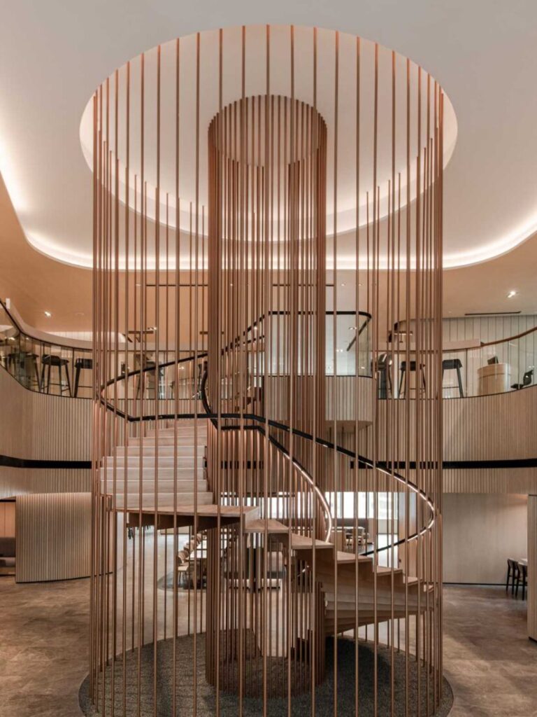
A warmer palette of materials like oak timber and dark stone effectively mark these floors as spaces for conversation and community – key ingredients in creating a dynamic working environment. The three floors function as the point of interface between staff and external visitors and consultants, and offer spaces ranging from casual communal tables, open discussion areas, booth areas to semi-enclosed and fully private meeting rooms. It is a clear nod towards a more modern, collaborative approach to work. At the heart of it all is a hefty granite café counter that serves up warm hospitality in the form of freshly baked confectionary and coffee.

A spiral stair also takes pride of place on a bed of black gravel in the middle of the eighth floor and connects to the ninth floor through a void that was created in the floor plate. “When you’re on level eight looking up, or upstairs looking down, there’s always this notion of connectivity and continuity,” says Seah. “It is a symbolic gesture of uniting and unifying the different parts of the company.”
Experientially, the two faces of the headquarters’ public zones are “bookends” to YTL’s story: the pioneering values that form the foundation of its legacy and a dynamic new way forward that esteems dialogue and openness.

A searchable and comprehensive guide for specifying leading products and their suppliers
Keep up to date with the latest and greatest from our industry BFF's!

In this candid interview, the culinary mastermind behind Singapore’s Nouri and Appetite talks about food as an act of human connection that transcends borders and accolades, the crucial role of technology in preserving its unifying power, and finding a kindred spirit in Gaggenau’s reverence for tradition and relentless pursuit of innovation.

BLANCO launches their latest finish for a sleek kitchen feel.

In this New Zealand workplace design by Wingates, Anthony Harper were “keen to evolve their working environment as the world evolves as well.”

The global leader in design and innovation, formed from the merger of Herman Miller and Knoll, recently hosted an exclusive event to mark a milestone in its partnership with Pergo.
The internet never sleeps! Here's the stuff you might have missed

In this comment piece, Buchan’s Dong Uong discusses the why and how behind the stories underpinning design projects.

The global leader in design and innovation, formed from the merger of Herman Miller and Knoll, recently hosted an exclusive event to mark a milestone in its partnership with Pergo.