Small bathrooms can be incredibly charming. But how to make sure they avoid feeling cramped? Here are some simple and affordable strategies you can employ to keep the appeal of your small bathroom intact.

May 30th, 2022
Any bathroom around 30-40 square feet is considered small. The smallest possible size is 15 square feet, which will just manage to squeeze a toilet and a sink. To have a shower you will need at least 30 square feet, and a full-sized bath requires at least 40. The most common bathroom sizes are between 36-72 square feet. Standard dimensions for a bathroom are 4 x 6, 6 x 6, 6 x 10, 7 x 7, 8 x 8 etc.

Small bathrooms are usually found in apartments as they can be downsized when space constraints are tight. A cramped space can be very difficult to style as it limits the type of furniture, accessories and décor that can be comfortably used in the space.
Bathrooms are also often shared, which can be a source of conflict if there are disagreements in the household about the design elements. However, the challenge of decorating a small bathroom is alluring and many renowned interior designers have thrown their hat in the ring.
The type of renovation or restyling you will be able to do will depend on your floor plans and the dimensions of your bathroom. Browse the photo gallery below for inspiration on how to best renovate your small bathroom.
FAQ: What size tiles for small bathroom?

Big tiles in small bathroom can actually make the room seem larger over all, because there will be fewer grout lines and those remaining will draw the eye to the far wall of the room, making it seem longer. The recommended sizes for a small bathroom are: 1-inch square (shower floor) 1-4 inch square (shower walls) and 1-12 inch square (bathroom floor). For a small bathroom laundry layout, it’s recommended to stick to the innocuous tile sizes.
The toughest part about finding the right small bathroom designs is capturing the airiness of a large bathroom without leaving the room too sparse. Avoiding clutter is a must – cut down on as much furniture as you can, and try to make sure that the necessary pieces like the sink or the shower are not bulky. Squeezing bulky furniture into a small room will drastically limit the potential open space and the room will feel cluttered before you even begin to decorate.
There are also many principles of modern design which can be employed to make your bathroom feel larger. Strategies of lighting, reflection, colour and even ocular principles can be used to make your bathroom feel radically larger. The best part? Many of these do not even require a rebuild or renovations; follow the simple small bathroom ideas below for an outline on small bathroom ideas on a budget.
Small bathroom ideas with shower: small toilet and bathroom ideas
5. Mirrors

Very small bathroom ideas: Mirrors are one of the most foundational pillars of small-scale interior design. Bathrooms will almost always have at least one mirror, but there are actual principles which can help ensure that your mirror is placed in the most effective spot. A single, large mirror is the most effective was to brighten a room – having only a small mirror or multiple mirrors around the walls might actually have the reverse effect, making the bathroom appear crowded.
Generally, bathroom mirrors will be attached to a cabinet or vanity of some kind; it is important to choose one that is slim and will take up the least amount of space. Light colours also appear to take up less space, so a white or a pastel colour will not go amiss here.
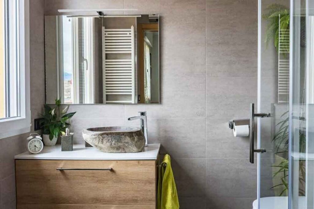
Keep in mind your own height as well. The average person’s eye level is 1.5m, so you will want to make sure that whichever mirror or cabinet you purchase will line up with this (especially if you are hanging one yourself!).
Another industry trick for mirrors is to place them next to a light source like a window. This means that the mirror will bounce the light from outside around the room, making it feel much brighter and more open. While mirrors can be fairly expensive, they are an extremely popular item and there are many budget conscious options available. Mirrored cabinets will also have extremely handy storage, which can cut down from the level of clutter in your bathroom and once again make it seem larger.
4. Wall Mounting

It may not seem like a huge space saver, but mounting your bathroom furniture on the wall will actually open up the area more than you think. Using as much of the wall space as possible is a tried and tested trick to make a bathroom appear larger. Floating shelves are a great way to manage this because they will limit the bulk of a cabinet while still letting you display your favourite bathroom accessories. They are also a cost effective method and a fairly easy DIY project.
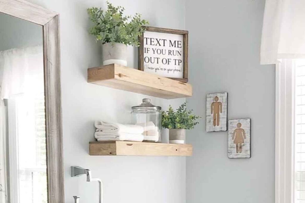
Another option, though it may be a little more difficult, is a floating bathroom cabinet. They are readily available and you purchase the cabinet pictured below here.

Attaching the cabinet directly to the wall saves on the space that the cabinet would have jutted out into and streamlines your furniture to just its most necessary components.
Even a tiny amount of additional space can give the impression of openness. This is why attaching shelves, your cabinets, sinks, or even your toilet is a great idea to try if you have the means – even the slightest change in room space will feel drastic when you actually stand in the new bathroom and observe it.
You can purchase this cabinet here.
3. Segmenting

Another opportunity to make your bathroom feel larger is by structuring it into clear sections. This is best accomplished with a change of material or colour to signify the difference between the two areas of the bathroom. It can be accomplished by wallpaper, painting or even tiling the wall to create multiple textures.

It works particularly well for small ensuite designs as you get to pick a more personal colour scheme because it is unlikely to be used by anyone except you and perhaps a partner.

A bonus is that this method is fairly affordable, depending on the type of paint or tile you decide to go with. The tiles pictured below can be purchased here for approx. $59.00/sqm.

2. Principled Design
This is where common principles of interior design can be extremely helpful. These usually pertain to the lines of the space and there are a few ways you can approach styling a small bathroom with these principles in mind.

Vertical design – this will help emphasize the height of the space and draw attention away from the width. To employ this, you will want to create straight lines in your bathroom which guide the eye upwards.

This is best done by choosing narrow, tall pieces of furniture such as a cabinet and mirrors.

Offset these with other vertically-oriented design elements such as tall plants or feature walls and you will have a dynamic bathroom which guides the viewer’s eye around the space. Limit horizontal lines as best you can and try to keep them contained within more dominant vertical lines.
Horizontal design – this essentially works in the opposite way to create the same effect: more space.

Here, the focus is on trying to make the room appear longer (instead of taller). You can elongate the space of your bathroom by placing long furniture pieces or even a patterned feature wall across the bathroom, with the goal of guiding the eyes to the furthest wall.

Horizontal lines like those of the bath and shower will naturally make the room seem longer and can drastically extend the visual effect of the space. This is particularly useful when trying to include baths for small bathrooms.

Make sure to measure the space when choosing furniture to suit these styles – you won’t want anything bulky or too long as it will cramp the space and negate the effect of the arrangement.
1. White and bright

Tried and true, white is one of the best possible colour ideas for a small bathroom. White is an unassuming colour associated with cleanliness which will not overwhelm your bathroom – while a darker colour certainly runs that risk. A trick for making your bathroom appear lighter, brighter and airy is to paint or tile the walls white and keep the furniture in similar monochromatic shades.

To break this up and keep the bathroom visually interesting, pops of colour such as timber shelves or warm-toned browns and plants are extremely effective. These little touches of colour will give the room personality and make it specific to your expression of style, while the white walls and furniture will bounce light around the room to make everything seem light and spacious.
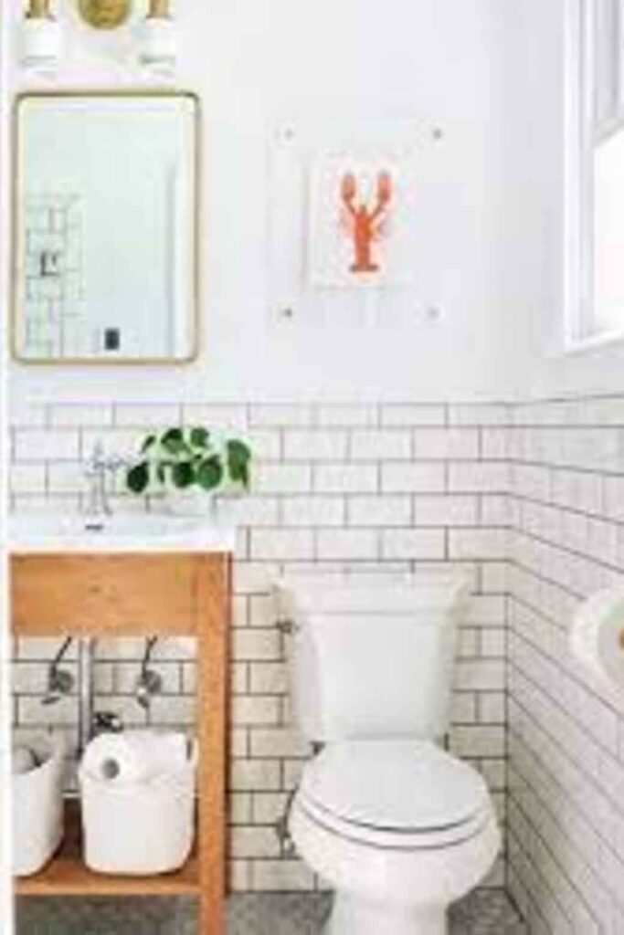
This is one of the cheapest ways to improve on a small bathroom, because white tile is one of the most popular and often cheapest tile types (see here), and bathroom paint is available in just about every major hardware store.
The difference in types of white – e.g. warm, cool, light and dark – also means that you still have the option to choose a shade tailored to your specific tastes. Layering different shades and textures of white onto one another is another effective way to brighten the space while keeping it dynamic.

INDESIGN is on instagram
Follow @indesignlive
A searchable and comprehensive guide for specifying leading products and their suppliers
Keep up to date with the latest and greatest from our industry BFF's!
Welcomed to the Australian design scene in 2024, Kokuyo is set to redefine collaboration, bringing its unique blend of colour and function to individuals and corporations, designed to be used Any Way!

A longstanding partnership turns a historic city into a hub for emerging talent
The new range features slabs with warm, earthy palettes that lend a sense of organic luxury to every space.

For Aidan Mawhinney, the secret ingredient to Living Edge’s success “comes down to people, product and place.” As the brand celebrates a significant 25-year milestone, it’s that commitment to authentic, sustainable design – and the people behind it all – that continues to anchor its legacy.
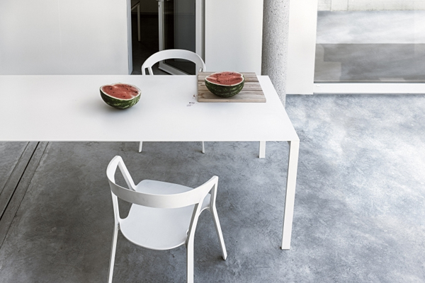
The Thin-K table and the entire Kristalia range are now exclusively available from Fanuli Furniture
The internet never sleeps! Here's the stuff you might have missed
Australian designed and manufactured, Laminex Architectural Panels transform timber design aesthetics with cutting-edge technology

A collaboration of creatives led by Sam Crawford Architects has produced a concept for the ultimate on-Country experience that both respects and sensitively interacts with the landscape.
The INDE.Awards 2025 has named House on a Hill by Leeton Pointon Architects and Allison Pye Interiors as the winner of The Interior Space category, presented by Tongue & Groove. This multigenerational country home on Bunurong Country redefines residential architecture and design with its poetic balance of form, function, and sanctuary.