Moving ‘uptown’ from five floors to a single open studio, Denton Corker Marshall has eschewed the popularist office palette of soft pastels and soothing timbers. “It’s a fairly stripped back fit-out, but it’s honest and conveys the way we work, as much as how we design,” says DCM’s founding director and architect, Barrie Marshall.
December 16th, 2019
Denton Corker Marshall (DCM) is well-known on the Melbourne and international architecture scene. Melbourne’s ‘gateway’ (sometimes referred to as the ‘sticks’), the Exhibition Centre, and the Melbourne Museum – all designed by DCM – are now ingrained in the city’s landscape. However, producing these great projects requires the right creative workspace and after decades of operating from five levels in Exhibition Street, it was time to move. “John (Denton) and I were happy enough with the multi-level arrangement, but the younger directors and the broader staff (85 in Melbourne) were keen to be in a more studio-style environment, on one level,” says architect Barrie Marshall, founding director of DCM.
DCM found a suitable workspace at the ‘top of the city’, just a stone’s throw from its previous location, at 55 Collins Street. Located on the 19th level of one of the two towers designed by I.M. Pei in the 1980s, it was undergoing a refurbishment when the 1000 square metres of floor area were first inspected. “The tradesmen were just about to lay carpet and ceiling tiles until we asked them to halt this process,” says Marshall, who was keen, as were his colleagues, to create a robust and industrial aesthetic.
Instead of ceiling tiles, the pipes and airconditioning ducts were left exposed. The concrete floor has also been left, complete with all the ‘blemishes’ time produces. And in a style that has been a consistent part of DCM since the early 1970s when the practice was established, finishes are raw, simple, and meticulously executed. Perforated steel wall panels appear on virtually every wall, with many of DCM’s furniture designs, such as the ‘Adelphi’ chair (named after the notable Adelphi hotel in Flinders Lane) appearing in many of the breakout spaces and meeting rooms.
However, the pièce de résistance is a fluid metal ‘cloth’, formed as a bench at reception, a one-off that is immovable. “I wanted something that looked as though it grew out of the ground, as in the landscape,” says Marshall, whose hand sketches of DCM’s pavilion at the Venice Biennale four years ago also feature upon arrival.
Although DCM’s new office is located in a corporate tower, the last thing in mind was producing a corporate-style environment – think an ‘interior designer’ rather than architecture aesthetic. “We haven’t changed our approach since we started, except for the short time that we experimented with the Memphis scene in the early 1980s, as did many other architects,” says Marshall, who still appreciates some of the iconic designs from this period, including two highly desirable Torso armchairs by Paolo Deganello in 1982, now taking pride of place outside the firm’s library.
Unlike the previous DCM fit-out with a singular view to a laneway, the new office is centred around the lift core, and enjoys floor-to-ceiling windows on all sides, offering views of Port Phillip Bay in the distance and people scurrying below along the city pavements. “Even though we’re on the 19th floor, you can identify people you know walking below,” says Marshall.
Conceived in a non-hierarchical manner, the staff, including the directors, share the open-plan workspaces, breaking off into individual teams when required. Small breakout areas, also framed in perforated steel, allow for more intimate gatherings, while large trestle-style tables in the kitchen morph between work and lunch.
“It’s a fairly stripped back fit-out, but it’s honest and conveys the way we work, as much as how we design,” says Marshall, who is one of the few architects remaining who still works from a drawing board, rather than sitting behind a computer. “John and I sit in one corner (the south-east corner) and we like to make things with our hands,” says Marshall, pointing out the plasticine models of the ‘blob’ that now features in reception.
This article originally appeared in issue #78 of Indesign magazine – the ‘Customer Experience’ issue. See what was specified here. And for all the latest design insights, join our weekly newsletter.
INDESIGN is on instagram
Follow @indesignlive
A searchable and comprehensive guide for specifying leading products and their suppliers
Keep up to date with the latest and greatest from our industry BFF's!
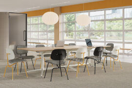
Herman Miller’s reintroduction of the Eames Moulded Plastic Dining Chair balances environmental responsibility with an enduring commitment to continuous material innovation.
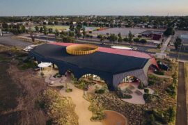
At the Munarra Centre for Regional Excellence on Yorta Yorta Country in Victoria, ARM Architecture and Milliken use PrintWorks™ technology to translate First Nations narratives into a layered, community-led floorscape.

FK’s Nicky Drobis takes us through a recent poll of 1,000 office workers across Sydney, Melbourne and Brisbane that suggests a preference for reuse – despite an ‘awareness gap’.
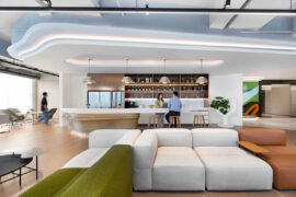
Steelcase has unveiled one of its largest Asia Pacific showrooms in Hangzhou, merging workplace, brand experience and client engagement in a single flexible environment designed by M Moser.
The internet never sleeps! Here's the stuff you might have missed
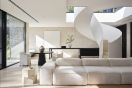
With interiors by Mathieson and architecture by SJB, Avalon Tennis Pavilion connects the main house with a tennis court at this Sydney property.
An array of coloured circles overlaid in perfect geometric sequences create a spectrum of musical auras in artist David Sequeira’s Bundanon Art Gallery commission, Form from the Formless (Under Bundanon Stars).